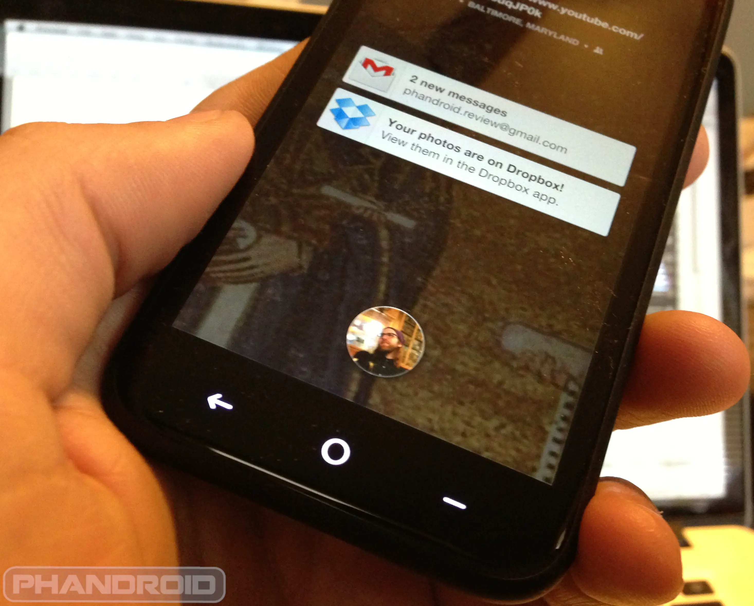
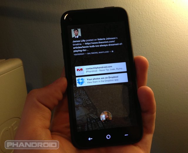
When we first saw Facebook Home for Android, many of us were taken aback. It wasn’t necessarily that the experience was ugly, but it took over our phones in a way that just wasn’t appealing. It got rid of the very things that made Android, well, Android.
Widgets and folders? Gone. Your notifications? Hidden until you instruct them to come into view (which, honestly, some folks already do through the use of custom launchers and ROMs anyway). And a traditional home-screen? Replaced by an endless stream of bad hipstergram pics and status updates from your drunken friends.
Still, Facebook set out to construct something and they never promised they wouldn’t change the very essence of the Android experience. We reasoned with the social network company in our initial assessment of Home, stating that they shouldn’t be knocked for creating an app that does exactly what they said it would. It’s not like you had to use the app if you wanted to use Facebook — it was there if you needed it, and gone if you didn’t.
Matias Duarte, the esteemed ex-Palm designer who is responsible for the transformation Android underwent from Gingerbread to Ice Cream Sandwich and beyond, seems to agree. In fact, he’s doing more than agreeing. The man behind Android’s attractive curves commended the Facebook team, noting the app’s “incredible amount of polish and attention to design detail,” and stunned at the fact that some device manufacturers don’t even hit the mark in some of those categories.
Duarte refuses to feel “threatened” by Facebook Home, and he shouldn’t. It isn’t trying to replace Android, it’s trying to enhance it, and the design chief did well to remind us that this is what Android has been all about for so long — openness, choice, creativity and innovation. Say what you want about Facebook Home, but if Matias Duarte isn’t complaining then I don’t see much of a reason to, either.
[via ABC News]


Of course Mattias would love the HTC First – it’s stock Android, which he pretty much designed. To be totally honest, FB Home sets out to do a task, and does it very very well. So long as you judge it on that, and that alone, it’s a truly awesome design. The issue most people take with it is that they want other “features” or it being less “intrusive”, such as widgets or something else that their Android launcher does that FB Home doesn’t.
I’m not surprised at all by this news, and expect other Android developers/designers/execs feel similarly – Eric Schmidt already voiced his approval, and I’m sure others have given less-public nods.
Well… I mean you can only polish the turd “facebook” so much. I guess they must’ve polished it as far as possible. I still think Duarte might be on something.
LOL
it is a great design… i will never use it but it does look great. that’s the beauty of Android.. you can do this and more. i’m sure teens are enjoying this a lot, since they like to post everything and anything.
Especially those people who seem to confuse Facebook and Twitter… No, I don’t want to know what you’re doing every 5 minutes.
I do. That’s why I check phandroid every 5 minutes.
You check it as a news source, not news about how your friend just ate a burger…Just sayin’
You really don’t understand twitter if you still think its about your friends telling you what they are doing every five minutes.
actually, i think the problem is that a lot of other people do
I don’t have an issue with him saying it’s a good ‘design’, but that doesn’t directly translate to usability for *everyone*. If you’re a ‘Facebook or die’ person then you’ll use and love it, but I’m not, so I don’t and won’t.
It can be a good design and still a terrible product. The two aren’t synonyms.
lol, good concept, but not a great design, it’s highly inefficient
its just a live wallpaper with facebook images and a xperia type app drawer for goodness sake :/
Not trying to replace Android? Then why would they remove widgets and folders? That makes no sense what so ever. If they could do what they’ve done, and confine it to a widget, I’d be on board. In its current form, I won’t go near it.