In 2013, HTC launched the One, a device that defined their vision of an Android flagship rooted in strong design and build quality and relying on powerful hardware and a slimmed-down Sense interface. Two years later HTC continues to refine the formula with the HTC One M9, a smartphone that borrows heavily from the past in the hopes that it might push us more firmly into the future.
Design and Build
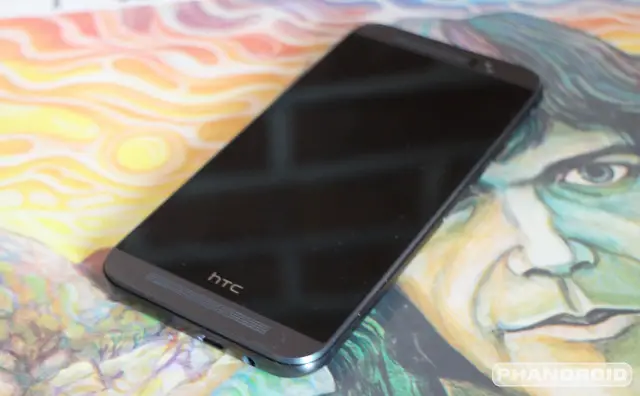
A lot has been made of the iterative nature of the HTC One M9 — we need look no further than the name. But let’s dispel the idea that ‘iterative’ is a pejorative and dispense with the cliches: if it ain’t broke don’t fix it. With the One M7 and the One M8, it was hard to talk about either device without at least a precursory mention of their superior design and build. The One M9 is no different, mostly picking up where the One M8 left off while reaching back to the One M7 for refinement. The One M9 has the grippier feel of the latter while being as comfortable as the former in hand. Some will be put off by a sharp edge that replaces the curved design of the One M8, but we didn’t take much issue with it.
In fact, the average consumer would be hard pressed to spot the differences between the One M8 and One M9 in a glance. The changes really are subtle ones.
The power button that has been relocated to the side of the device under the volume rocker. This makes it more easily reached than if it were placed on the top of the device, but we still took some issue with its placement. The volume rocker has been separated into two separate buttons, both pretty close in size to the power button. The power button gets a textured finish to make it easier to feel out, but it’s was still easy to find yourself seeking one button and pressing the other. Perhaps it’s the positioning of the button below the volume rocker — we would have preferred it either be placed above or simply on the opposite side of the device.
A one-piece metal front houses the One M9’s BoomSound speakers, UltraPixel camera, and 5-inch display. It’s a small touch that will be overlooked by most, but it is a departure from the One M8. With that model, the speaker grills were inserts. With the One M9 everything is machined from a single piece of “jewelry grade” aluminum.
The rear of the device is perhaps most noticeable altered, ditching the UltraPixel camera in favor of a traditional 20MP sensor now housed in a raised enclosure topped with a piece of durable sapphire glass.
Hardware
HTC went all in on the build quality of the One M9, but there was no tradeoff when it comes to hardware. The One M9 is a flagship phone in every sense of the word, utilizing the latest and greatest components to push one seriously powerful device.
HTC One M9 Specs
Processing Qualcomm MDM 8994 Snapdragon 810 RAM 3GB DDR3 Storage 32GB internal, microSD expandable up to 128GB Display 5.0-inch 1080p Super LCD3 Camera 20.7MP rear with dual-LED flash/4MP UltraPixel front-facing Dimensions 5.69 x 2.74 x 0.38″ Weight 5.54 oz.
Display
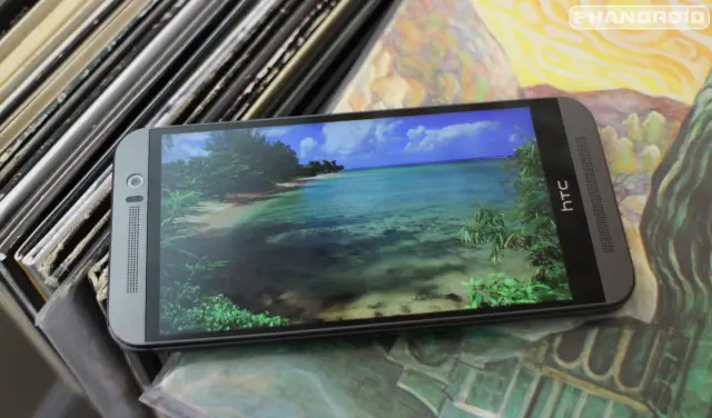
The 1080p resolution of the One M9’s 5-inch display leaves us a little wanting, at least on paper. While other major flagship devices have opted to upgrade to 2K resolution, HTC has stood pat with a display identical to the one featured on last year’s One M8. The thing is, we would challenge anyone in a blind test to take issue with the One M9’s pixel density. Yes, 1080p lacks the buzz of 2K and seems like an ancient technology in 2015, but when we are dealing with a 5-inch viewing area the difference between the 441 ppi of the One M9 and the 577 ppi of the Samung Galaxy S6 is negligible.
On the other hand, the One M9’s LCD3 hardware seemed to lack a bit of vibrancy and depth and contrast of color. Blacks could have been blacker. Colors could have popped with more brightness. Perhaps this is merely the result of our eyes becoming too accustomed to the often exaggerated color palettes of Super AMOLED displays. Either way, it is hard to call this a knock on the One M9. Rather, it’s more an issue of personal preference.
Performance
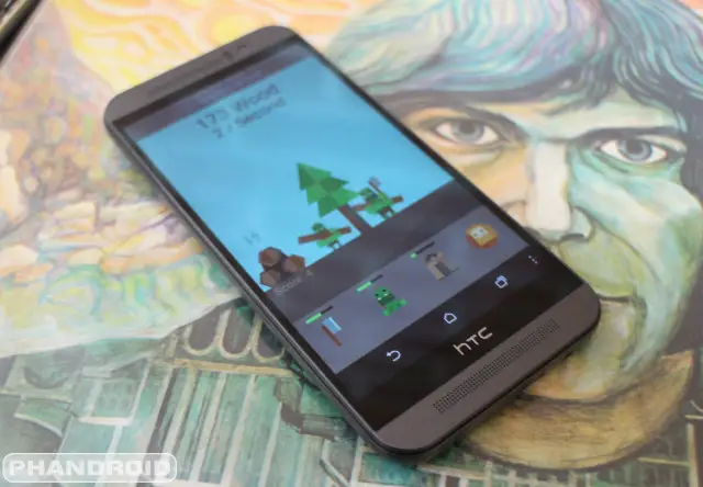
The One M9 handles its software with deftness thanks to the Qualcomm Snapdragon 810 enclosed within its metal shell. The octa-core processor coupled with 3GB of RAM makes for one of the fastest Android devices in recent memory. Apps and menus would open so fast that we would often have to wait for the network to catch up, resulting in staring at a quite a few blank windows as data loaded.
Here’s the catch: it does result on a device that tends to run a little warm when put through its paces.
We first got a hint of heat during initial setup while downloading and updating dozens of apps from the Google Play Store. The phone’s propensity to double as a radiator was more apparent during heavy gaming sessions. The worst of it seemed to occur when charging the device. The heat was never so bad as to cause concern, and the device was never too hot to handle. In fact, there was something comforting about the soft warmth.
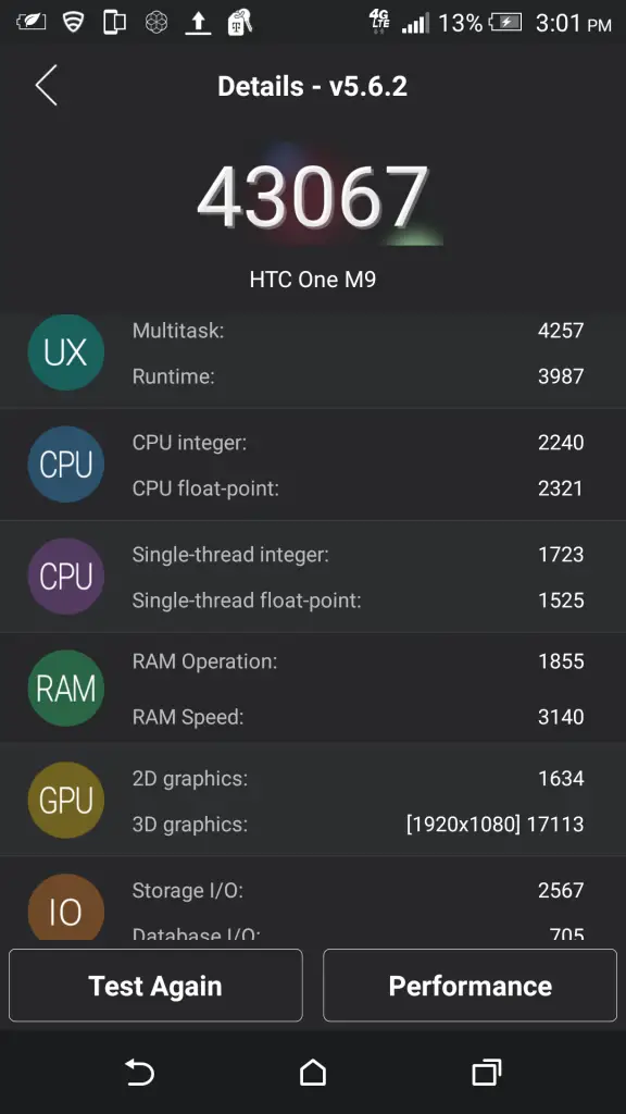
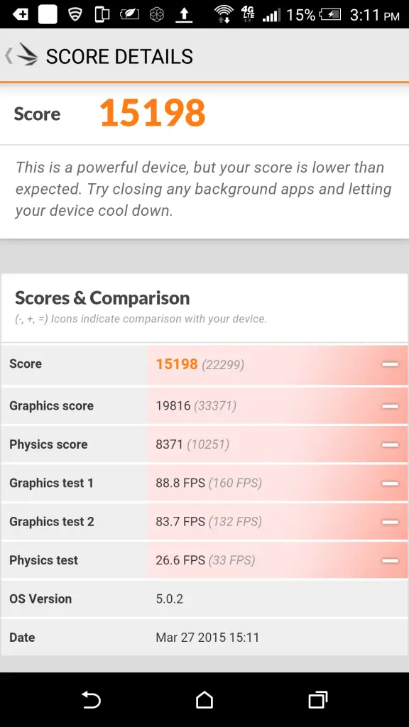
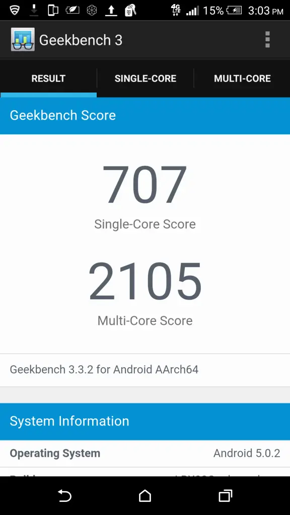
And yes, the One M9 also gets hot while running benchmark tests, the results of which are included below for those curious.
| AnTuTu | 3DMark Ice Storm | GeekBench |
 |
 |
 |
BoomSound speakers
HTC’s stereo BoomSound speakers are back, enhanced by Dolby Digital Audio (with two audio profiles: Music and Theater) and offering even louder audio output than the One M8. It’s impressive, to say the least, in terms of volume, and there is a surprising amount of depth in the audio reproduction, but ultimately we are still dealing a pair of pretty small (though larger than the average smartphone) speakers packed into a tight metal chassis.
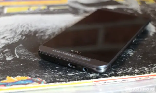
BoomSound will not replace a good portable speaker like a Jambox or the Braven BRV-X, but it’s will make due for casual listening at home or in small groups, or if you just want to enjoy a movie or other video without the need to wear headphones.
Software
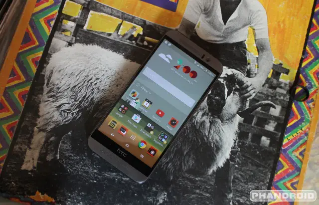
With the One M9, HTC continues to move toward a software experience more true to its Android roots — in this case the most lightweight version of HTC’s custom Sense UI. While the interface itself relies more heavily on the enhancements inherent in Google’s Android Lollipop OS, HTC has focused much of their efforts with Sense 7.0 on user customization.
Sense 7.0
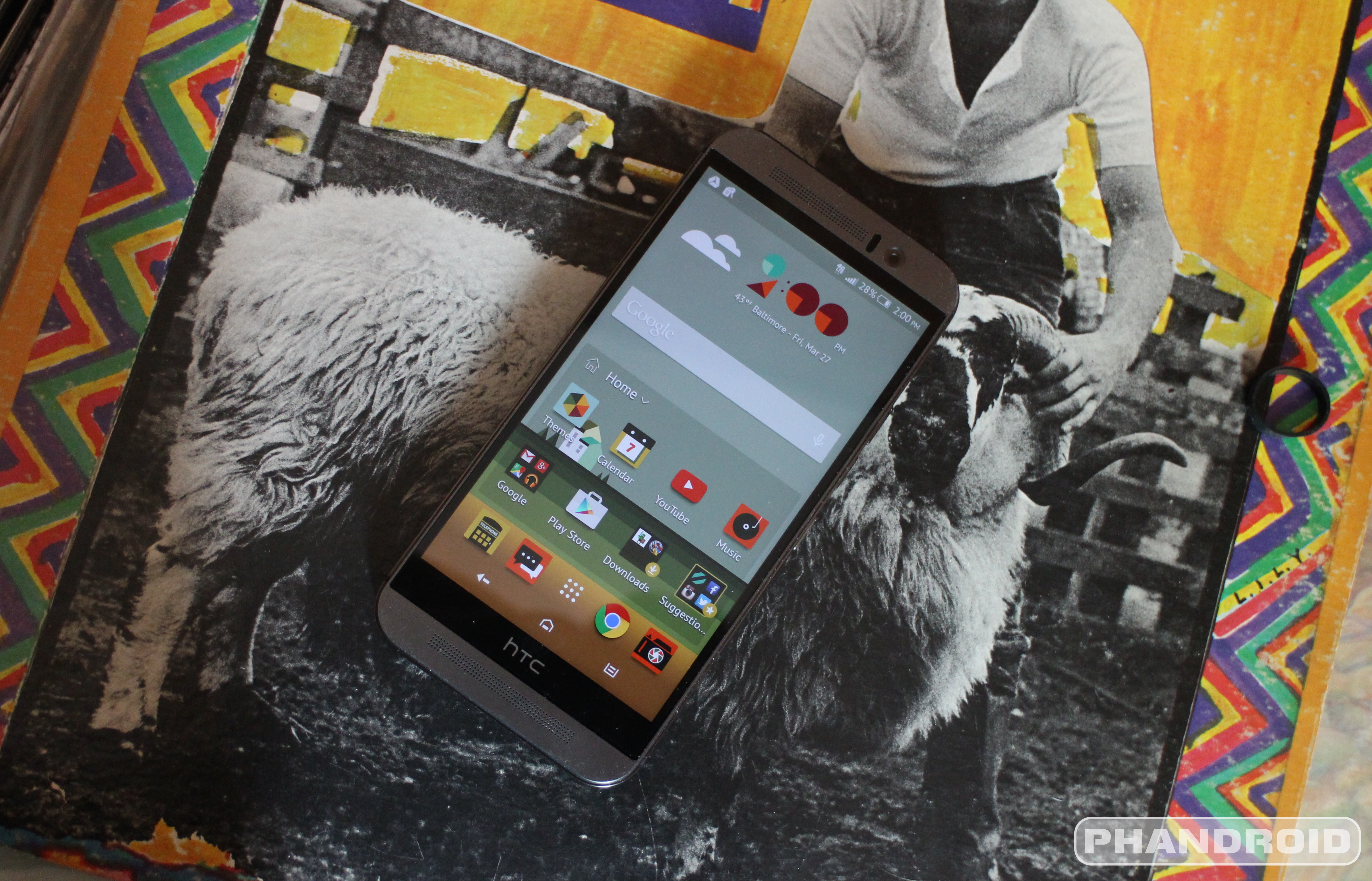
Sense 7.0 is continues HTC’s evolution by devolution, stripping away much of the interface’s gaudy scaffolding in favor of something more familiar. It plays to the strengths of Google’s Android Lollipop operating system while offering just enough in the way of tweaks and features to differentiate it from the competition.
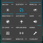
You get Lollipop standards like a Material Design base with smooth animations and an emphasis on color and contrast, notifications filtered and sorted by priority, and improved quick settings including quick access to a flashlight toggle. But you also get a bit of polish from HTC with added perks like the ability to customize, rearrange, and add to the handset’s software navigation buttons. For instance, you could remove the multitasking button and replace with one that allows quick access to device settings, or you could choose to have both at the same time.
HTC Themes
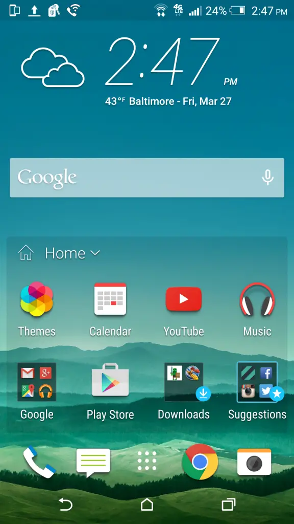
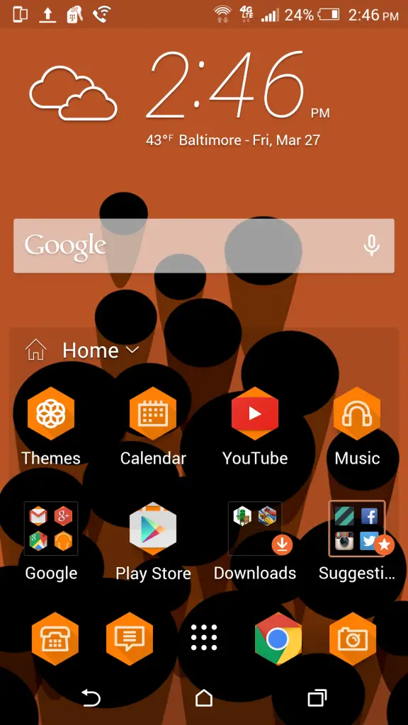
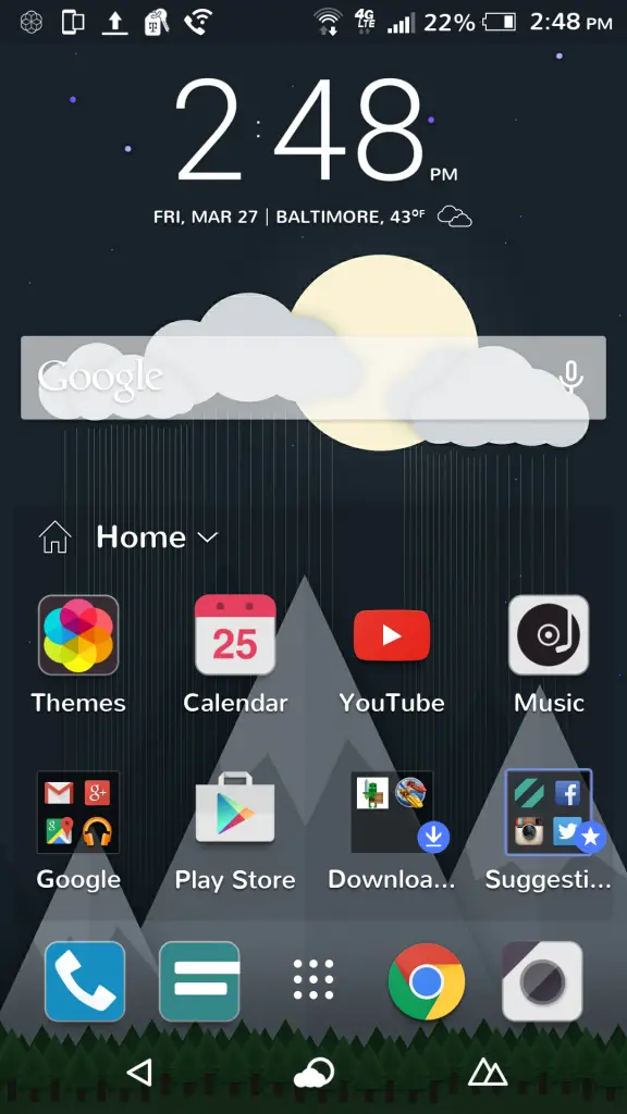
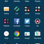
HTC has made theming a central part of the One M9 experience, and users are given a surprising amount of flexibility in adapting their homescreen to better suit their tastes. Users can browse a wide-ranging selection of pre-made themes or pick and choose items from a catalog of wallpapers, icons, and fonts to create their own custom look. Even better, visiting HTC’s Themes landing page on a desktop opens up even greater possibilities, allowing for themes that make use of alternate versions of Android’s software navigation buttons and HTC’s clock widget.
 |
 |
 |
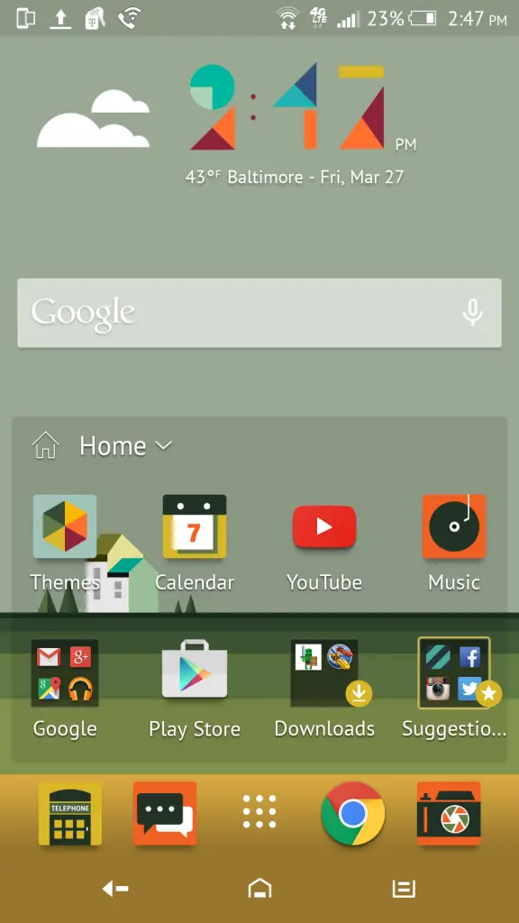 |
One cool trick allows the user to generate a theme around a chosen wallpaper. The One M9’s Themes app will analyze the wallpaper’s content and use it to create a custom color scheme from which to build a totally unique look.
Sense Home
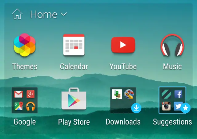
A new Sense Home widget focuses on tailoring your device to your location. It determines the apps you use most at locales like home or work and surfaces them for quick access. This feature relies heavily on tracking your location and learning from your habits, so it starts off by offering a selection of apps HTC believe would be most suited for a particular situation. It will slowly pick up on your habits, but thankfully you can also simply drag and drop the apps of your choosing into each category (choices are Home, Work, and Out).
Sense Home also provides a selection of suggested apps to download and install, but for the most part these were relegated to pretty mainstream services. We could see the feature being a nice touch if it had the capability of surfacing those rare yet useful apps one might otherwise overlook, but we were presented with something more akin to a top apps page on Google Play. We mostly ignored these suggestions. For anyone wishing to ignore Sense Home as a whole, the widget can easily be removed from the homescreen altogether.
HTC BlinkFeed
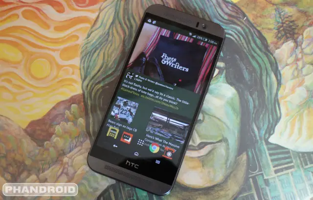
HTC’s BlinkFeed is still present from past Sense iterations (swipe left from the main homescreen), and it learns a new trick, offering location-based suggestions from sites Yelp and Foursquare. The suggestions, much like with the Sense Home widget, are supposed to be personalized, but that personal touch did seem a little lacking. The suggestions presented read more like generic recommendations based solely on proximity and rating.
The suggested items can be turned off, but we didn’t find them too overbearing mixed in with the variety of other content BlinkFeed offers (a selection of news outlets and blogs, your social streams). Otherwise, it’s a familiar BlinkFeed experience that is actually quite useful once you get accustomed to it.
Camera
That camera also represents one of the biggest hardware departures from last year’s One model. In 2014, HTC was eager to abandon the megapixel war in favor of their UltraPixel sensor, a camera designed to perform well on its own merits despite a deceptively low megapixel count. With the One M9, however, HTC returns to a traditional sensor in the hopes that megapixels sell, and we’ve got 20 of them here.
Unfortunately, this camera is one of the more disappointing aspects of the new One. It’s not outright terrible, and in the right conditions it is capable of producing some stunning shots, but it struggles in lowlight situations and photos can often appear dull or grainy.
The one thing HTC’s camera does have going for it is a pretty slick software interface. Swiping up or down on the display will cycle through photo modes including panorama and the front-facing camera. Tapping on a particular part of the image will focus. And while these features make it easy to jump right in and snap some shots, the real power of the camera is its wide range of manual adjustments, which include white balance, ISO, and other settings typically found on “pro” camera rigs. Using these settings we were able to squeeze the most out of the One M9’s underperforming image sensor.
The UltraPixel sensor does return for the One M9’s front-facing shooter, and it makes for a very worthy selfie camera perfectly capable for late night group shots in a dimly lit bar. 4K video support is also embedded in the HTC One M9 for fans of ultra HD resolution video, but it’s a far cry from cinema-quality results.
Battery
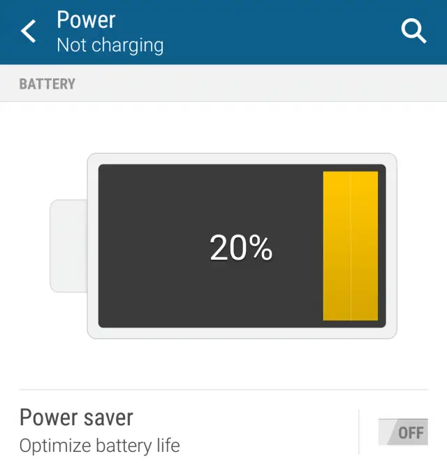
The 2840mAh battery was strong, offering pretty standard uptime during average use. The power cell can conceivably get you through the day with anywhere from 13-15 hours of use before needing to hit the charger. The minute you start really pushing that Snapdragon 810 processor things change, however. Hours of intense gaming or HD video streaming will quickly take their toll on the One M9. In these situations you might be lucky to get 8-10 hours of use.
The good news is the One M9 includes a few features to help you get the most out of your battery. For one, there is the battery saver modes that come stock as part of Android 5.0. There is also support for Quick Charge 2.0, which provides as much as 60% charge in as little as 30 minutes, but HTC has made the bizarre decision to not include a Quick Charge-compatible wall charger out of the box.
Conclusion
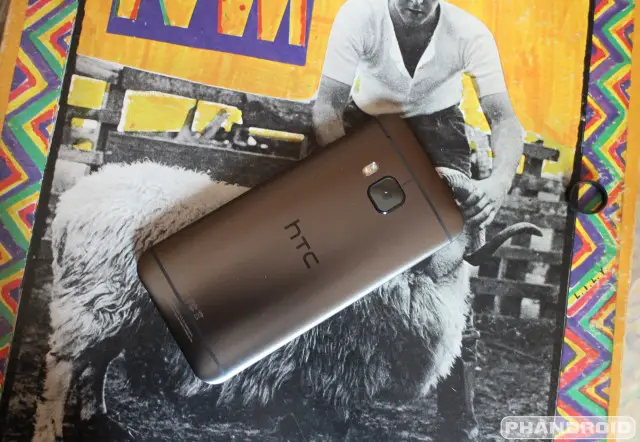
Is the HTC One M9 iterative? Yes. Does it lack the flash of a curved display or fingerprint sensor or other gimmicks found in competing Android flagships? Yes. Is that necessarily a bad thing? The One M9 puts design above all else, and in that respect it could still be crowned the best on the market. With strong hardware and improved software, the One M9 makes a case for the best overall Android device, as well.
HTC One M9 Rating: star_fullstar_fullstar_fullstar_fullstar_25 (4.25 / 5)
The Good
- Gorgeous design and premium build
- Sense 7.0 is a perfect union of Android Lollipop and customization options
- Top-notch hardware for great performance
The Bad
- Battery and display are not a marked improvement over last year’s One M8
- 20MP camera does not live up to its pixel count
- Has a tendency to run a little hot when pushed
The Bottom Line
The One M9 is a minimal update to the One M8. It doesn’t do a lot to warrant an upgrade from the previous year’s model, but it’s still a solid and relaible device.











With an 810 processor I am kind of surprised at the benchmark numbers. It is lower than my stock Nexus 6. I believe this is the second review I’ve seen with the numbers in the 40k range.
I was thinking the exact same thing.. My Note4 and N6 can get 50k and this HTC with a SD810 does 42-43k!? That’s odd..
This makes my decision to get a note 4 even more valid, thanks for pointing that out =)
Benchmarks aren’t everything. Both phones will perform more than well enough. That said, the SD810 at the moment isn’t much better than the SD805, and the SD805 may even be better depending on your use case. SD810’s advantage is in the big.LITTLE octa-core design, which should help with standby times and less-active use cases. Either way, performance has been “good enough” since the SD800, nearly flawless since the SD801. Arguably, it has been “usable” since as far back as the original Snapdragon in the Nexus One, but probably crossed the line into “enjoyable” around the time of the Snapdragon S4 (Galaxy S3, HTC One X / J Butterfly, etc).
+1 for McCartney…
Could have sworn this uses the latest ddr4 ram not ddr3 as mentioned above. Sounds like a solid phone either way. Lack of OIS stings, but HTC may be able to improve it with a future software update.
Nope, DDR3. DDR4 isn’t insanely faster than DDR3, either. It has higher clock speeds, but right now the latency is also higher, so that offsets the performance gains. There might be slight battery life benefits for DDR4 right now, though this will be more significant in the future.
Gotcha. Thanks for the breakdown
I dunno, it just kinda feels like HTC gave up.
More like they’re playing it really safe and conservative this year. I get the feeling that they were too preoccupied with things like the Vive and the Nexus 9. Perhaps they’ll have something more amazing with the M10, when they learn from the M9’s mistakes. (Hopefully the sales team at HTC stops fighting for marketable features at the expense of quality.)
People said the same thing last year about the S5, that it wasn’t different enough from the S4. Do people expect radical redesigns every year?
No, but how about every 3 years? I gave the M8 a pass since the M7 was a beautiful looking device. But as an M7 owner I don’t know that I want to look at essentially the same phone for another two years.
Told y’all that the camera is cheeks. But people of this site were fighting tooth and nail to prove otherwise. It’s Sucks. I’ll stick with my ultra pixels.
Oh what could have been. Sorry HTC, I’m moving on. My M7 is the best phone I’ve ever owned…but it’s time for something new. Maybe you’ll get it right with the M10.
Was this review based on current/updated software?
After playing with the S6 and S6 edge, I have decided on the M9 without having yet seen it in person. The S6 is a beautiful design but I couldn’t get over the ugly new design of TW and I’ve been loving TW over the recent years. There was lag here and there just navigating the UI. The Edge screen felt smaller with the curves and they didn’t provide and benefit. Both were 32GB models with only half of the memory available for the user, even with minimal apps installed. So much for a slimmed down TW. It was as I suspected; hiding apps is great so you don’t have to look at things you don’t want to but it doesn’t do anything to free space. Any S6 owners will have to root and delete to retake available memory.
I will pre-order the M9 on April 1st when available for Verizon based on the general good reviews. The only negative any review can find is that it isn’t a huge change from last year. For someone who hasn’t owned an HTC since the mytouch3Gslide, that’s not an issue.
The fact that it’s similar to the One M8 is a good thing, honestly. The only negative I’d say is the camera’s performance, particularly in low light. However, for daylight applications, it’s not really any better or worse than most other flagships.
“Both were 32GB models with only half of the memory available for the user, even with minimal apps installed.” I said the same thing several days ago in an HTC thread. It caused a stir.
Apparently, the Verizon models will have locked bootloaders so no immediate root options :(
And yes, the curved edge screen does make the edge phone feel narrower I agree.
Does anyone know the width of the non-curved portion of the screen? I was actually thinking they should have made the G6E screen slightly larger to account for that…say 5.3″ or 5.4″ as opposed to the 5.1″ they went with. The screen width on my M7 is just over 2.25″, and that’s on a 4.7″ screen. I’m wondering how the non-curved portion of the Edge will compare in size.
Does the M9 really not have all 32 GB? My friend has the M8 and it has the full 32 usable.
And the system is 0.00go? Your friend is a liar. Except if he count the storage from his sd card lol.
No lol I’ve seen it myself. Idk how it works but it shows 32.00 GB as available storage. He doesn’t have an SD card in it.
Perhaps he has a phone with more than 32gb of storage. It’s not possible for a device to have a 32gb storage space and have all 32 gigs available to the user.
Sorry it’s impossible. There’s absolutely no way a phone of 32gig arrived in your hand ( with android +sense) and still deliver 32go of free space.
Maybe it just says 32 but it actually has less? I just looked at his phone and it shows he has used 21.63 out of 32 and that he has 10.37 available.
Ho ok I see the problem here. So the total of gb on the S6 is 32go too, but out of the box, you have 23go available ( personnaly when test, i’ve found 25.02 go). Said differently, out of the box there is already 7gig used.
He maybe rooted & have a script/hack to do what is sometimes referred to as a memory swap,utilizing an SD Card.
Look up LINK2SD for a general idea……….
The S6 has 23Gb of usable storage. The M9 has 21Gb of usable storage though you can use sd storage. Also, it has been reported that you can remove most of samsungs apps without root access if you feel so inclined to free up more storage. As for lag, I personally haven’t used the phone but just about every source that has the final build software report it as lag free. There is also the option of using a custom launcher if one hated touchwiz that much.
http://www.reddit.com/r/Android/comments/30kv6x/a_32gb_samsung_galaxy_s6_has_23gb_user_available/
Edit: I was wrong about deleting system S6 apps, you can only disable them
You can’t uninstall the apps. You’re just able to disable them, as you can with any app on Android.
I keep saying this, but 3rd party launchers doesn’t get rid of Touchwiz. There’s still the settings menu and other system apps.
Your right, I read previous articles wrong. Didn’t realize that samsungs idea of uninstalling just meant hiding them from the app tray. I understand that 3rd party launchers do not completely get rid of manufacturers design elements but I do think that they help. I think most people dont spend a whole lot of time in the settings menu. There is still annoyances with the pull down tray, multitasking, google now access, and changes to transition animations. I do know that I really dislike LGs skin (whatever its called) but using a custom launcher helped to get rid of most my annoyances. But yes, you are right on both accounts.
So unless a 64gb S6 comes along, that’s another phone crossed off my list.
Camera on M9 has meant that phone is already excluded.
Perhaps it’s a Sony year….
Go to anandtech website and prepare to be blown back
Well, it’s a solid phone, but not a winner like last year’s M8.
exactly right
If this had just a decent camera in low light and a bump up to a maybe 5.5 inch screen even with its somewhat aging design… I would be sold.
It’s unfortunate that they didn’t go the extra mile on fine tuning the camera processing algorithms and figuring out a way to include decent DIS or somehow getting a ois rig in one of the thickest phones in recent memory. The lack of psr in the screen and a bizarre lack of proper color accuracy (makes no sense) make for what ultimately feels like a phone that spent all its r & d on looks rather than where it counts ultimately. The battery life also makes no sense either. A processor which is supposed to be 30% more energy efficient having worst battery life than the previous and arguably better m8. HTC really let me down and their “best phone” but ultimately will be forgotten like it already has on gsmarenas popularity chart. Samsung brought their A+ game and delivered a evince which is laughably better in e nearly every way.
My son has a pretty good review of the M9: Thanks for watching! https://www.youtube.com/watch?v=ViyzL5LHTBI
anxiously waiting for the s6 review… having seen some hands-on and early reviews, seems s6 is gonna be the best smartphone for 2015…