
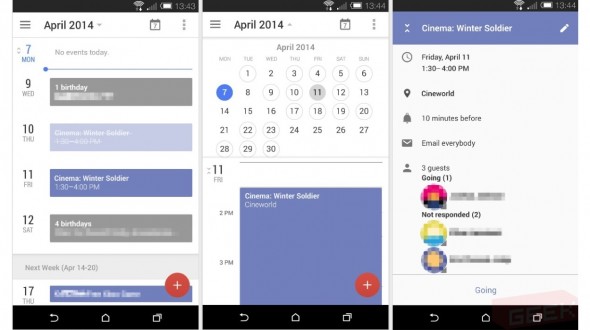
Last week, we were tipped off to some new changes that could find their way inside Gmail, but we also heard Google was experimenting with some changes to both Calendar and Hangouts. Unfortunately we didn’t get any visuals on the latter two at that point in time, but the deed has been done today for Calendar.
While Gmail had a lot of functional changes, it doesn’t seem like Google will be doing much in that way for Calendars. Most of the differences here are purely visual, which — if you’ve ever used the current calendar app for an extensive amount of time — is enough to satiate most people’s appetites.
The app will do away with harsh lines and muted colors for a more cheerful, colorful look and feel. Circles will naturally highlight the days on the calendar as months move by. The agenda view will color-code all your day’s important objectives in a way that’s obvious and begs for attention. And clicking a birthday cake, well, it’ll show you those days where you are reluctantly forced to be nice to someone.
Google is also said to be infusing a bit more social capability into this thing, though we’re not sure to what extent just yet. Just as with the changes to Gmail none of these are guaranteed to make it into the final experience.
In that same breath, it’s worth noting that there’s no telling when we’ll see the changes, but we bet Google’s hanging onto a few surprises for their upcoming Google I/O conference (the registration process of which has been postponed until next week). Let’s cross our fingers for the tri-fecta, which should hopefully culminate with the much-needed changes to Hangouts.
[via Geek]


I love that Google is always looking to improve their designs.
If you call this an improvement.
Not everything they try is perfect, but you can’t knock them for a lack of effort.
That’s true, the effort is always there.
Oh you don’t like it? I personally think it looks good. Better than before, at least.
Its nice… it looks almost as good as the one on Sense 6
I’m really liking that dual-pane month/day view!
This has such an iOS look and feel… I don’t even know what to think. Either way, I’m excited for app updates.
I guess apple now owns color haha jk but it’s not colorful enough to be ios-Ish. Not even close(that’s a good thing imo)
Both this and the Gmail “leaks” were shown on the M8 and both look quite HTC Sense-ish, I think it’s more likely they’re upcoming HTC apps rather than leaked Google ones.
I think you’re right and it makes sense.
It’s sad how little these “Android” sites actually know about the Android. This is clearly an M8 running sense 6.X (http://www.phonearena.com/news/HTC-Sense-6-UI-vs-Sense-5.5-UI-a-visual-walk-through-the-changes_id54257#25-). The dead giveaway is the menu icon, which is identical to HTC sense’s, while Google has been using the drawer icon that runs off the left edge.
There similarities between the two but they are not the same.
Long overdue
hey, I’d be happy if when I click off “all day” that it doesn’t change the end DATE to the next day. I’m not sure what wild party animals they have working at google, but they seem to attend a lot of 24 hour events that go over night.
But does it work offline without having to sync?
What would be really cool would be a pinch to zoom month view that can let you zoom in to see week and day detail. There are a few apps like this in the Play store and it’s an intuitive way to navigate your calendar.
About time too! The current calendar app looks awful. A bit like some remnant of the 1.6 Donut days…
But I was just getting used to figuring out what the ant-sized shapes mean!
Step in the right direction, but my S Planner app on my Note 3 puts it to shame. They should have really looked hard at Samsung’s app. It a rare gem from Samsung, who admittedly has a lot of half-baked software.
I wish it was more like aCalendar+