The last year or two has seen a sea of change when it comes to the design of Android apps. Unless the developer has provided exceptional functionality, he can no longer expect success if the app doesn’t look good. In the Design Love series, I’ll share some of the best examples of the growth the platform has seen. So far, I have written about Camera Zoom FX, Ovo Timer, Flib, 7X7, Feedly, ADiA and Grand St.
Despite trying dozens of apps every week, it’s pretty rare that I come across one that makes it to my “can’t live without” list. The last I can remember is probably One Touch Expenser that I started using in February. Since then I have failed to find one that really stuck, something I would use almost daily or at least weekly.
Umano, which I came across a couple of days ago on Google+, should make it. In fact, it might just be my most used app since its installation barring GMail and Hangouts. Juggling various hats in my life right now has left me with little time to do any reading. I have completely ditched the newspaper, skim through my Pulse/Currents feed once a week at best and have read a total of 100 pages of The Bourne Supremacy in the past 30 months (thought I should point out I read the same 100 pages three times).
Because of my laziness, Umano is exactly the kind of app I need. It is a news reader with a unique twist: it actually reads out the news to you. And no, it doesn’t rely on the inbuilt text-to-speech, but actually has professionals doing voice overs. This means that the sources are limited, but except for the lack of sports news, I’m happy.
The first thing you should do on installation is sign up. While it isn’t necessary, you cannot build playlists without an account and the playlists are key to your experience. The only OAuth offering is Facebook, which is disappointing as I would much rather have recommendations based on my Google+ feed.
One you’ve signed up, you need to choose the categories that are important to you. While you can listen to posts from other categories from the navigation drawer on the left, your preferences are utilized by the app to create an auto-playlist for you. My suggestion for your next step would be to head into settings, and switch on offline usage. After that, just go through the articles in the various categories, add the interesting ones to your playlist (offline usage means they’ll be downloaded to your device immediately), and enjoy!
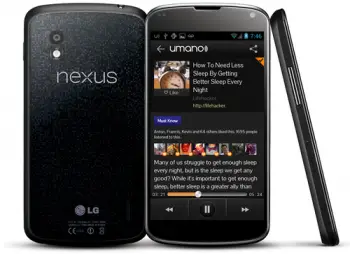
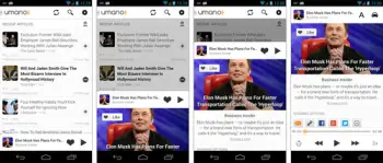
Umano has gone through a huge redesign to get where it is today, as you can see from the before vs after images provided below. You can clearly see that the Play Music app was a huge inspiration, and that’s a good thing. They have also open-sourced the slide-up panel. I find the screen for each post a bit too busy for my taste since I don’t really care about the comments left below, or who did the voice-over. But, like your music app, you are probably rarely going to be looking at it while using it.
They have also added a very useful Car mode, which drops all the extraneous items from each post’s screen. You are left with a big skip forward or back and pause controls, as you would expect. What I really like over here are two options: one allows you to rewind the post by 15 seconds and the other allows you to double the reading speed. I actually prefer the car mode over the regular one even when I’m not driving.
Do head over to Google Play and give Umano a shot, it is well worth it.






Great app idea!
funny how the “before” shot looks so much better than the “after” version. but I guess it’s fashionable for just about every blogger these days to give the obligatory “light holo makes it better” loine with every review. After reading recent comments on Umano app page on Play store, there are many people very unhappy with “contacts” permission and nagging “please rate us” popups every time you use app, along with no Google+ support. If they amend these misstops and return the dark theme, I’d consider reinstalling it. until then, no thanks.
I actually truly much prefer the holo design over the old dark one…its all preference though,and most people seem to prefer the holo designs
Fine, but why not offer theme options in settings so users can choose either one? Nothing better than choice, right? Then everybody’s happy.
Developers often don’t want to maintain multiple layouts. Additionally, the new UI is more than just a new coat of paint, the slide up panel is essentially a rip off from the Google Play Music app, and that’s a good thing since Google got it perfect. It allows users to control the stream while browsing through additional content.
I’ve been waiting for a news app that reads out the news for me. I’ll give this a try.
I also think the dark design is better than the holo design.
I installed this after reading the article — nice app and a nice find by Phandroid.