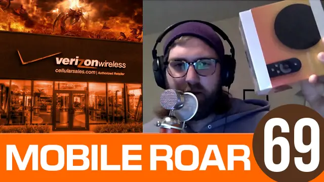
Chris was finally able to make it out of the Verizon store to join us this week. He shared some early thoughts on the Nexus 9 tablet, and Kevin unboxed the Nexus Player live on the show. The guys also discuss their thoughts on Material Design now that more apps have it. Other topics include a new design for the Galaxy S6, Lollipop for current devices, and much more!
Big News
- Chris’ Verizon store story
- Nexus 9 first impressions
- Nexus Player unboxing
Quick Hits
- How are we liking Material Design now that more apps have it?
- Samsung Galaxy S6 to be “designed from scratch”
- Lollipop released to AOSP, no rollout for Nexus 5, 4, 7 (could have been delayed)
- New Moto 360 options and apps arrive
- AT&T Lumia 830 available on Friday
- Apple Watch could cost as much as $5000 for some models
Wins/Fails
- Kevin: Apple pay leads to rise in Google Wallet users / Amazon Echo (and their hardware efforts in general)
- Joe: Microsoft Office is now free for mobile / CNN uses Surface as iPad stand
- Chris: Whatsapp with VOIP calling leaks / Nexus 6 launch fiasco
App Picks
- Kevin: Microsoft Office for Mobile
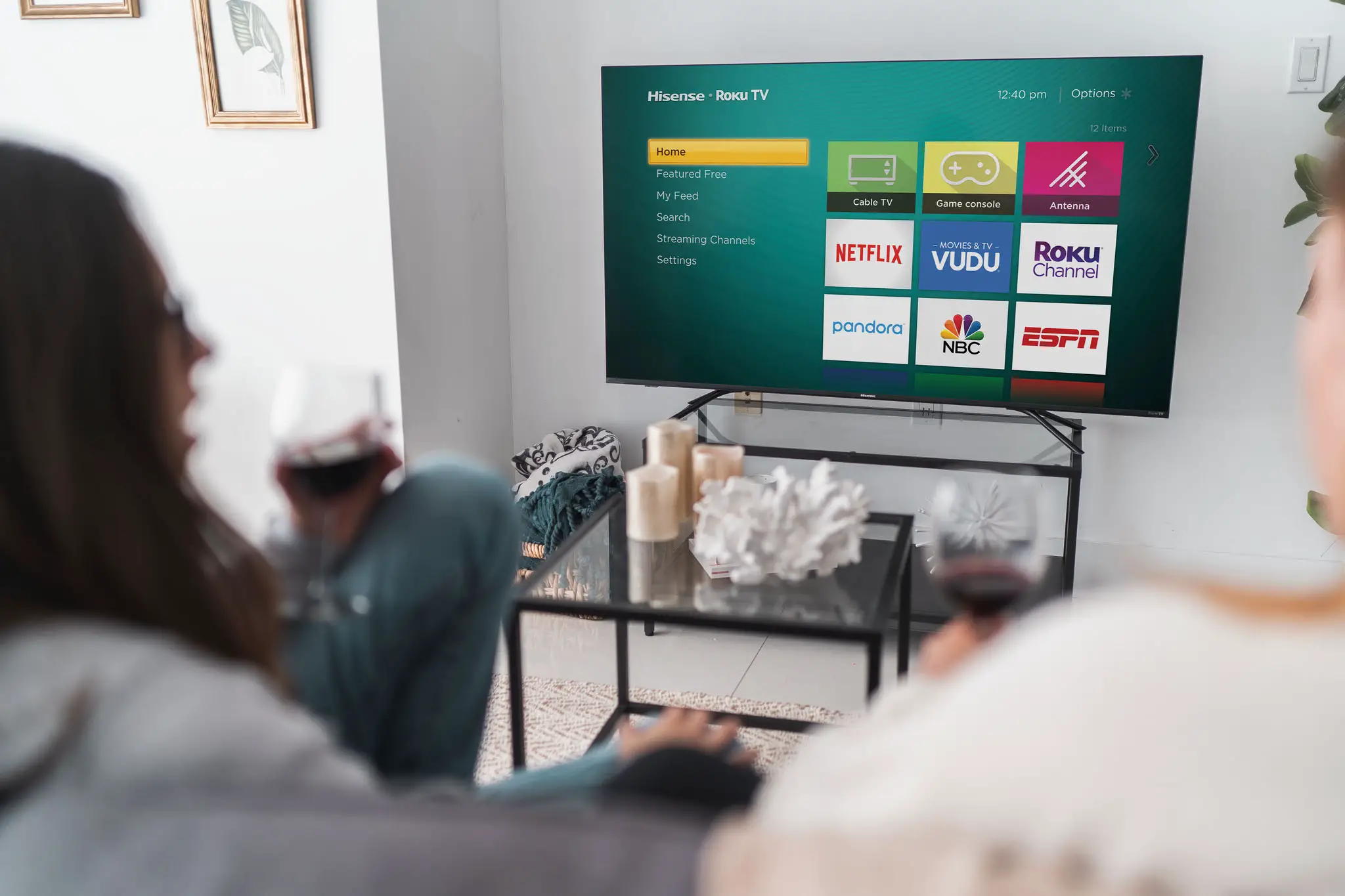
- Joe: Google Play for Roku
- Chris: Disney Movies Anywhere
Follow Us
- Joe Fedewa (@tallshmo)
- Chris Chavez (@gamercore)
- Kevin Krause (@youdontknowkev)
Subscribe
Hear us on Stitcher Radio
Subscribe on iTunes
Add RSS feed
Download MP3






Chris, I think you’re crazy for not liking Material Design. I was pretty ambivalent before my apps started updating (holy app torrent, batman!), but playing with a few of them, I absolutely love it! And the apps are so much more responsive in the updates!
I love the way Material BEHAVES (animations and such), just not a fan of the look when it’s static. Too many Crayola colors. Maybe I’m just an old fart. Ha
I’m really curious to see how OEMs skins will look. Always been a fan of the mature look of Sense. Can’t wait to see how they implement Material into their UI.
I might be enamored due to it’s novelty, Android has looked virtually the same for a long time, and 5.0 changes the way everything looks. It certainly doesn’t hurt that the behavior is much nicer and much more intuitive. We’ll see how I feel 6 months from now.
I’m still undecided on Material Design. I’ll have to see what it looks like in general on Lollipop and what more apps look like once I get the updates. I will say that I wasn’t crazy about Chrome’s Material Design look but I’m okay with it now.
Boy that was depressing.
About the OS on Tablets… is it just me, or does anyone else miss the Android 3.x tablet layout? I honestly want the system tray style layout back. It almost felt like a real tablet operating system, and not just a blown up phone.