Earlier this month, there were rumors of Google finally giving all their apps a redesign in an effort to, not only freshen things up a bit, but unify the way all their apps and services look across a variety of platforms (Android, iOS, and the web). Dubbed “Quantum Paper,” we got our first hints of this in leaked images of both the Gmail app, and it’s matching Gmail interface on the web. We’d later see this new design peek its head in the latest Google+ update which scrapped its earlier design in favor of an all new Quantum Paper user interface.
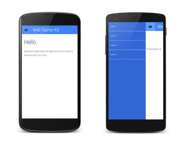
If there was any doubt that we are likely to hear more about this during Google I/O 2014 kicking off next week, the internet search giant is already showing off their shiny new interface in their Web Starter Kit, a new template for developers to help build mobile websites. It seems Google wants every mobile site to feel like more like a native Android app, well the Google apps anyway. If nothing else, this is further confirmation of the new Quantum Paper we’ve been hearing so much about.
As we’ve been saying for weeks now, we don’t expect Google will unveil a major firmware update until later on in the year, but when it comes to its own apps and services, expect Quantum Paper to be a major talking point. You guys excited?
Thanks, Tito_01!

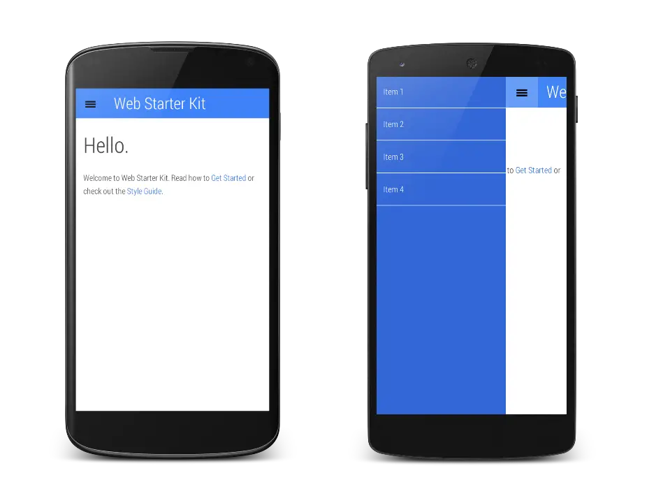



I’m looking forward to seeing more.
Dunno how I feel about that blue.
It doesn’t look bad, it just appears to be suffering from sausage-finger spacing.
Google Classroom is also in Quantum Paper mode.
https://www.youtube.com/watch?v=WGlv4rpsLTc
looks like windows phone