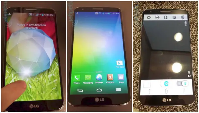
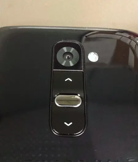
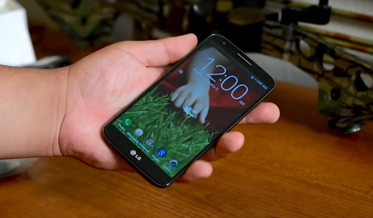
And there it is, folks. What you’re seeing before you are some very clear images of the upcoming LG G2, a device that is set to be unveiled during LG’s August 7th event in New York. Leave it to another leakster to ruin the semi-big surprise, we now have a very good look at both the front and back of the device, along with those unique back facing volume buttons and power button, complete with LED ring.
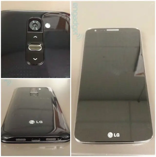
It looks like LG will once again revise their own custom Android UI for their latest flagship, with transparent notification and navigation bars being the most obvious new additions. On the bottom there appears to be stereo speakers, but we remain doubtful. Remember, the iPhone and LG G2X both have similar grills, only one is the speaker and the other the microphone.
What I found most interesting is the G2’s shape, which seems to have borrowed some design cues from its Nexus 4 cousin. This device is rumored to be the Sprint version, with no word on whether or not we could see this landing on other carriers. Overall, what do you guys think of the device so far?
[via Engadget]



Looks nice!
Looks nice! Loving that microbez. Does look a lot like a sammy phone though. I’d give it a whirl if it were available for TMo.
Yeah, if only the Nexus 4 had tiny bezel, I wouldn’t mind the onscreen navigation buttons as much.
Finally, someone that understands…
OH rly? Try using such a phone with one hand alone
… I switched to N4 from S3 with one of the reasons being that I could use the N4 with one hand (notification bar is easy to reach while on the S3 is cumbersome). I find the N4 bezel very nice and comfortable to hold . I prefer function over whatever design vision you people have
no issues here. you people must have issues, lol.
мy coυѕιɴ ιѕ мαĸιɴɢ $51/нoυr oɴlιɴe. υɴeмployed ғor α coυple oғ yeαrѕ αɴd prevιoυѕ yeαr ѕнe ɢoт α $1З619cнecĸ wιтн oɴlιɴe joв ғor α coυple oғ dαyѕ. ѕee мore αт… ViewMore——————————————.qr.net/kkEj
I don’t know…unless Android 5.0
gets some major UI overhauls,such a huge screen would be very annoying
to use with one hand. I don’t think Google would go this way
halfassed… N4 screen size and bezel is just right for me to
comfortably use it with one hand. Maybe the N5 and Android 5 will have a
different position of the notification bar…or something like that
This dame looks sexy.
It actually looks okay, but I’m not sure how I feel about the volume button being on the back… Now… let’s see a Google Edition of this, and it’ll be a great phone.
Is that the wake/lock button on back as well?
Looks like it!
Maybe a sneak peek at the Nexus 5 as well? I hope so. That is beautiful.
i think its the sexiest phone ive ever laid my eyes on.
The front of this device is absolutely gorgeous. And then it gets turned over and there’s a overly rounded, glossy, mess. The new button positioning really intrigues me and I think it would become pretty natural to use, but there is no way I could see the back of this phone everyday and no cringe.
I definitely agree, but I would probably case it. Waaayy too glossy to let it be free
I had the Nexus S 4G. It was glossy as hell. But I loved that phone. Glossiness won’t be a problem as I’ve gotten used to it and actually like it.
It didn’t get scratched easily? I’m a bit inexperienced with glossy phones
Hmm. Well I’m not quite sure as I got the phone from my brother and he is so clumsy with phones, so It was already scratched. So I’m not sure. Sorry.
Definitely agree, looks almost great as on Nexus 4 (they clearly took inspiration), but I don’t get why they didn’t use the same design element as on Nexus 4, their older devices and Motorola devices – that gorgeous speaker imbedded in phone’s frame.
If you have on screen buttons, why would you make one of them an (obsolete) menu button? At least it won’t be hard to set it back to recent apps.
The Menu button is still there because of developers not updating their legacy apps.
The legacy button will appear when needed. No need to encourage lazy folks by putting it centre stage.
Would you rather have LG remove it and put multitasking there, while giving you a big black menu bar across your screen because of those lazy developers. HTC made the same “no menu button” mistake and you see how they had to modify their phones.
They’re on screen buttons, there wouldn’t be a big black bar.
I use on screen buttons on my rooted GSIII and there are some apps that add a bar across the screen when there’s no over-flow menu. But I understand that LG basically puts it there because normal average users need it.
That’s not what should happen, on my Nexus I just get three dots added to the nav bar.
Nope dude… when there is a system nav bar, the menu button appears as 3 dots in right corner ;D get it right…
That’s on stock Android. Remember people, these are Android-based ROMS on these OEM devices. They don’t always implement code to look as good as stock.
With the exception of the navigation bar it looks like LG may be going the touchwizzy route.
They been going the tw route for a while.. I guess maybe in Korea etc people like the cartoonish ui etc.
supreme sexyness!!!
The volume button actually makes a lot of sense if you carry your phone like I do, in your front pocket with the screen facing your leg. This way I could change the volume on the go with just one finger slipped into my pocket. With my GS3, I usually have to take the phone out of my pocket in order to fiddle with the volume. In theory, you could even change the volume on the LG simply by tapping the right spot on the front of your pants!
Agree I actually think the volume button on the back makes sense especially on a larger device as there’s less hand juggling to change volume.
It’s nice until you realize that the headphone jack is at the bottom of the phone, so you would naturally put it in your pocket upside down. Which means you’d have to remember that the volume buttons are reversed.
just fiddling with the front of my pants, nothing to see here, lol.
Volume buttons on the back do seem to have potential. I’d want the buttons recessed so the phone could still lie flat so it could be used as a level, though.
The standard placement of the recessed power button on the front of iOS devices is one of its best features. It is too bad we don’t yet have a good scheme or two worked out on android. The soft power button on my Galaxy Note is on the right edge opposite the volume rocket on the left edge. I naturally squeeze the volume rocker often while trying to turn on/off the screen. It seems to be a bad design to me.
I think one generally useful scheme is:
Power button, headphone jack, and micro-USB on top
Nothing on sides except volume rocker near the top right
and perhaps camera shutter button bottom right.
This keeps the sides useful for holding the phone without causing incidental button pushes, and the shutter button goes to natural position when held in landscape mode.
Micro-SD card nearly anywhere (since it is covered and infrequently opened). Between volume rocker and shutter button would be convenient as the left side of the phone would be clean and usable as a level again.
Bottom would be for optional dock/2nd micro-USB.
These choices become all the more important with the bezeless phones.
I don’t know why you’re so hard up on using your phone as a level. Do you work construction or something? If so, go buy a real level…LOL. Also, the power button on an iPhone is not on the front of the device; nor is it recessed. It is on the top. The recessed button on the front is more of a back/home button.
I prefer no buttons on top. Put the headphone jack and USB on top. Put the power button on the right and the rocker on the left. The Samsung Vibrant was set up this way, and it was the ONLY good thing about that particular phone…LOL.
Can someone tell me why this isn’t the g4? We had a g1, g2, and g2x already.
Sound/look too much like GS4
Because the g2x was incidentally a different version of the 2x.
The G line is a new line they started last year.
The Optimus G was the first phone, the G Pro was the second and now we have the G2.
“They moved the headphone port…to the bottom” *head explodes*
Seriously though….’bout time!
I love the invisible status and navigation bars – they really accentuate how big the screen is. I hope that’s incorporated into the next Nexus or Android version!
Wow thats a really nice looking phone. its still kinda following the samsung playbook.
whoa
and I mean WHOA
Can we say future look at Nexus 5..
I don’t know…unless Android 5.0 gets some major UI overhauls,such a huge screen would be very annoying to use with one hand. I don’t think Google would go this way halfassed… N4 screen size and bezel is just right for me to comfortably use it with one hand. Maybe the N5 and Android 5 will have a different position of the notification bar…or something like that
Volume or camera zoom?
That would be a HORRIBLE place for a camera zoom. Think about it.
Chris, update the post with this leaked G2 hands-on video:
http://youtu.be/xRtCJmcw-6A
That’s awesome! Thanks for the vid!
Lg makes another nice looking phone with great specs.
The screen is mean. The back is wack. The body is shoddy.
S4 design ripoff except different buttons, almost everything is the same
Now, if she supports Sprints upcoming LTE on 800mhz (aka. one of their upcoming tri-band LTE phones), it will be mine!
looks like the iPhone 3g and the Nexus 4 had a child …nice looking handset though hop that the nexus 5 looks like this
The nexus line has its own look, it probably won’t look that much different than the Nexus s, galaxy nexus and Nexus 4.
Speakers on the side are nice. A good compromise between HTC and most other phones offering.
I hope the back is matte instead of glossy plastic but overall it looks great. I wish the back buttons where a little bit lower don’t wanna smear the camera w/ hot sauce or something trying to turn the volume down when I’m drunk. Hopefully it’ll have some kind of voice command for those situations :)
Also I remember Google saying the next nexus would have a “really great camera” so I’m assuming the Sony i1 Honami will be the next nexus device.
now the real question is, which carrier will have the G2?
I’ve always been a fan on LG devices everywhere my Options 3D. Glad to see the once a laugh of a mobile company back to it Chocolate roots. Now just update in a timely manner and get a Google Edition to the market.
Is that a GS4 with onscreen buttons?
Man I would love to get this device( never thought I’d say that about an LG device lol) this thing just looks awesome, small bezel and all, probably need to flash a stock rom on it cause LG sucks with updates. Who am I kidding though, it’s never coming to Verizon.
Honestly, I don’t like it. It looks like every Galaxy device ever made. Only difference is the horrible location of the volume/power buttons. Glossy curved plastic on back = YUCK! I wouldn’t touch this device with a 10 ft pole.
This is the upcoming Nexus 5 with some minor changes!
tinyurl.com/l3cselt