
Android design has been rapidly evolving ever since Ice Cream Sandwich was released almost three years ago. What used to be an ugly and unorganized OS is now much cleaner and more focused. Google is never done tinkering with things, and if a new rumor is true it could mean big changes for the way Android and Google apps look.
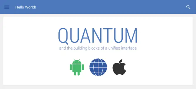
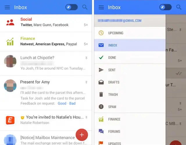
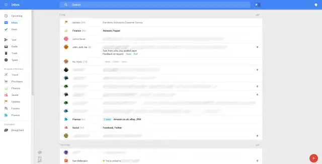
Sources familiar with the situation have revealed information about a new initiative at Google to unify design across its apps and platforms. They are calling it “Quantum Paper,” which sounds more like a Bond film than a software redesign. The goal is to make all Google apps have the same user interface and experience on the web, Android, iOS, and any other platform. This new design can be seen in leaked screenshots of a new Gmail app and the Gmail web version.
Quantum Paper is about more than just Google apps. The new design language will be available to developers, and Google will encourage them to integrate the new elements into their own apps. Simply put, Google is trying to unify applications across the internet. It’s a bold venture, but right up Google’s alley. Quantum Paper will start showing up in Google apps first. You can already see some elements in the most recent version of Google+ for Android.
What do you think of this new design? Yay or nay?


Looks like someone @ Google pays attention to Mobile Roar podcast ;)
I actually kind of like it. Clean crisp and striaghtforward. And its different colorful but yet stylish.
Yep, agree. Looks great.
I wouldn’t call that a redesign
Has the design changed? Yes. Therefor, it’s redesign :P
Not a fan of this UI design, but hey that’s just my preference :) I respect all those that like it, individual taste is a beautiful thing :)
Can’t. Wait. Unified experience is best experience.
Said nobody ever.
I freaking love it! And the idea of unifying everything is just awesome: exactly what UI design should be like :D
Oh my god oh my god oh my god oh my god I REALLY hope this is true! That UI is absolutely sick! And I’ve been hoping for a light Android interface for way too long! And Roboto Condensed, YES! Won’t have to flash the zip after every ROM flash now!
Maybe I’m alone, but I think Android has mostly gotten worse with the recent redesigns. Taking away of options or layering them deep and obscure. Heck, their stated goal of “Only show what I need when I need it” translates roughly into “those decisions you used to be able to make.. yeah, we’ll do that for you”. If I wanted that crap, I’d go Apple.
Nevermind the current design philosophy that seems to think that now we have enough power to do any sort of graphics we want, we should go back to monochrome and 2 dimensions.
Sigh.
Never been a fan of chrome but I also don’t get why when we had less powerful computers there was more chrome which is far more expensive to render than solid colours and rectangles.
I don’t understand if you’re trolling me or you truly don’t understand the word ‘monochrome’?
I understand monochrome but I’m talking about window chrome, fancy borders and all that.
Looks Like the new Crayola design. Not a fan.
Guess I’m in the minority when I answer your question, Joe. That’s a big NAY from over here!
I love uniformity, but I also love what Google curently has going with Android design
^this^
As much as I love the 4.X UI, and I really do love it, I agree that it’s time for something fresh. Of course, I probably won’t ever see it on my Nexus 4, as it’s almost reaching it’s EOL, but one can hope.
I certainly hope nexus 4 will get it, either through google or custom ROM (and there won’t be any good reason Google could use if nexus 4 don’t get it. The chipset is still more capable than most android phones)
I like it
Thumbs up
Looks a little too much like Apple for my taste.
It doesn’t help that Apples Design has been shifting to a more Android look.
Love.
I like it.
This look has already been pushed to Phone and People in 4.4.3 so not really a surprise. It’ll be interesting to see if it has any affect in the OS or if it’s just a new design guideline for apps.
Sure. I’m always down for something fresh and new.
It’s a bit ‘touchy, feely’…but I suppose I don’t care too much what it looks like, as long as it flows really well, and runs like butter.
Be nice if Google made their minds up. No sooner have they redesigned the Google+ app and done away with the “slide from the left” menu than we see new designs with it back
Keep calm and proceed to break the bones of the “keep calm” people.
Stop it Google. Just give me a damn dark theme option.
Microsoft tried to make Windows 8 look and function the same across different types of devices. Windows 8 already looks the bastard child of a Web designer and a square psychobitch. The attempt at the aforementioned consistency between devices made it even worse.
Well thats your opinion… Windows 8 has quite an elegant unified design thats very functional. I don’t understand why everyone likes to join this bandwagon of bashing Microsoft with WP…
Looking forward to it, I hope this comes with 4.5.
Nay
Will there be a PURE BLACK theme too? These all-white themes are brutal for battery life.
I like it.
Uh oh, unification always ends in disaster.
No, you’re thinking of fragmentation. Or does it depend which day of the week it is and which way the wind is blowing?
Okay? I guess. Lot’s of white doesn’t do much good for battery life though…
Google should release a common design API for all their apps (Android, Chrome, & desktop) so that real designers and UX guys can create useful interfaces that users can choose from.
Google’s designs are uniformly “meh”, and their UIs tend to not show the things I want them to show, while filling the screen with things I don’t want (I’m particularly looking at you, Gmail, Maps, and Docs).
Yay!
ew!
Surely this is just a sick joke… right?
Eurgh, please do not be like Microsoft. I do NOT want everything to look identical across platforms because it never works well.
Harmonising colors, fonts and button styling, etc. is no bad thing. Trying to run the exact same app or UI on a desktop a tablet and a phone is prone to failure.
Too flat and boring, I like color. But I guess we have no choice so we’ll have to get used to it.
That Gmail is more colorful than the current Gmail app…
I can say that I’d love android to be more colorful but with good color combinations, without making it look cartoony. I think that android doesn’t look that lively for now and I dislike the dull dark menus and interface. So this kind of change is certainly welcome!
Again? Nay.
I actually like the black-and-dark motif. It’s better on my eyes.
It’s so freaking horrific.
Ok Google, just announce this as part of Android 5.0 and make it available for my Nexus 5 in a week or so.
I’ve got no problem with a universal UI across platforms, but those colors everywhere shouting at me are just awful.
Crappy design is crap. If this is the future of Android…. Google might as well just cancel the project now.
When have mobile versions of webpages EVER looked good? What’s next? Google closes the app store and just makes one button for Chrome so you can view everything? /boggle
It’d be nice if the OS theme switched from light/dark based on time of day. Obviously, the dark theme is much easier on the eyes at night.
Giving Google Services a unified look? That’s a great idea. Hope it comes.
Theh new “finance” category in Gmail will be good too.