We’ve seen the videos from Haykuro’s HTC Hero ROM and apparently the brand new UI is called “Rosie”. The upcoming June 24th HTC Event flyer shows a hipster laying in the grass with a rose laying on his chest, further proof that the issue at hand will be the announcement of the HTC Hero with Rosie UI? Or maybe we’re reading too far into it.
Needless to say there are a LOT of people eagerly anticipating the HTC Hero and Rosie UI and (thanks to Jeff from CodeSector and his Flickr) we’ve got a bunch of screenshots that will have you yearning further:
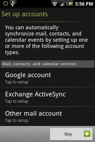
Setup Screen:
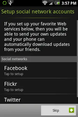
Another Setup Screen:
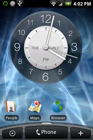
Main Screen:
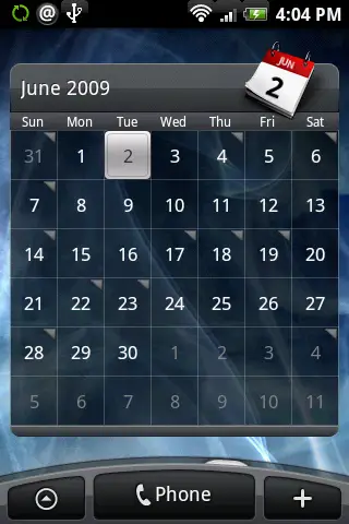
Calendar Widget:
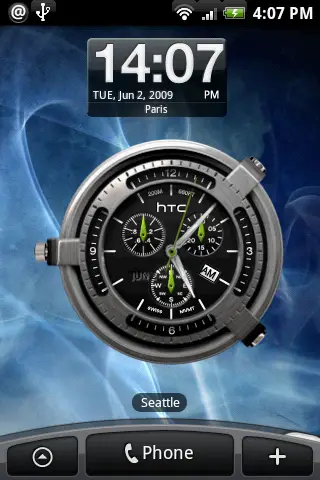
Clock Widget:
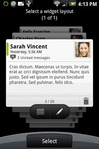
SMS Widget:
Lock Screen:
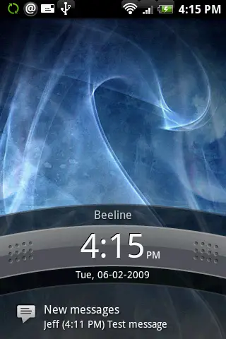
Lock Screen 2:
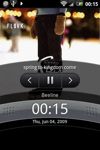
Media Player Widget:
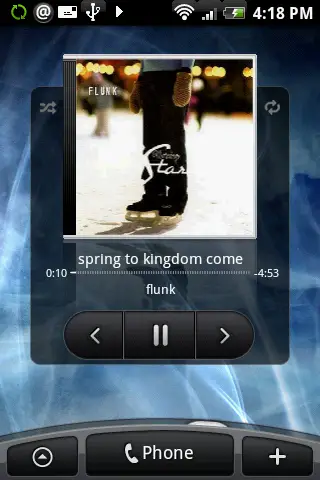
Media Player Widget 2:
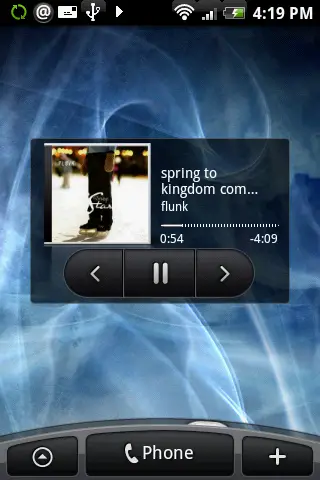
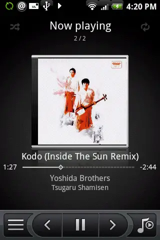
Media Player:
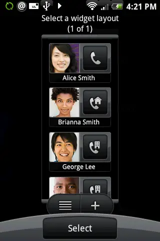
People Widget:
Weather and Settings:
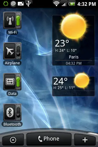
Weather Widget:
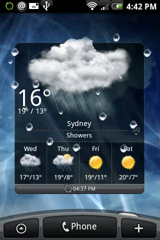
Alarms:
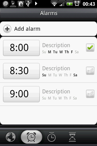
Bookmarks In Browser:
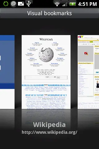
Bookmarks Widget:
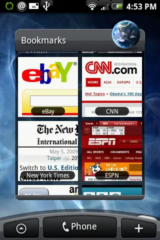
Browser – Page Loading:
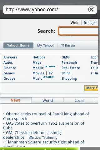
Edit:
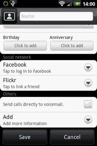
Edit Contact:
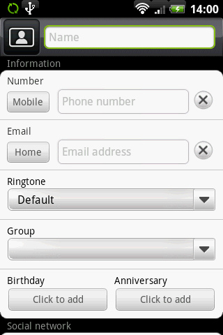
Fast Scroll:
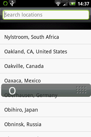
Lock Screen:

Stocks:
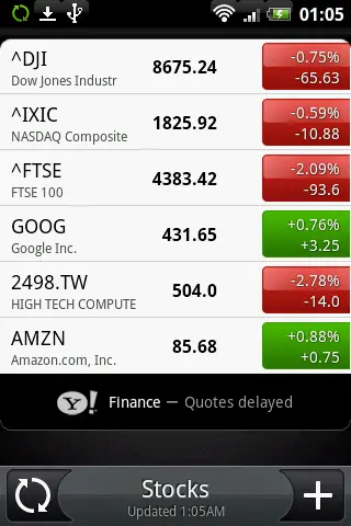
Stocks 2:
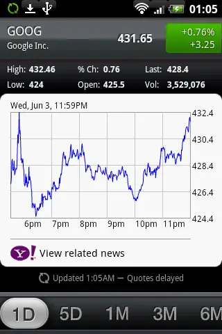
Timer:
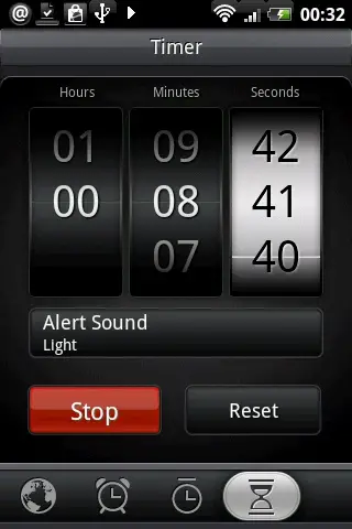
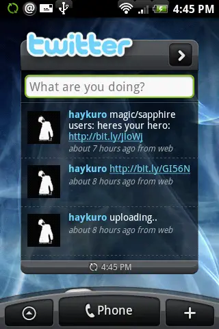
Twitter Widget:
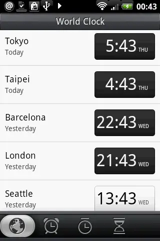
World Clock:
Forget Justin Timberlake… Rosie just brought sexy back!
This all comes from Haykuro of course, who is the homeboy who made this all possible via his Hero ROM on XDA Devs.





It looks alright, I like all the cool widgets.
But the stocks, alarms, and all those things look WAY too iPhone like for my taste.
Well I have not stared at the IPhone too much so I don’t know if they are IPhoney or not but I like the look. I look forward to the future looks of Android. All I can say is IPhone is in trouble and Palm better watch out. I knew the desktop widget deal would put it over the top.
I have this on my phone. Love it. Of course it still has bugs and is a tad slow sometimes but other then that its great.
But everyday it gets better and faster.
Please, fix the bluetooth issue so I can flash it onto my phone!!!
I like the water drops on the weather widget.
Personally I’m not too worried about it being too iPhone like … I’m no android religious zealot, i just like stuff that works =). We should all admit at some point that apple did some amazing things with their interface and it’s really the slickest design we’ve ever seen, but it just has a VERY low glass ceiling as far as functionality. I think this is a great combination of the sexy iPhone look and the brilliant function of android. If this is what we can come up with in 6 months of it being around I can’t wait to see what the future brings =)
Am I the only one who noticed that the “clock” screen, which has 3 clocks on it, all have different times? ;)
@Arlo – Thats because each clock is set to a different time zone. Yep.
I hope that some great programmer makes “Rosie” and aHome or Openhome theme. I would buy that.
……………………….*droooooooooooooooooooooooooooool*. I have never in my life actually yearned for a phone/OS, but Android and this Rosie UI is making it very hard to way until December to get an android phone. I’m trying my best to wait for the G1 v2(whatever that may be) but I’m not sure i can last.
The UI is great, however I hope that this is not just a UI update as there are some fundamental elements missing from the Android platform that we all know about…
As I had all of this functionality and more on my Ericsson T68 from 2002, the two missing basic capabilities that really bug me are:
Bluetooth stack: sending and receiving files, and contacts.
Contacts App: sending and receiving contacts via SMS
Give me those, then I’ll be a happy bunny, and make sure that all of the sexy Rosie widgets are available to us all in non-rooted form.
Yep I’m running it too and it’s great.
Let me say that this is WAAAAAY better than iphone and Rosie really shows off why Android is leaps and bounds better than iphone.
How? Because the meat of what Rosie does is run background apps and create the very first, true, smartphone imo.
Weather isn’t a lame app that I need to check, it’s just there, working like it should. Twitter is running with all my friends updated, I shouldn’t have to “check twitter”, when I click on a friend, I automatically see their facebook status (rather than having to open a facebook app) and their latest flickr pic is automatically added for their portraits if I want. Push email from work and gmail… I snap a photo and the options are to immediately share it, post on facebook, send to flickr, or even post it as a twitter so everyone gets it immediately.
Even their “footprints” application is awesome and it uses your friend list and google maps to mark all the places you take photos of and your review of the place so that you social circle can hear your review. It even captures your audio along with the photo, your star ranking, etc.
Seriously this is what a smart phone is supposed to be. Iphone is far from this. And their 3rd gen still won’t get background apps. Just a lame server kludge. Maybe next year ;p
I think HTC have spent so long battling with windows mobile OS to make it look and act how they want, and with Android now they can finally do that – they are just going full steam ahead.
Providing they start bringing out more sleeker phones – that would appeal to the mass market – then they are sorted and we are seeing some more “traditional” HTC phone devices for android being leaked. So all in all, it should be a fun time seeing what HTC cooks up.
Beeline? Is that a Russian phone?
Looks sweet, by the way.
i dont know why users are saying that these screenshots look too “iphone-ish” i see all HTC, check out the touch pro 2 and youll see the similarities.
So which of these screenshots are Android Standard and which are HTC Android customisations?
I am such a pussy when it comes to this stuff. I am so scared about flashing my phone and bricking it.
I need someone to fill in a missing bit of info for me. If I brick the phone is there anyway back after? Or is it rendered useless?
Do you think HTC will release the official ROM which will work with G1’s and Magic’s once the phone is out?
i’m with ‘User’. can anyone identify which are standard android features (with just a new skin) and which are specific to rosie? i’m not sure i like the rosie skin as it seems a bit gimmicky but the actual features look good. i’m just not sure which is standard android and which are htc specific
Looks like HTC is really leveraging their advantage of being first with Android smartphones. Practice makes perfect, as they say, and HTC’s new UI demonstrates that they are improving rapidly.
This is one of the exciting aspects of Android. Vendors are free to create their own unique user experience, to differentiate their products, as long they maintain app compatibility,
I’m curious if HTC will also try to launch a netbook. This could be a cool interface for a device like that, as well.
just as a reference for people: The only thing apple came up is touch interface for it’s crappy idea of a phone. the looks are borrowed from Gnome & KDE, which what this is looks liked. So in this context Android (being Linux) rightfully inherited the style when apple people borrowed it. Kind of annoying to see people give Apple so much credit for taking free stuff out there and making it their own (ex: FreeBSD -> Apple OS). Thanx Google for keeping Android open source. About time the world started moving to one OS, even though is a phone !
The only thing that looks like the Iphone is the STOCKS tickers .. .and that’s because it’s the same service … YAHOO … last time I check Apple did not invent Yahoo Finance…
I wonder if this is going to come with Donut… or Eclair… :/ … cuz……… I really like this… its so awesome :)
oh… and can someone tell me where I can get that wallpaper? its super cool too… :) please and thankyou!
If they merge Rosie with the Huawei phone it may very well be the best phone out there.
https://phandroid.com/2009/03/31/huaweiphone/
Wait how can i get this in my phone!?
This looks SWEET!!!! Where and when can I get the completed version? I don’t really want to install the leaked version, I hate when think bug out on me.
first.
Look at the visual bookmark. Got a permission to copy iPhone UI?