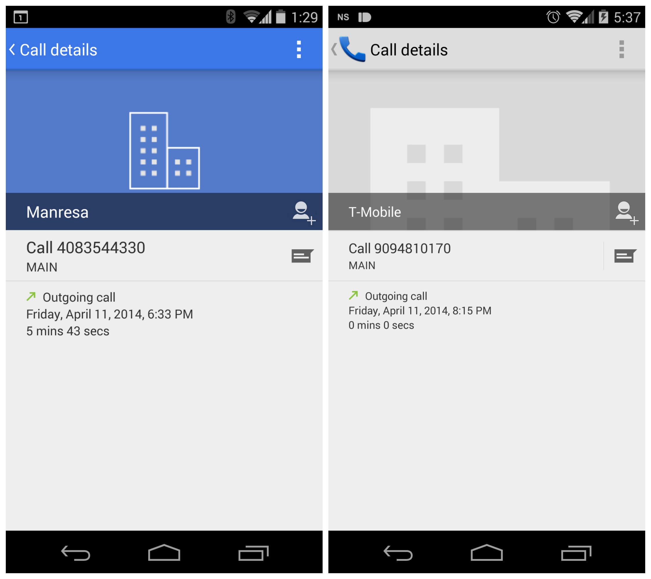
Looks like the Google Nexus account may have inadvertently tweeted out an image of a new Android Dialer app, completely with fancy blue accent bar. We know, it sounds silly to get excited over this kinda stuff but we have a feeling this just another one of Google’s stock Android apps receiving a splash of color, like the recently leaked Calendar app.
@karlyeh26 To get to this screen on your phone, go to: Phone > Clock Icon > click phone # you want to see pic.twitter.com/IFxjwmKa40
— Google Nexus (@googlenexus) April 17, 2014
We’ll be keeping our fingers crossed the Dialer, like the recently released Google Camera, will also be making its way into the Google Play Store for quick updates and installation on non-Nexus devices. It wasn’t too long ago we saw Google Keep updated with a new yellow bar and a leak showing a redesigned version of Gmail (also with more color). This newly “leaked” Dialer could be just another piece of the puzzle.







Edit: Reason — ‘done goofed
This could mean Android 4.4.3, but I’m hoping they’re releasing the dialer app on Google Play for everyone on KitKat.
Or it could have been an accident.
Is it possible to install aftermarket dialers? =.?
Doesn’t sound too far fetched. *fingers crossed*
Of course, it always has been.
There’s litterally hundreds of the damn things:
https://play.google.com/store/search?q=dialer&c=apps
I have no idea why I’ve never done that search. I’ve just always believed it wasn’t possible. =.S
100% off topic, but what ever happened to WinSource? It’s been a month with no posts.
They’re ditching the other sites. It’s just Phandroid now.
Officially, or you’re just assuming? I thought that, but I couldn’t find any source to back it up. They’re awfully quite about this :)
They announced it on the podcast : )
Which one? I probably never saw it. Thanks in advance
I believe it was the 4/11 Mobile Roar. They announced Edgar’s departure, and said that Kevin and Joe would be writing for Phandroid from now on.
Thanks
Pretty soon there will be no reason to get a stock android device.
What happened to the circular Menu Overflow dots?
would be nice if for once they thought about all the devices with oled screens.
with primarily blue and white in the dialer, and all the white in other google apps, it’s going to really hurt battery and screen life of devices with oled screens.
they should just start maintaining dark and light themes for android and google/aosp apps and give an option for themes in settings.
many phones in the past did this, and carriers would probably love to include their own colors in the list.
i personally don’t think it really makes all that much of a difference. Phones with the similar mah and different screen types still usually get about the same battery life.
the difference between a mostly black screen and a mostly white screen is pretty much the same as min VS max brightness on an lcd screen.
black uses almost no power on an oled screen, but a white oled screen will drain much more than any color on an lcd screen.
i mean im not saying there’s absolutely no difference, but i don’t think its anything worth being concerned over. Other things play a much bigger part in my opinion. like i was saying i’ve seem phones on LCD with auto brightness last just as long as phones with AMOLED screens and sometimes longer with the same or smaller batteries… even if they have a dark theme.
What I would like is a dark theme option for all Googles apps. I dont like the white ui.
Does they just throw darts at a board when they’re determining design? There doesn’t seem to be an arc to their design points.
I am confused. Just got Kit Kat forced upon me by ATT and all icons in the notification bar are white. Now Google is reverting BACK to blue. Always consistent Google…