
As a mobile operating system, one of the biggest appeals of Android is that it is “malleable” inside and out. Sure, there’s a basic template as determined by Google, with a key set of features and software regulations, but it’s clear that time has allowed the platform to evolve not only as Google’s flagship mobile OS, but also as a digital entity that gives countless smartphone brands and electronics manufacturers freedom to take it and shape it in their own image.
Oppo is one such company – fans and Android enthusiasts will know that the Chinese manufacturer puts its own spin on Android by way of “ColorOS,” its take on how Android should look, feel, and work on its devices. Following the recent launch of Android 13, Oppo has unveiled ColorOS 13, the latest iteration of its custom Android interface. The company says that it’s taken a lot of inspirations from nature, as well as an approach to post-pandemic daily living, resulting in a UI that comes with a special focus on user wellbeing.
With that said, ColorOS also with a set of visual and functional changes, which add some improvements to usability and the overall feel of the UI. Let’s take a look at some of them.
Aquamorphic Design
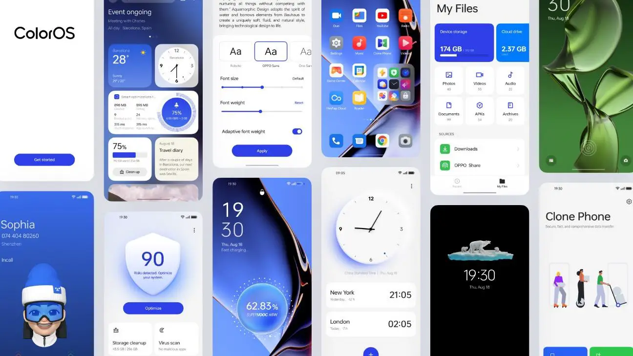
For starters, Oppo has brought over some new visual design tweaks with ColorOS 13. Dubbed “Aquamorphic Design,” Oppo says that more than 100 engineers worked on the new interface concept, which introduces a pleasingly “cool” and clean feel to the interface, and takes some inspiration from water molecules, as per the company’s words. Oppo says that the new visual style is designed to allow users to experience ColorOS without any additional learning effort, making for an intuitive and personal experience.
Color Accents & Card Layout
A major overhaul, ColorOS incorporates more rounded elements, which can be seen throughout the icons, windows, and even input boxes in the UI. The main color theme is based around a shade of blue, with orange accents scattered throughout the interface. This is topped off with an improved redesign of the Oppo Sans Font, which was likewise present in ColorOS 12.
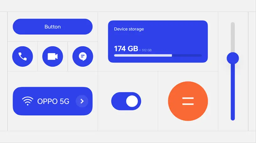
Of course, all of this is customizable through the Settings menu, which will provide users with a variety of different colors, widgets, and personalization options to suit individual tastes.
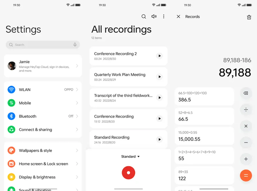
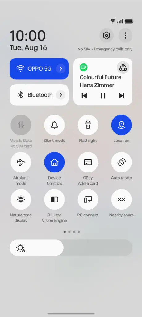
ColorOS 13 also introduces a card-styled layout, giving users an organized presentation of whatever’s information is displayed on the interface, all in an easy-to-read format. This is quite similar to what we first saw on Android 12 (and now 13), particularly with the prevalence of rounded square graphics in a redesigned drop down menu, as well as in the main Settings app. Oppo has brought over this particular design aspect into its built-in apps for a more uniform experience. This card-based visual organization also carries over to the UI’s Control Center, which is essentially the main Quick Settings menu that you get when pulling down from the top of your display.
Even more in-depth animations and design cues are present within ColorOS 13. Tiny details like ripple effects, droplet animations, as well as Gaussian blur overlays can be seen when using fingerprint unlock or charging your phone, for example. ColorOS 13 also comes with an upgraded “Quantum Animation Engine” that features improved animations for seamless and fluid and lifelike movements of virtual objects on your display.
Gestures & Always-On Display
Oppo has also incorporated new “Behavioral Predictions” for multi-gesture operations, which aim to improve response accuracy to user gestures. One example is with exiting an app – if a user swipes up on the screen to exit an app and to abort a previous instruction to open the app, the system would immediately suspend the previous opening instruction, and will directly initiate a real-time aborting response.
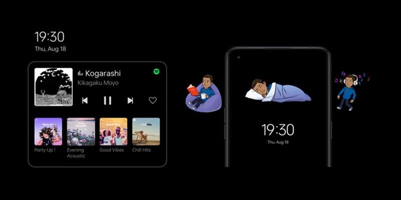
ColorOS 13 also makes use of Always-On Display, with a priority towards keeping users updated on only relevant updates, without disruptions from unwanted messages and notifications. With smart AOD, users can check on items like delivery updates and Spotify playback for example, all without turning on the entirety of their home screen. Oppo has also been working with Bitmoji developers to provide more personalization options for the AOD interface, allowing users to integrate custom avatars into their AOD wallpaper.
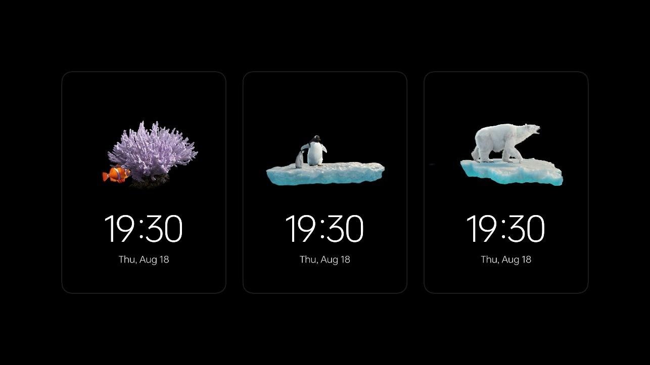
The refined AOD system also features ColorOS 13’s “Homeland” wallpapers, which bring a focus on wildlife and the effects of climate change, aimed at raising awareness to such issues.
Digital Well-being & Multi-Screen Connectivity
Google’s introduction of the “Digital Well-Being” feature for Android has provided users with a means to keep track of their smartphone usage habits, and make necessary adjustments to their usage patterns in order to better monitor and keep their device usage in check. While devices like the Pixel phones take a detail-oriented approach to this by way of graphics and tables, Oppo has settled for a more subtle approach to keeping users updated about their digital well-being stats.

ColorOS 13’s Blossom Wallpaper gives users an update of their device and app usage through an animated plant with petals that gradually lose their color depending on how long they’ve been using their devices. When the time spent on the device exceeds a user-set limit, the texture of the plant would change gradually, reminding users to take a break from the use of devices. ColorOS 13 also comes with “Insight AOD” that displays a colored bar showing phone usage in 24-hour intervals.
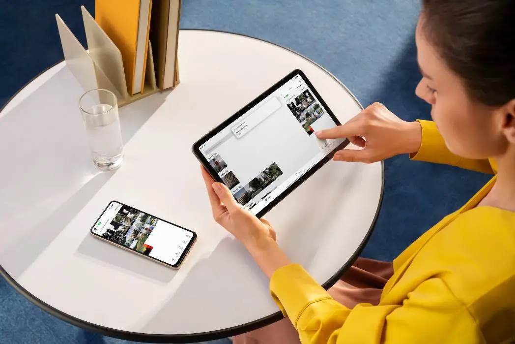
Oppo also gives special focus to its growing hardware and software ecosystem with the latest update. ColorOS 13 comes with a feature referred to as “Multi-Screen Connect,” which is aimed at improving multitasking and productivity for users who switch between multiple devices in an efficient manner. The UI users adaptive layouts which work towards giving users a consistent experience between different devices and different screen sizes, such as a phone and tablet, for example.
Final Thoughts
With ColorOS 13, Oppo has certainly added a lot of useful features, as well as subtle tweaks which no doubt add value to the brand’s own Android skin as a whole. It’s clear that the company has designed its newest interface with a focus on providing useful insights and value for its consumers, and at the same time incorporates some nifty software components which result in a streamlined user experience across different Oppo devices.
Oppo fans will find a lot of new improvements with the new design and visual elements, and it will be interesting to see how ColorOS 13 improves over time as more functionality is gradually added to its line-up of software features. For now though, it’s a nice and intuitive approach to what was once “just another” Android skin.


Comments