
Slack, a rich team communication platform, has updated their Android app in a big way. This is version 2.0, and it’s a complete rewrite from the ground up. The company felt the app needed to be done from scratch so that they were better-equipped to support Android’s unique features down the line.
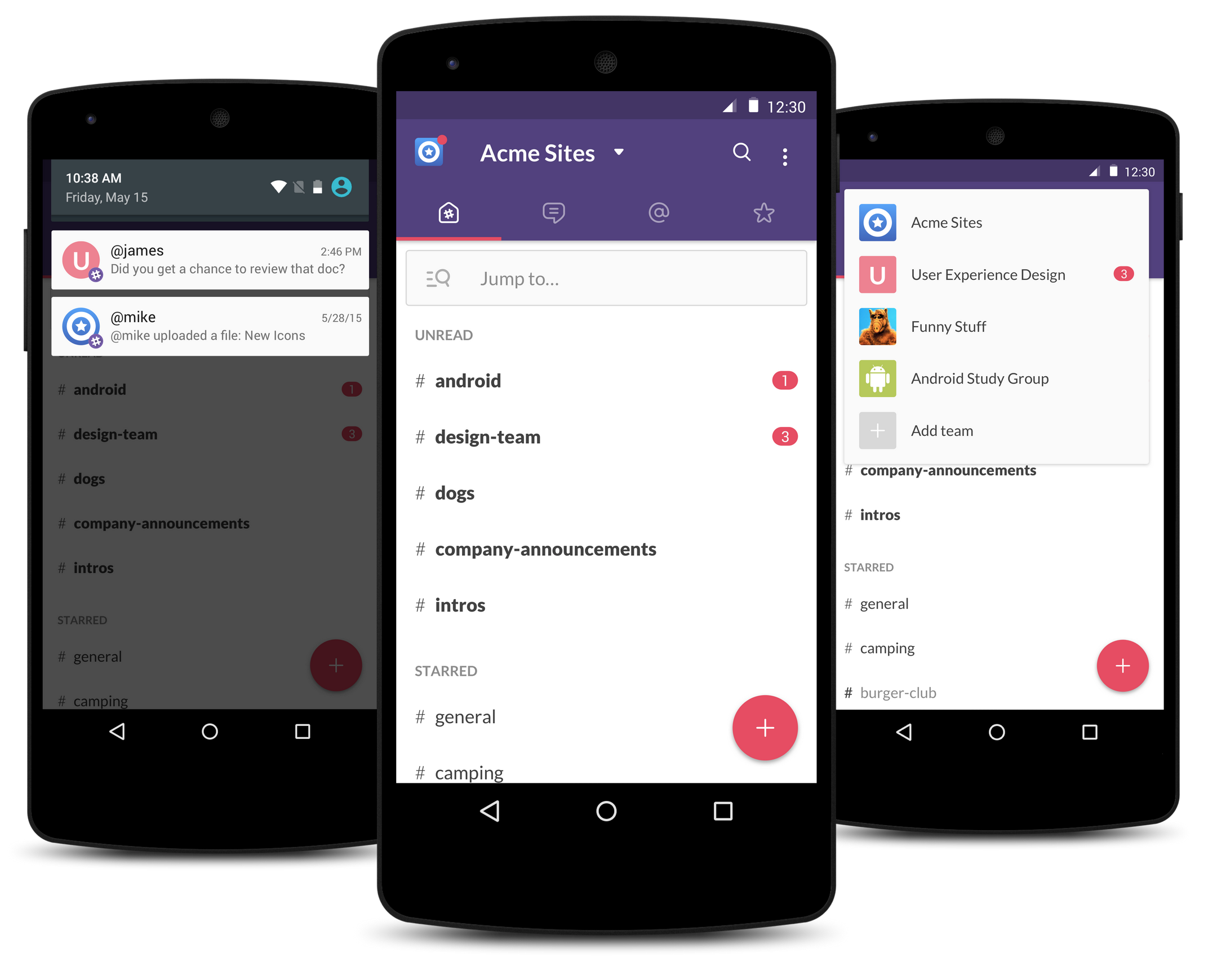
The first thing you’ll notice when entering the new app is a complete Material Design overhaul. Dropshadows, white space and FABs, oh my! It’s certainly a lot better than the archaic mess that spawned in the Ice Cream Sandwich days.
There’s a long list of new additions and changes that should make the lot of you Slack users happy:
- Slick new ways of navigating around the app
- Simple tabbed navigation
- ‘jump to’ option for channels, DMs and private groups
- Team switcher dropdown menu
- Refined notifications
- Support for Message formatting
- Support for Android emoji
- An enhanced search function
- Local message storage
The upgrade is headed out through Google Play over the next couple of days so keep on the lookout for it. Haven’t tried Slack yet? You can give it a free download right here to find out if it’s right for your business, student group or whatever it is you may need it for.
[via Slack]


Thanks for the heads-up! I have been waiting for this.
Everything looks great except for the search icon which isn’t the MD one and the three dot button that’s not aligned to the rest of the icons in the App Bar.
I’ve never even heard of this app.
It was pretty simple and straightforward in the ICS days, then it got ugly, then it got uglier and harder to use, now… every app needs a complete rewrite from the ground up every year or two just to throw off users and overhaul things that were working fine before.