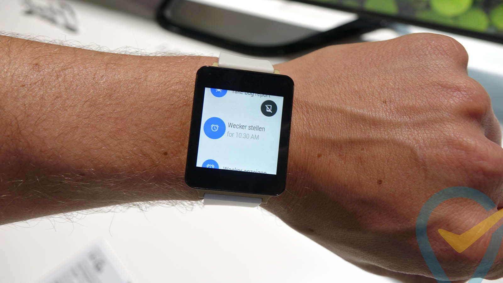
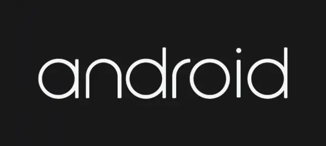
Android branding could soon be subject to a bit of a face lift if this purported LG G Watch boot animation is to be believed. The file — which was apparently pulled from a G Watch and is now flashable thanks to the handy souls at XDA — features a calming sunset that transforms into an eclipsed moon, and then eventually breaks down into a swirl of Google’s typical Blue, Green, Red and Yellow color scheme. Near the end of the animation the colors draw out the word “Android” in some rather stylish font.
We’re not sure if Google will make this the new permanent logo, but we sure are hoping so. It’s not that we don’t have a sentimental connection to the original that can currently be found on some recent handsets, it’s just that… well, it’s ugly. It’s dated. It looks like it was designed by logo company that missed the web 2.0 ship. It’s time to retire it, and dammit I wouldn’t be mad if this is what Google would use to do just that.
[via Reddit]





I like…
Moto 360 next
That’s F’ing Sharp
I think thats probably just the logo for android wear. It makes sense considering the whole animation is pretty much clock based. The sun and the moon, and the circular blue and yellow part reminds me of a clock. Just my 2 cents though.
makes sense in some senses, but from a branding standpoint, having different logos for different products although the brand is the same, isnt always the wisest move.
That’s true. It just seems to be to clock based to be the normal, cell phone version of the android logo.
you could be 100% right
Maybe, only time will really tell for sure I suppose.
That’s what I thought. A circle-based logo to fit the round watch faces.
So sexy.
This reminds me of the old Bing logo.
The sun and the moon, and the circular blue and yellow part reminds me of a clock.
The red, blue, green and yellow swirling around part reminds me of the Windows 7 startup logo.
That’s the same font that Apollo Computer used in the 80’s. http://en.wikipedia.org/wiki/Apollo_Computer