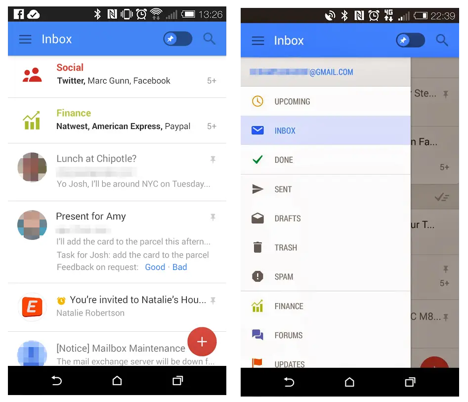
Google could be readying some extreme user interface changes for a few of their Android apps soon. Newly-leaked shots of a vastly different Gmail user interface have sprouted from the folks at Geek.com.
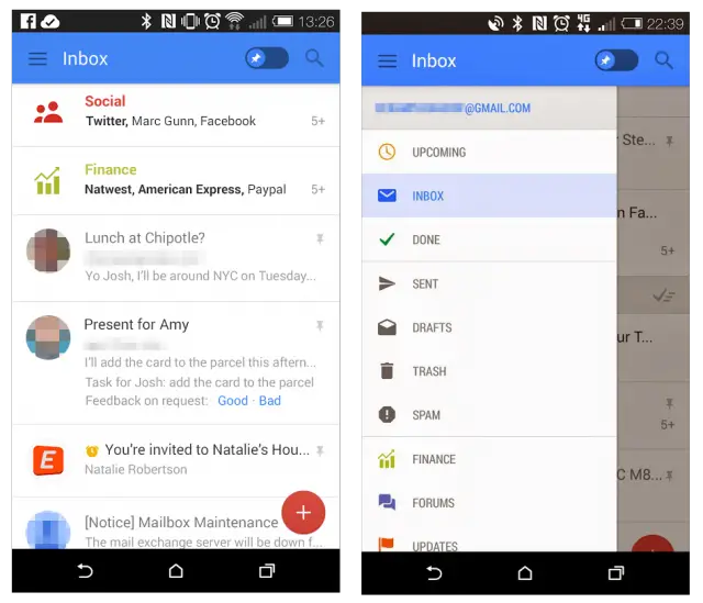
Aside from updates to some of the graphics within the app (specifically, neat icons for each and every smart inbo and folder, as well as circle-based profile photos for email ala Google+ and Hangouts), the screenshots suggest Google will be adding a couple more categories into the fray. Email is already automatically sorted into promotions, social, updates and forums for users who fancy that feature, but we’re also said to be treated to categories for finance, travel and purchases.
Other new reported features include the ability to “pin’ email, which will apparently replace stars. The change is not only stylistically different from stars, but it also differs fundamentally. Pinning an email makes it float to the top of your inbox whenever you enable pinning, and go back to its original spot whenever you disable it, whereas stars were simply another folder where you saved your most important email.
Finally, Gmail could be getting a “snooze” function. How does it work? If you choose to snooze a new email, the message will be pushed to the bottom as newer messages come in, but will find its way back to the top of your list once the snooze period is over. You can snooze multiple emails at a time, and can snooze them as many times as you want. I can’t be the only person in the world to put an email off until later only to forget about it, so this would be a very welcome change.
Phandroid has also independently learned from trusted sources that Google is planning major changes to both Hangouts and Calendars, though we don’t have any further details at this time. As such, there’s no word on when — or if — any of this is coming to the forefront, as sources say these changes are meant to be experimental.
Google is probably testing a ton of different ideas their engineers have come up with, and some of them could be weeded out by the time these updates come to light. Let us know if you’d enjoy any of these changes to Gmail in the comments below!






Hangouts need to add attaching “record audio” to their SMS tasks.
Gmail needs to just merge with the emails app. With a combined inbox etc…
You can do that now if you want. I use my Email app to access my Gmail all the time. That way I only have one app to go to. The down side is when I delete something, it creates an IMAP Deleted folder in Gmail that I have to clean out once in a while. It doesn’t go into Google’s Trash folder.
My initital reaction to this is YUCK!
I like it, a lot more beautiful than the current monotone one.
Looks like the easter bunny came and ate all the icons and crapped them out
Honestly, I don’t like it. :/
Same, it looks too much like ios
You mean looks too much like Google’s Web UI. Which just so happens to be very flat and very gorgeous.
Not ANOTHER interface change! Google should take heed of the Windows 8 debacle and realise that when millions of people use a product, changing the UI can end up alienating more people than it helps.
apples and oranges.
Indeed.
I welcome the new features. But your right, everyone I know hates change………. period. About the time my wife learns her phone and knows exactly what she is doing it prompts her for an update, then completely changes what took her age’s to learn. Ya she’s a little slow.
I can’t really tell, from the screenshots, so I won’t really judge until it’s formally released into the wild, but my first impression is that it looks way too confusing. I remember, when they initiated that first user interface change with the letter icons to the left of each email (as supposed to radial check box), I was so upset that they had taken out the ability to select multiple emails…only to find out, by searching, that you could actually click on the letter icons and it would serve the same function. I just hope they don’t, as you say, go the route of Windows 8 and try to get too cute in making things supposedly “easier.”
It’s going to take some getting used to, but I love it. Right now Google has 3 UI’s. Their web UI, Chrome’s UI, and Android’s UI. This looks as if it’s unifying them. Also, the design language used looks very similar to the colorful UI we’ve seen on Android Wear.
I like idea of all the UI’s coming together. It makes things more fluent when switching between the 3. There’s been times when I’ve drawn a blank or forgot how to accomplish a task when the UIs update since they’re all different.
I like it.
We need the ability to create, edit, and delete the labels from the android Gmail app.
Starring an email is awesome. It’s fast, easy, and convenient. Pinning sounds like cluttering up my inbox. Snoozing sounds wonderful.
I don’t like the sound of pinning. I like starred because it gives me a separate folder for them and when I go to the main inbox they go to their respective spots. Now it’ll be a freaking mess it seems, my newer messages will be pushed down.
I love the snooze idea.
I don’t know if I like it or not. I will wait for Google to tell me what to think.
I like it for the most part but that blue reminds me of the toolbar in Windows XP too much.. excited to see how Calendar and Hangouts look though.
I love it. The auto categorization works really well. Excited to see it expand.
I like the new inbo too
as long as they keep google voice intact, go for it.
Google Voice is going to be fully integrated into Hangouts eventually.
Snooze function : Deserves a Nobel prize
Hope theres a read button in the notifications.
So we can do without any 3rd party apps.
Maaan, you really need to download 3rd party app to be able to do this? Wow, I would really want to know how care about this kind of bullshit and waste MUCH more time than actually dismissing the notification or something. Because if I didn’t, it would ruin everything…
Use your technology responsibly people… goddammit. Life is about other things, too.
I’m really hoping for a Hangouts update soon. It takes several dozen (yes… Dozen) tries to send an MMS message on hangouts with my Nexus 5. Hopefully Google will fix that soon.
Really? Even with full coverage?
Yup, even with 4 bars of 3G or 4G. A couple of my friends that use Hangouts as their default messaging app on android also have this problem
Man that’s unfortunate, I’ve had the same issue as well on my N5 but on when I’m stuck on 1 or 2 bars of 3G.
Huh, that’s weird. What carrier do you have?
AT&T
I have T-Mobile, but now that I think about it, I don’t think that would effect my phone’s capability of sending MMS messages
It definitely shouldn’t, I think its just poor reception in my apartment. I don’t experience the problem elsewhere. Hangouts has been very reliable for me as an SMS/MMS and IM app.
Its very reliable for me as an SMS app, but not an MMS app
Hopefully the update changes that. It was my understanding Hangouts was optimized for the N5 after all.
I guess I’m old fashioned but I like interfaces being what I expect and reliable instead of having to relearn them all over again like some amnesiac, improvements notwithstanding.
I’m looking forward to the changes, I hope they’re well thought through.
Hope there’s a Android redesign too, even though my Verizon note 3 is forever stuck on 4.3 lol
looks good, cant wait
Can’t wait for Hangout support on mobile Calendars.
That is hideous. I’m betting its fake