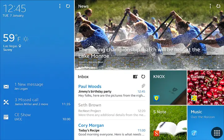
You might have noticed that Samsung is using a new user interface for their Magazine UX on the latest Galaxy tablet devices (hands-on of which we have right here). We didn’t want to say anything before, but it looks like the word got out — it looks quite familiar. We’re talking about a light hint of Microsoft’s Metro UI used in Windows 8+ devices.
While it’s clearly not exactly the same, you have to wonder if Samsung borrowed some design elements from Microsoft to craft this new user interface. Our friend Joe from WinSource suspects Samsung did it to create a product that lends itself more to the business users that the latest Galaxy TabPro and Galaxy NotePro tablets are catered toward.
While no one can say for sure, we’re sure everyone has their own opinion. Personally, I think Samsung did borrow a bit from Microsoft, though they obviously used the power and flexibility of Android to create an experience that’s more useful than that of default Metro. Most of all, though, I think I’m just glad that they aren’t interested in trying to emulate Apple (though some supposed upcoming changes to TouchWiz seem to suggest they’ve dipped back into that trend for the phone side of things).
How about you? Drop a vote in the poll below, and let us know your thoughts in the comments section right afterward.
[polldaddy poll=7698230]





Damn skippy it is. But hey, sammy is only doing what it does best……LOL
guys calm down. remember that time where they were accused of copying iOS and we all found out how wrong we were? Does anyone remember?
and now, it’s the other way around! lol
Only in the US they were so called copying.
Well we took up for Samsung because we didn’t believe they were copying. But if they blatantly continue to do things like this, IDK…
I’m not saying their copying Metro UI, but they’ve been targeted for copying a little bit more often then I’d expect.
Poll. Are metro live tiles similar to these mockups present in SurfCast patents from 2004? (They are live tiles that update information). The patent is US 6724403.
no – it’s different because of a subtle difference only described in Microsoft’s patent filing.
If by different you mean parallax effect than that’s almost on all android UI’s (changing home screens for example) and iOS. The patent system is ridiculous.
Which is why it should just be thrown out.
Plagiarism is the best form of flattery
I’m not so sure about the UX, but for some reason my gut tells me that BLUE they’re using is very close to the Windows blue RGB.
edit:
Windows blue RGB is: #1BA1E2 | 27,161,226
Samsung’s blue (above) is: #2681D2
(so, close, but not that close. gut == wrong.)
Upvoted for actual research and being able to admit being wrong. So rare here.
I know right? Contrition. Such a rarity on the internet. And as for the UI, when it comes to powerful Android tablets and phones I don’t really care what it looks like. It’s 2014, I’ll root the damn thing and flash a stock-based ROM and use my own launcher and customize that thing further.
That’s what I LOVE about Android today. You start from a powerful hardware platform and just run wild customizing the device’s software to your personal liking. Supreme control over something you’ve spent good money on. Just like it’s meant to be.
IDK. At first glance, it more or less resembles Flipboard and HTCs Blinkfeed more than Metro to me…
It seems like a combination. I couldn’t give either a yes or a no, there are things that are similar but not everything
Or Chameleon launcher.
kind of similar, but not really. windows tiles aren’t like true widgets, or even apps running in a grid system exactly like this way. however, du have updated live tile info, and do have where you can run two to three apps at the same time next to each other but doesn’t allow other tiles etc still displaying.
It’s more like Flipboard if anything. Having tiles doesn’t make it Windows copy.
Flipboard + Blinkfeed really
Flipboard and Samsung have been partners for a while now. The UI is “powered by Flipboard”. They did this on the Note 10.1/2014 already: http://www.theverge.com/2013/10/1/4788258/samsung-galaxy-note-10-1-review-2014-edition
I’m well aware. Which is why I said it was more like flipboard…
Looks like a mashup of of Flipboard and Metro
I can’t believe a color and blocks with images these days automatically mean Windows now.
Actually, I think it’s an improvement on Metro. I’m not a big fan of tiles, but this looks not nearly as headache inducing as Microsoft’s version.
I’d say it’s more of a widget ui than a live tile type of ui. But everyone is allowed their own opinion.
I personally don’t care for it to be honest.
Live tile and widget ui are practically the same except in how it operates Live tiles are based off of widgets anyways.
Only so many ways to make blocks/tiles work… heck, looks like Chameleon Launcher from a couple of years ago.
Wannabe blinkfeed and windows phone..
Apparently only iOS can have icons, and only windows can have tiles, anybody else who tries to improve on it is nothing but a copy cat.
Well, you have got it all wrong.
good idea of anyone no question is good for the industry. The thing is the original concept has a value, there is a proper way to do this called “cross licensing” simply ripping off someone else’ is a way of greedy and unprofessional act.
It is one thing is that you neighbor is imitating you to make fun of it. It is quite a another thing he copies you one-to-one to imitate your life and way of living. How would you feel?
This is what I called cheap “the next door grocery concept” if he can do it, why I can’t do the same. At the end both groceries loose to the big department store come in the near town.
Everyone can try to innovate themselves and that far more beneficial to the industry than copying.
yeah, maybe Apple should not have copied Toshiba and got into the laptop thing or maybe Apple should not have copied windows and bundle in a browser with their machines. Everybody copies everyone else get over it. The only problem is you think only Samsung copies.
Yes everyone copies, but most usually add some new feature to their version. Samsung’s expertise seems to be copying while adding the bare minimum to ensure legality.
Well, it says what you value in life.
I have nothing to get over. I always value what I value in life. Not Samsung, if anyone copies without playing respect to the original, it’s wrong in my book.
Rather than coping the next door companies should try to enhance things further, that’s how human race going forward.
Most famous MS, coping Apple battles have stagnant the PC industry for decades until Apple brushed up the ashes with iPhone. iPhone was the top example how things should be done after the MS anti-trust cases, read iPhone About page it has all of the-borrowed technologies have properly cross-licensed and mentioned there. Remember we lived in a dark world where we didn’t see single IE update for ages after killing Netscape? Most these cases later professionally handled specially after 90′ have licensing deals behind the scene.
Now, try to find such document for Android or Samsung, even on the web? Oracle case proved Android even had cut+paste+copy of Jave code in it.
Original concepts have value and they need to be paid for business to survive and go forward.
Everyone pays the original owners lately, Samsung and Google are the one’s just rips them off sending others out-off business and make it sound like so normal and okay to copy others concepts.
Most morons don’t understand this.
Will see, when China copies Samsung 100% they have no where to run. In the recent future Samsung is the company which faces most identity crises. S4 original here 500USD up here, the same hard to identify copy is less that 100 bucks.
Other than the tech savvy, most common people can’t say the difference and get caught it. Who looses the business?
Everyone should respect business ethics this tech cycle to evolve. Or will end up another decade of innovation killed by counter copy Android onslaught.
That’s what we should be worried. At least Google trying to take back control of Android now which is in the loose. Guess what ? still it’s Apple’s play book Google trying with separating Google Play from stock Android.
At lease now MS seem to have guts to do different so was the Metro UI efforts with Lumina when Google ripped off iOS.
MS did not stagnate the PC industry, it enabled democratization of PC industry, by making PCs affordable. Only thing is software licensing business model has a endgame and now Google has disrupted them by making it free. If it were only Apple, PC industry would be stuck only to rich persons in rich countries.
PC industry stagnation was removed not by iphone but by internet, the i in iphone stands for internet. Iphone is merely one of the main thin client devices that connect to the internet.
You seem to be an oracle shill, but yes google uses standard JDK java on desktop computer for development and then uses it to cross compile into dalvik. THe thing is standard JDK is free. Even SUN CEO congratulated google for android.
Android is not copied from iOS, maybe they copied a few stuff like pinch to zoom, just like how apple copied many things from google, but android was brought long before iphone was in development.
If there was no google, Apple would dominate mobile and only 600 dollar toys would be available, but thanks to android we now get functionally equivalent phones for 100 dollars.
Go learn proper English before commenting.
Original concepts deserve to be respected? Sure. But concepts do not need to get protected.
It does not seem like you have any idea related to what you’re talking about.
Please go take your philosophy somewhere else.
Thank you! I am not native English.
But, well, you seem not to like different notions. Rather than hitting a bush in the wild. Why not pin point and talk to the points?
Did i say something wrong? then point that out rather than bashing out nothing..
At least Microsoft would buy out the company before they ripped off their technology. lol
You know how much Samsung is worth right?
Samsung Adding Windows features to Android doesn’t mean its a bad thing
I haven’t really seen Metro UI on mobile devices. I’ve seen it on Windows 8, but it just looks like squares for apps. LoL!!
It’s the same. One tile is relevant to one application (a website can be considered a first citizen app) and frequently updates its info for that application. Magazine Ux uses widgets and besides having more info than live tiles (they are bigger) and possibly display a full application interface, they can be used to group different applications in one tile, like an app launcher. I don’t see any other difference right now.
So, basically like Plan 9, AwesomeWM and other tiling systems have been doing for over 30 years since it was invented at Xerox Park. It’s hardly a new concept, although it has never been that mainstream (it is becoming so in the last couple years).
I would say it’s more like Chameleon Launcher. Just because of the amount of information displayed versus Windows Live Tiles.
Hey, they copied apple first… why not windows too? And to whichever samboy wants to deny it, please refer to the internal document they gave to their engineers on how to copy iOS.
Look like Metro but it’s better than Metro at least ! Btw i am very happy that i left samsung for Nexus.
Looks the part… Hey at least it looks cleaner than touchwiz, on a large tablet like that oversized widgets and icons don’t always look so good. Kind of reminds me of flipboard
Its a revision of Metro of which is an alternative design based off widgets. It falls back to android. Metro UI wasn’t really new it’s just using the best of Android basically using widgets which was already designed by Google in the first place. Difference lies in M$ft forcing the end user to use tiles. With Android either use it or change it.
It looks like they’re ripping off Flipboard.
looks more like the chameleon launcher from android: https://play.google.com/store/apps/details?id=com.chameleonlauncher&hl=en
Very much like Chameleon Lanucher. And chameleon launcher sucks..
Lol that is what samsung does… Working smart not hard… Lol
Just want to say that the picture shown isn’t rowing. It’s paddling. Two distinctly different things. The exact sport is dragon boat.
Its just a bunch of window screens in my opinion you put it together and and they say its Metro? Interesting …
I say stop arguing over shapes and sizes! And for Samsung ….. Take my money! Jk
It works so shut it. A better way to do widgets
Agree With TechWings looks more like Chameleon Launcher..
my Aunty Julia got silver Volkswagen Beetle
Convertible by working parttime off of a home computer… Look At This
Buzz31.ℂom
cool man !!! http://www.htcmate.com
Come’on Samsung never copies anyone!! Or you’re gonna say that Touchwizz was based on iOS now? Haha
They are just like photos arranged in a grid for crying out loud. What kind of ripoff is this?
I’m here at CES, and got to play with these. from I distance I mistook these for Windows 8 tablets. up close, not so much. Is it metro inspired? Oh most definitely (and I’m not convinced its a good thing). That said it’s no more of a ripoff of metro than the S4 is a ripoff of the iPhone.
Functionality-wise, it actually quite reminds me of blinkfeed
Really? This article is wack.
If people think it looks alike then post screenshots comparing.
Or maybe this Samsung and Microsoft were inspired by the same thing. Like some magazine layouts.
I wish most Windows 8 Live tiles looked as good as the 4 in the bottom right corner. Really I’m not seeing it all that much except for that corner and I use Windows 8 at home and like it.
First thing that popped in my head when I saw this was Chameleon Launcher. Windows 8 never crossed my mind.
Mine too!
it’s a grid, which is like how a real magazine’s layout is. since when is using a grid design reserved solely to microsoft? what a stupid article.