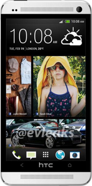
Would it really come as much of a surprise if the phone rumored under the name M7 launched instead as the HTC One? That’s where speculation is leaning as yet another image of the device — this time a promotional render complete with a look at Sense 5.0 — has leaked.
In 2012, HTC put plenty of emphasis on their One brand, and the impression was that the company would keep the line going well into the future. The goal was to create the sort of awareness folks now hold for the iPhone and Galaxy series, both brands instantly recognized as being among the top smartphones on the market year in and year out. So, after putting considerable time, money, and effort behind the HTC One X and its siblings, would HTC really let the name, which was presented last February as a sort of new beginning for the company, simply die?
Adding to the buzz is a photo that recently surfaced on Flickr. Its EXIF data ties it not to the M7 but the HTC One, while the camera linked to the image is rated at 4.1MP. You will recall that HTC’s upcoming flagship is said to use a new “Ultrapixel” array that stacks three sensors of about 4MP each, stitching together the final image while keeping a resolution in line with the lower megapixel count. The actual picture itself isn’t very impressive, but we’ll wait to see some better conceived compositions.
The big reveal is about a week away. HTC will be giving an early look at the M7/HTC One on February 19th before packing up and shipping off to Mobile World Congress where we will have another chance to look at the phone in more detail.
[via TechCrunch]




That’s a good looking phone. Imagine if it came unbranded on all US carriers like the iPhone and GS3.
I think that is a must. I liked Samsung approach towards the GSIII. Same phone EVERYWHERE, Europe Asia all the US carriers. Sure some had the Eynos Quad core, and some has the snapdragon s4, but the performance was near identical and the shell was the same. The average consumer would have NO CLUE there was a difference and that is what matters. This allows for great brand recognition and more available accessories, which consumers will eat up.
I fear sprint will put up a fight on this and want to use their EVO branding….sure hope not.
What’s the big deal? The EVO line of devices is almost always better (specs wise) than the original it is based off of.
Except, there might not be a Galaxy S4, soley because Koreans think the number 4 is bad luck. Might be named something else, like Galaxy RoseSmellsAsSweet
Just a home and back button? No menu or multitasking button??
maybe its the HTC logo?? could be gesture based like a flick up from the home button….like the wave launcher on the pre. Could be a simple long hold of the home button for a cleaner look, many people don’t use the app switcher button much i don’t think….could be wrong.
I hope they don’t do that for the released product
Fantastic design. Even if it turns out that this is not the final design, I sure hope it will keep that shape.
It doesnt need a multi task button. The home button will be the multi task button. N the option button will be on screen just like the nexus device does it.
“The One … by HTC”
“The One-2”
Shrug
M7 is definitely a no go…
I would like to see htc thrive in sales this year. Htc and sammy are my favorite phone makers. Idk if I will ever go with anything else other then the note though. Unless htc can make an amazing “phablet” like the note2. A girl can dream…
Fugly. But… Everything ain’t for everybody.
Why can’t they release their phones with options for the battery indicator? My rom has an awesome one that shows the percentage charge remaining as the bar creeps down. Why make us guess? Is it that hard to put the digits in? I know I can get apps that show the percentage in an icon on the left, but then you clutter up the bar.
Fugly if real.
More importantly, who the hell is Jay?!?
:-P
Unfortunately I’m looking for a 5 inch screen for my next device. Hopefully Google can hook that up with a Nexus 5.
Agree!
5″+ in the tightest possible design. They should remove all that design BS and create AMAZING bezel-less devices-displays!
I want 2013 display, not 2012 display with 2013 PPI!
We want WOW!
I bet you’d be cool then!
Now it only has 2 buttons at the bottom? Wut?
what if “HTC” would be HTC’s HOME BUTTON?
Looks definitely better than everything HTC has made before. Almost everything)
The question: can TOP elements (eye-tracking, speaker, camera) be ALIGNED horizontally?
Blackberry hasn’t been smart enough to improve intuitiveness of its Z10 by making “Blackberry” a touchpad-like button;)
There’s already a home button next to HTC though. This is lame if it’s only got two buttons. If HTC pulls up menu or recent apps, I still think it’s lame. Using company or carrier names as buttons really irks me. Save the logos for the back please!
ALUMINUM? #yes
chamfers? #no
SPEAKERS…. FORWARD…. WHHHAAAAAA??? MIND BLOWN…..
makes sense since their ceo was on video shouting “HTC one” and “m7” at year end party
i was initially optimistic about this. i like how it tricks ur eye into thinking it’s an edge to edge display. hopefully more phones emulate this design as they get closer to a true edge to edge display. upon close inspection, it appears to be a horrible render from some iClone5 images. i don’t want my superior Android phone to resemble the other guys’ aside from being some kind of shaped rectangular prism. the edges are beveled like the new iC5 and has it’s classic, rounded-edge rectangle shape.
speakers on the front is brilliant and simple, overlooked since inception of the smartphone. also, i would appreciate speakers in stereo. hopefully, it comes with a physical camera button that works like the Nokia 822 (awesome. , and all the latest high-end specs. though i’ve been an HTC user and champion since the DInc, Sammy has stolen my potential business with the GNII and possible GSIV. they’ve really stepped it up with their software, the GNII being a potential PC replacement.
obviously, unlocked and unbranded would be ideal, like @phinn said (and others reiterated), but i’d just be happy to get it on VZW, even if it had a big-ol’ checkmark. VZW has been lacking in the best phones for a few years now. biggest, best network in USA should have access to biggest, best phones in USA.
thanks for reading.
Stopped reading here, “the GNII being a potential PC replacement.” – cant take serious.
Would this phone have expandable memory with an micro as card slot?
Sd card
This thing looks like the back of an iphone 5. Its not edge to edge, and although it looks better, it still has htc sense. Guess my hopes lie in the X phone and the s4
This may be what the phone will look like but this photo is a Fake, I have analysed the pixels & where the screen meets the white/silver top part the pixels show clearly that this has been cut & pasted together.
I do hope the phone does look like this though,
Am I the only one who thinks this is fugly from a design standpoint? It looks like someone took a picture of the back on an iPhone 5 (white) and threw a screen image over the aluminum back. Also, while HTC could try something different , e.g. putting speakers on the front (like in this design), I think it looks akward.