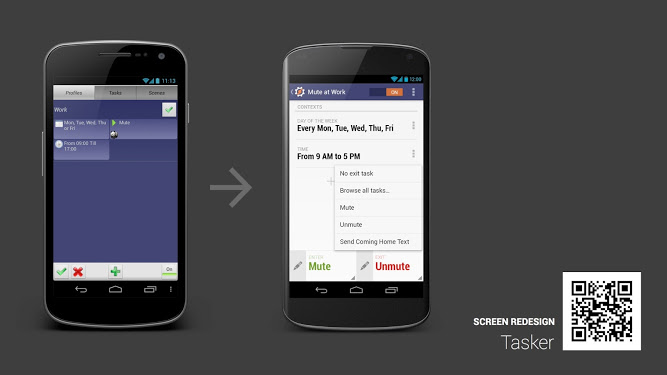
In case you haven’t noticed, the Android team has been running a series called “Android Design in Action” where they take apps with outdated user interfaces and show how they could look with Android’s much nicer Holo UI-based elements. Well, the latest video in the series highlights an app that I think everyone agrees could use some tender love and care.
I’m talking about Tasker, the automation app that can manipulate your device in many different ways based on many different factors. For instance, you can have your device turn WiFi off, Bluetooth and GPS on, and dim the screen brightness once you leave the house. As great as this app is functionality wise, it’s no secret that it’s butt ugly in design.
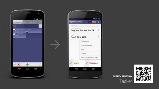
Googlers Nick Butcher, Roman Nurik and Adam Koch get together and re-imagine Tasker as an app that looks like it was designed in 2012 instead of 2008. It makes use of better fonts, image resources, the best Android design practices as outlined in Google’s official style guideline and more to make Tasker look like a the mobile app equivalent of Shakira instead of Whoopi Goldberg.
It’s a long watch as it comes in at just over half an hour, but it’s a great video for us to fantasize about what could be with this great app. Is Tasker’s current user interface going to make us stop using it? No. Substance comes before style in this rare instance because no third party option comes close to the abilities Tasker provides. But I would be a lot more happy to see the result of the Android team’s imagination hit the Google Play Store one of these days. Take a gander above.




1000% agree Tasker needs a major facelift, this is where apple does well, & where lazy! app developers need to work on there phone & tablet versions, google needs to name or shame more often. So many apps look like something from 1995 not 2012.
Apple does well? The whole OS looks like its from 1995. Skeuomorphism for everyone!
I got that he was talking about how good ios apps look from his comment.
Its from the future!
The point still stands. Most Apple apps look better than most Android apps. Style -Apple wins. Substance- Android wins. Most of us enjoy substance over style, but it would be awesome to have both.
Really? I guess its subjective but his comment about looking like its from 1995 totally screams IOS apps to me. All of the baked in apps are like a Compuserve web page and some of the 3rd party apps as well. Beyond that of course some 3rd party apps can look good but even then the UI that is forced in the app, with the hokey shading, gradients and such, just make it look old to me.
But then again I was never a fan of computers attempting to imitate real life. I also thought Android itself looked horrid before the “Tron” interface.
http://threepanelsoul.com/comics/2012-12-04-257.png
I’ll take substance over style. I’m not part of the lindsay lohan generation I guess.
For something like tasker, function MUST be far ahead style. And stop using those “lazy developer” term. So tired of hearing it. You must think its easy to be a developer. That they don’t have other commitments and priorities. Everybody wants “everything” and expects it to be free. Not a great business model to follow. And from a business perspective, you have to consider if the developer is going to get a whole lot of new buyers vs spending a big chunk of time in redesign (and potentially breaking the app). If they’re not going to make a lot of money on it then why would they want to do it and take time away from another project?
I might consider paying for Tasker, again, if they redisigned the UI like this. I wonder if this re-design is already in the works and thats what it was featured.
So.. What you’re saying is Whoopi Goldberg isn’t attractive? Lol
Yes. That’s what everyone should be saying.
This is not the first time a designer (or in this case designers) has lent their talents to Tasker. I paid for a copy but haven’t installed it in at least a year. Very convoluted and confusion user experience and downright ugly. It shows that you can only go so far with design or engineering but if you don’t have both, you’re screwed.
As long as you understand basic programming languages, you can figure out and use tasker. And those are the people it’s aimed at.
With all due respect, I understand and can use Tasker just fine. That doesn’t mean I don’t think the UX is a POS. Like I said, I am not some lone user who thinks that the program is very confusing and the interface is terrible.
“No third party option comes close…”
I’ve never used tasker, but I’ve been using locale since my G1, and to this day, its still my favorite app. Idk… what makes tasker better?
Tasker gives you the ability to make your own apps and even post them on Google play and sell them. basically you can do anything you want, if you take the time and actually learn how to use it. It’s almost like have 1000 apps in one. You just have to think like a developer, which is its biggest problem.
I don’t like the business model surrounding locale. You have to buy a “plug-in” for something generic like doing a task when your headphone is plugged in or automatically send SMS. Those are built into tasker.
Locale is a lot more user friendly and fool proof. Tasker is a lot more extensible and you have a lot more control over smaller details. Tasker has variables, and conditionals, and for loops, and scripting, and raw sensor output, etc. It can trigger off of almost anything, and then do almost anything. However setting up contact-based or GPS location based scenarios are really complicated, whereas on Locale it’s really easy. I use both. When Locale can’t do something, I use Tasker.
I just sent the developer of Tasker an email encouraging him to make these changes happen. You guy should too, you can find his email in the play store just in case.
Calling it now, Tasker is going to be bought/sold to Google very soon. I for one would LOVE if this was baked into delicious Key Lime Pie. The OS needs to get a bit more automation at a lower level than a non-root app can provide.
I wold love it if google bought them and propel them further. Tasker is my favorite app. Google treatment would make it incredible.
That would be great.
@Quentyn Kennemer ” Is Tasker’s current user interface going to make us stop using it? No. ” actually, YES. I own tasker but uninstalled it long ago because it was confusing and cluttered… having an appealing interface helps the user deal with the steep learning curve.
This is true. It’s not just about being ugly, but also about intuitiveness. But for those of us who have grown to accept and tolerate the interface it’s a tool we won’t put down without a very good reason.
yeah, i do have some apps, like this bulk renaming utility, that is extremely powerful and useful, but looks like it came out during windows 3.1 days… but I dont care because it does a fantastic job. I did lose interest in tasker partially because of the confusing interface and learning curve, but probably partly because i liked the idea more than needed or really wanted its functionality.
fyi – I believe the Tasker UI is in a redesign phase already, but I have no idea how long it will take. I think their imagined redesign looks good though, even though I’m already used to the current UI.
I think it’s very funny that they specifically mention airplane mode as a possible action you might add to a task, when Google broke the ability for any user app to affect airplane mode beginning with Android 4.2. Even these guys see the usefulness of being able to automate changes to airplane mode, but someone else at Google apparently didn’t get the memo.