It was a few months back Google began rolling out their all new redesigned Chrome user interface for Chromebooks. While the functionality or convenience of a Chrome-only laptop was still up for debate, everybody was pretty much in agreement that the new design of the OS was beautiful. Clean, minimal — all the great things we loved about Android, but with a flavor all of its own.
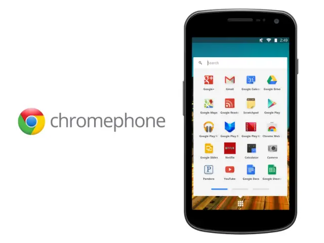
It was this design that sparked the imagination of Android themers, and we even showed you one such design titled “Chromium OS Theme” back in June. Today, a Googler posted a quick concept image of “Chromephone,” a vision of what Chrome OS would look like on a phone. Have to say, the minimalist in me was drooling. Take a look.
It was earlier this year Google also introduced Google Now, their all new revamped search app. The one thing that seemed to strike me about Google Now was that the UI seemed different from even the white Holo look of Android. I always felt it looked more akin to the “Chrome OS look.” Cruising through MyColorScreen.com (a guilty pleasure of mine), I came across an equally striking Google Now theme. Check it out.
You’ll notice some similarities with the Chromephone concept, the only difference being this is ones a reality. The theme was built using a variety of apps and images and with a little time, you can get the same look on your stock Android device. Tonight. Hit the source link for a full list of apps used to create this and if you guys pull it off, post a screen shot in the comments. I’d love to take a look at your fabulous creations.
[via ChromeSpot | MyColorScreen]


I prefer the seperateness of Chrome and Android thank you very much :P
I think the convergence of these two platforms is inevitable…
I keep hoping that Google is going to announce something like Ubuntu desktop for the next version of android.
Yeah, we’ll have the general functionality of android along with some of the always-connected aspects of chrome. I don’t know how this will be much different than having enhanced widgets on android, but I do imagine google will screw it up for several iterations. As to whether it will be a frankenstein+ kludge at the end — or a beautiful, polished, intuitive, online and off functional OS is a toss up. Google does massively screw up things at times and has near zero ability to hear what is going on around them.
I wouldn’t be surprised if Key Lime Pie looks something like this..
If anyone wants to download a .zip of Chrome OS icons for Android, I have some I made on my site, android.mitchs.co. I had them in an ADW/Apex theme, but it kept getting taken down for copyright (EVEN THOUGH NONE WERE TAKEN FROM GOOGLE!), so I gave up.
<3
@Gamercore:disqus That’s one SHARP hard on! haha
hey do your themes work on phones or just tablets. couldn’t get tge site to work properly but id be interested to see them. thanks
now if we put that on Nexus 10….
for sharing this… I LOVE YOU.
thanks….looks good
love that pic where the Google search bar is
Looks like Miui
that could be likely due to the icons being from the ”
Minimal MIUI ” theme that was used.
I hate grids of icons. If you want a phone that looks like it’s built for a 3 year old, buy an iPhone. Android’s special UI sauce is widgets and live wallpaper. PERIOD. Android and Windows Phone have it right.
I cannot get the wallpaper to fit like that. It’s killing me!
I like it. Google is steadily rolling out new things worth oo’s and ah’s
Yes because Android needed yet another major look overhaul and square icons are really attractive.
I’m probably gonna get a lot of boo’s but when you turn on my galaxy nexus. the second thing you see after unlocking my phone is.. the metro tiles of windows phone 8 lol I’ve always loved the design of windows UI after the release of of windows phone 7. even owned the Htc HD 7 for a brief period. the only thing I disliked about windows phone is that app market was so small. but now I got the best of both worlds. the user interface of windows phone 8. with the android playstore
I wouldn’t boo you. Why anyone older than a 5 year old or younger than a 70 year old would want to stare at a boring grid of icons is beyond me. That’s the iphone’s market. When I turn on my phone, the homescreens are filed with WIDGETs because I can’t be bothered to pop in and out of every app all the time. I want to see my calendar,my emails, the weather, and read the news instantly.
You were drooling over this ? :–)
Android really needs to focus on customization. Everyone is fed-up with manufacturers “differentiating themselves” meaning fucking up the code and taking 4-5 months to get up to date. Android is all about customization and it seems really odd that they haven’t adopted this philosophy yet. It would allow manufacturers the ability to add in their own stuff from the back end, allow the enthusiasts to get the AOSP experience without rooting/modding their phones and it would allow third party customization easily.
Imagine how big this would be?