Uniquely Android is a series we started last month to shine the spotlight on those apps that take advantage of the unique capabilities of the platform and provide an experience that you wouldn’t find in most other phones. So far, we have featured Plug In Launcher, AirDroid, Shush, Llama and Swiftkey 3.
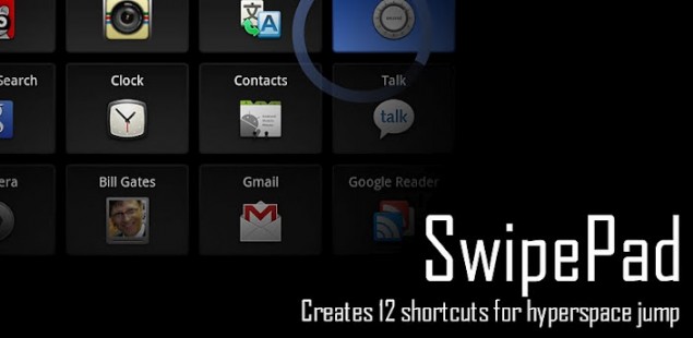
Thanks to a lot of popular demand, I’ve finally decided to add SwipePad to the Uniquely Android series. The app allows you to create a drawer of sorts, containing any app, shortcut and, with another plugin, even widgets. This drawer can be launched by swiping from any specified region on the edge of the screen while any app is opened. In short, if there’s any app or contact that you use frequently, you could simply add it to the drawer, and launch it from within another app by swiping and releasing at the location you have set for it.
Personally, I must admit that I’m not a big fan of the app, however I won’t for a moment hesitate others from trying it. It definitely ticks the boxes for Uniquely Android, and I could see it being extremely useful on a pre-ICS device. However, with the improved app switching and folders in Android 4.0+, I haven’t found the need for it. Some have said that it has even slowed down their ICS devices, though I never found that to be the case even on a single-core phone.
The main fault I had with it was that I found the swiping to be inconsistent, maybe because I only use a 3.8″ screen device and hence might have a very thin swipe area (I do understand the thickness can be increased, but I still found the experience lacking). Additionally, I found the 4X3 drawer grid a bit too much because I felt like I’m having to pay too much attention to perform the action I want.
What I would have preferred was the ability to perform a multi-touch action, such as a three-finger swipe, to launch the drawer from within the app, or maybe even choose from a set of multi-touch actions to launch an app in a manner similar to the Mac app called BetterTouchTool. I doubt how feasible that would be though, since SwipePad puts a surface over the opened app and effectively prevents the app from getting touch feedback from that region.
You can get SwipePad here, and I’d love the feedback of those users who get the most out of it. Maybe I’m just using it wrong or something, but as of now I’m probably going to be uninstalling it soon.







With the plug-ins for multiple pads, more slots, widgets and app drawer, virtually anything you can put on a home screen can be accessed directly from the lock screen (eg Widget Locker), eliminating or minimizing the need for a home screen altogether.
Raveesh, how exactly does ICS eliminate the benefit of this app? (VZW Galaxy Nexus, 4.0.4)
Just find it so much faster to either hit the multitasking option and open the required app, or press home and do the same. The improved folders in ICS help too, since I’ve got nearly all of my important apps on my default homescreen itself. Like I noted, I was really having to focus on where I’m ending the swipe to perform the action I wanted. That kinda goes against the idea of SwipePad being there to quicken things up.
multitasking option would only work if the app was previously opened.hitting homescreen and clicking folder and selecting app, 1 additional step. If you keep all important apps on homescreen might as well get an iphone.
Wait, so the only reason to get an Android is that we don’t have to keep all important apps on the home screen? Anyhow, yes one extra step. But considering how fast ICS is (and Jelly Bean feels even faster), you barely notice that extra step, especially if I’m walking or doing something else, at which point I don’t want to focus on where I’m swiping to. SwipePad just hasnt come naturally to me.
The main feature of android is customization. It’s built on the tenet that what works for one person might not work for another. SwipePad doesn’t work for me, but hey, I saw that the app is still something that offers others a lot, and is worth of being featured in the Uniquely Android series. I’ve made that very clear, and suggested what I’d have liked SwipePad to be like for it to work for me.
I always put the same apps there. LoL!! So it’s as natural to me as your folders I’m guessing.
I may move a few apps around, but settings is always the bottom middle is an example. =.P
I completely agree that. With ICS I found that I didn’t need this app anymore because the folders kept everything I used frequently close by. I used this app and paid for the add-ons when i was on froyo & gb and it was great and served its purpose well but now I haven’t used it and haven’t missed it.
Hmm… With the touch surface, if you tap twice it doesn’t register the SwipePad touch surface. I have mine in the top left/right edge. I learned about that when trying to scroll. If I try and scroll, I would hit the SwipePad. But if you tap that area, then quickly tap again, it doesn’t register the SwipePad. It’s as if SwipePad knows you don’t want to open it.
Also, you have the option to hide the panels. When you press and hold, one of your options is “hide”. But I think what you’re saying is completely changing the 4*3 to maybe 1*3 or something.
The multitasking is obviously flawed since you still have to ‘swipe’ and search for the app. LoL!! With Swipe the app will always be guaranteed to be there. The whole folders thing is what SwipePad is preventing. SwipePad helps limit the amount of apps you throw into a folder. No need to go to the home screen. Just swipe and go to the app. You don’t necessarily have to put ‘important’ apps in SwipePad, do what I do. I put apps like Drive, DropBox, Maps in there. I don’t always go to DropBox, but when I do go, I don’t want to have to search for DropBox in my App drawer. Folders would have been good, but now I don’t have to have it on my homescreen. It just saves a few strokes. I may be messaging someone, swipe to DropBox to get a link, then multitask back to messaging. Why go to the home screen, open a folder then finally open dropbox? LoL!!
Oh my? Quite wordy. =./
I dont know what phone do you have but some kernels (for ex. Siyah) have support for multitouch gestures. They need some understandig how to program them but this feature is very usefull. (And kernel based so i think they can run on any phone when implemented properly)
I use a lot of apps with side navigation like Dolphin Browser, etc. Would this conflict?
No, you can adjust where and how sensitive the gesture areas or “Hot-spots” are. So if you actively swipe on the right for other apps, you can place the hot-spot on the left (upper, lower, or even corner) side of the screen.
no as Greek_Ice states. I use Dolphin as well, and once you configure your hotspots it isn’t a problem.
I suggest the icon in the top left corner as the best swipe starting point. For me it’s not that useful since it doesn’t work nicely in full screen which would be the only scenario I would like this app. A suggestion for a great app in the series is Gesture Search (free Google app) which is pretty much overlooked but works exceptionally well.
I use this lyk crazy. It’s very convenient when playing games. I may be playing a game and can just swipe to settings to alter my brightness. It’s the fact that I don’t have to press home then open some folder and look for an app.
I have random apps, like PokeDroid and Maps here. So I’ll be playing PKMN and see a PKMN I don’t know and just swipe to it, look at it, then multitask back. I don’t use these apps often enough for them to be on my home screen, but I use them enough to want quick access to them. This limits the amount of home screens I need giving me a little boost in battery. LoL!!
Raveesh, shame on you. You are still using a 3.8 inch device. Upgrade my friend. Just ask Rob to make it a business expense
A One X is just a day or two away. To be honest, I’m not looking forward to a bigger device so much, though definitely in love with the screen on the One X itself.
I have an evo lte with the crappy sense version of display multitasking. I love this app and have been using it for a while.
I don’t think you can compare this to the app switcher / task manager in Android since those only list the most recently OPENED apps while SwipePad allows you to open ANY app from within any app.
I love this app on my Galaxy S2 but not on my Transformer. It does slow down my devices, although, it doesn’t affect my S2 much. My Transformer, though, becomes annoyingly slow if I activate this app.
Gave it a try – uhmazing! Such an UI improvement for CM 7 on Nook. I’m actually thinking that it wouldn’t be too bad for ICS either, and will try it on my phone too, as some aspects of ICS UI are not to my liking.
I use swipe pad for my most used apps and it certainly isn’t faster to
utilize multitasking, at least with how I use my phone. I like minimal
icons on the screen and Swipe Pad helps me achieve this. I have 2 pads
with apps that I use.
I have not had problems with the swiping on a Samsung SII Skyrocket. I
think the app is nifty and adds to my usability experience.
It did take some thinking of how I wanted to organize things. And once you set everything up I have built a memory of where things are and can access apps without looking at my device. I have haptic feedback disabled for everything but SwipePad actions that helps out as well.
I prefer Widgetsoid. It allows you to put multiple bars of quick settings buttons and app shortcuts into the notification screen.
Been using this app for a long time use it daily. It allows me access to anything I routinely need from any screen immediatly. I highly recommend
Swipepad is awesome, a must install followed immediately by lastpass. May I also recommend SMS Flash as a contender?
https://play.google.com/store/apps/details?id=com.bl.smsflash
Not to open up a stale post but I think Wave Launcher gives similar functionality and considerably more flexibility.
I personally use Folder Organizer for this. I put my “Applications” folder in the notification bar and have access to all of my apps through any app. It’s essentially like having your app drawer button in your notification bar. You can also add individual apps/shortcuts or specialized folders instead.