Alongside some redesigned (and very good-looking) apps, the entirety of Android OS has gotten a very pretty update with Android 4.0. Matias Duarte said we wouldn’t recognize Android as we know it and, well, he was right. Let’s jump right into all the new UI changes and features we’re getting, shall we?
Color scheme
To go along with the change in color scheme made in Honeycomb, Ice Cream Sandwich for phones also adopts the heavy blue accents in various parts of the operating system. Some status icons – such as WiFi and signal strength – are blue, as are menu selections, check boxes and more. I personally like it, but I know some will miss their green.
Font (Roboto)
Google made a big deal about the new font they’re using for Android 4.0. It’s called Roboto and is supposed to look good no matter type of display you have, but is said to really look good for the 720p display on the Samsung Galaxy Nexus. They used Roboto throughout their press conference and I can say, at least for me, that it was pleasing to the eye.
System-wide Gestures
Google’s focusing on simple gesture-based navigation in Ice Cream Sandwich. In most apps and parts of the UI, swiping up, down, left or right will do a lot of things. In Gmail, for instance, you can switch between different emails with ease, while in Gallery you can move on to the next page of images. We will discuss some scenarios where this is used below.
Lockscreen
Google’s borrowed some elements from the Honeycomb lock screen but have made it even better. You can either unlock the phone go directly to the homescreen or unlock it and go directly to the camera app. The camera is the number one thing people need very fast access to as things can happen in a blink of an eye and they’ve made that happen here.
And while this isn’t quite “lockscreen,” the call reject and answer functions deserve mention here. Like many phones now (including Samsung’s TouchWiz 4 devices), you now answer calls by sliding to the left or the right – reject and answer, respectively. You can also reject and immediately send a pre-written text to let your caller know why you had to reject the call. The list of pre-written texts can be customized to your most common situations.
Homescreen and Launcher
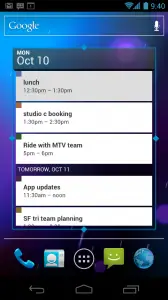
Stylistically we get a similar launcher to Honeycomb’s. When placing apps and widgets, you can use the light “plus” symbols in the background to help you figure out how much space you have and where you can drop the application or widget. Also coming from Honeycomb are resizable and scrollable widgets. Controls are present on all four corners of a compatible widget, while scrollable widgets are presented in the same card-like system from Honeycomb as well as the traditional scroll (like the Calendar and Gmail widgets from Honeycomb).
Folders have gotten a great overhaul. To create folders, simply start by dragging one app icon over another and the folder will automatically be created. Opening the folder will give you the ability to either launch an application, reorganize application icons or rename the folder. And more than just apps, you can also put people into folders so you’ll have one-click access to all your favorite contacts.
A dock at the bottom gives you icons for opening the apps and widgets tray, the phone application and the browser. You also have two additional spaces to put whatever you’d like there. You can simply drag and drop any application icon or folder (including “people” folders) for access on any of your homescreens.
Jumping into the apps tray is nothing out of the ordinary. We’re greeted to a tabbed layout for switching between applications or widgets. Scrolling through each set of homescreen items is the same – simply flick left and right, just like Honeycomb.
On-screen Controls
At the bottom of every screen – at least on the button-less Galaxy Nexus – are software buttons for Home, Back and switching between apps. These controls can be dimmed or can be completely shut off depending on what you’re doing. We imagine there’s a “flick” gesture to bring it all back up.
Notification Bar
The notification bar has gotten a pretty significant facelift. You get more information such as the amount of items within a notification, as well as a photo to the left relevant to that notification. Some apps will simply display its icon, while others may show your contacts’ faces (such as for missed calls and text messages).
Also new to the notification bar is the ability to dismiss individual notifications. If you want to get rid of a notification but don’t want all of them to go, simply swipe it off of the screen either to the left or to the right. Intuitive, simple and EXTREMELY useful.
Other features include the ability to pull the notification bar down while your lockscreen is up as well as native lockscreen controls for the default music application. We imagine the former is an optional feature for those worried about security.
Hardware Acceleration
Although Google made no mention of this in their press conference or in their platform highlights for Android 4.0, they noted in the SDK notes that if developers target SDK revision 14 in their applications, hardware acceleration is on by default. This means smoother application use as the GPU will handle a lot of the eye candy.
Redesigned Settings Menu
The settings menu has been redesigned with new controls and new UI elements. Not too much of a stray from the norm but it all looks very nice and clean.
Multi-tasking
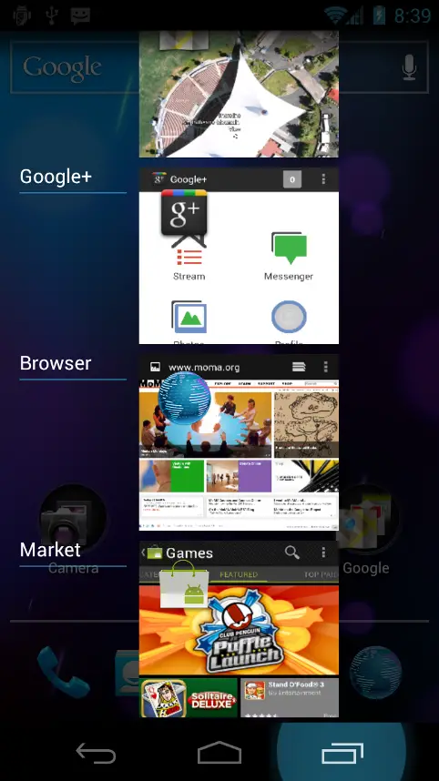
As I alluded to before, you switch between different apps by pressing the right-most button on the on-screen controls. You get a list of apps you’ve recently used and a snapshot of your latest activity within those apps. You scroll up and down to traverse the list and tap it to jump back into that application. It’s the same feature introduced in Honeycomb, but new to it is the ability to get rid of any of the apps you want. Just like with notifications, simply swipe the card off of the screen and away it goes.
Text Input and Editing
The Android 4.0 keyboard is more reminiscent of Gingerbread than it is Honeycomb, but it’s gotten some nice upgrades. Alongside improved text prediction, keyboard responsiveness and accuracy, Google’s added better text editing controls.
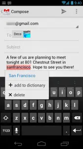
The tabs for moving word selections are back, but you can now replace selected words with the tap of a button. You can also drag and drop that word anywhere within your sentence if for some reason you ever need to jumble words around.
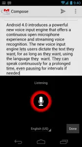
Perhaps the biggest change is to voice recognition and input. You still have a microphone icon to activate voice input, but you no longer have to get your sentences out in one breath in order to avoid pressing the button multiple times. If you stop on a certain word or section, it adds the words you said in real time and continues listening for new words until you specify you’re done with inputting text.
—
And these are just the things they talked about on-stage. It seems like there will be a lot more that hasn’t been revealed so already you can tell Android is a completely different operating system with this upgrade. Click here for our rundown on the core applications Google’s updated and included in Android 4.0 Ice Cream Sandwich.






When they said Roboto at first I thought it was gonna be a Siri alternative :P
You had to go to there. Android’s “Siri” is called “Google Voice Search” and it’s been in published and working for over a year. Siri is just a sales gimmick. Who REALLY uses voice commands anyway?
I use voice commands. I just don’t want my Phone to give me any lip. That’s what I keep women around for. Ha ha haaaaaa! chauvanism.
^Harvey Birdman: Attorney at Law
Bingo™
HAHAHAHA!!! Great comment and post =D
it really isn’t a gimmick…….
Harvy Birdman!!!!
when its all said and done it will be..most will use as they use google voice commands.
Steven Colbert uses Siri!
Yes. And curse it.
as someone who owns more android devices than you, (and a few ios devices) your dreaming.
siri is more accurate, faster, tells you more. I only use it in Google land for GPS nav.
Well, this honestly doesn’t seem like to huge a jump from what is currently on my Galaxy S 2.
Don’t hate.
Not hating, just sort of mentioning how awesome Samsung is. I can’t wait to see what Samsung does on top of Ice Cream Sandwich. :)
Google should hire the cyanogen team, and whoever is in charge of android over at Samsung.
Samsung already did hire cyanogenmod
Well, that explains quite a bit.
So basically, Google should buy Samsung.
I didn’t like the Galaxy S II, but this seems very promising.
What don’t you like about it? I came from the Droid 1 with Cyanogen mod, and I love everything about this phone. Except Samsung Kies. *shakes fist at Samsung Kies*
If you want Roboto TTF files, click the link below.
http://goo.gl/LMDoa
That’s interesting about dismissing individual notifications. I can already do this on my Fascinate running CM 7.1. I thought it was simply a new feature in Gingerbread, but apparently it’s actually one of the bells or whistles that the Cyanogenmod team has added. Nice to see it made it into the official OS now, because it is very handy indeed.
You know, a while back there was a report about some of the features they wanted to add in ICS not making it, so I was a little concerned that this was just going to be a glorified refresh of Gingerbread, and not truly worthy of the 4.0 version number. From what I’ve seen today, there is no doubt in my mind that this is a game-changer for Android. Up until now, the stock Android UI has left a LOT to be desired, resulting in a plethora of OEM customizations, third party launchers, etc. Now ICS is putting all the competition to shame.
You know, I’ve read blog posts about people who have “had it” with Android, and were ready to buy an iPhone 5, which never came. They then talk about how Google has one very, very tiny chance to convince them not to dump Android forever and switch to iOS when the iPhone 5 debuts next year. Well, I would love to see what those people have to say now after seeing this product launch. In my opinion, the Galaxy Nexus is to Android what the iPhone 5 should have been to the iPhone product line, had it actually materialized this year. Google and Samsung have really taken the time to rethink the whole user experience, and the result is awesome. Now, let’s just see if they are going to stick to their word about working with OEMs and carriers to ensure consistency and quick updates, as that has yet to truly happen.
It makes me wonder … if this is “not all the features they wanted” … what do they have in store for 4.1?
Well, seeing what they’ve got so far, it can only get better from here on out, can’t it? ;)
Ya I an interested in Molly Woods impressions of ICS to
Can’t wait to get ICS on my current hardware, looking forward to an upgrade next year (hardware that is) bet here will be 4.5 out by then. Why was there no 3.0 version for non “larger screen size” devices, was it just screen size adjustments coming from 2.3.3 to 3.0.
This is about STOCK having everything, and being DECENT from the GET GO! Not everyone wants to have to add and change system apps because the default ones suck. It’s what’s made Apple so sucessful, and I think Samsung with Touchwiz.
Interesting argument. I agree that the stock experience should not make everyone want to replace all core apps because they’re so terrible, but at the same time, I wouldn’t ever want to see Android prevent users from replacing stock apps, because no matter how nice they are, one size will never fit all, and end users will always want to be able to customize at will. I will be very interested in seeing the advancements made in corporate email functionality in the stock email app, but I highly doubt I’ll be giving up Touchdown anytime soon. This is where Apple falls short, because they don’t allow core app replacement, and you rely on one single company to fix any bugs or add any new features, which kind of limits your options.
Tmobile???
I want me a galaxy nexus..!
Jesus, ICS looks even worse than GB! One more reason to use HTC Sense.
You’re entitled to your opinion…even if it’s wrong.
LOL o god…….
I’m in love, this looks so great! I love Android!
I feel like It’s really dark. I love my green white and black accents. They should of made it an option.
Is it just me or did anybody notice how identical ICS’s UI is to Windows’s METRO ???….. the Layout…. the Colors…the Minimalistic style….???
Hell I’m just happy they got rid of the ugly green and replaced it with blue.
I wish we could choose the icons to place on the lockscreen ring. I think I’d like to have more than just camera and unlock. Not fill it up with icons or anything, but have a couple more.
ICS totally just cleaned the floor with iOS5 in my opinion. And while some have commented that iOS notifications borrowed heavily from Android, Google went ahead and upped the ante. Very exciting!
My only question is will my Samsung Galaxy Tab 10.1 (Wi-Fi Only) get ICS because I have Android 3.2 on it now…