The joint Samsung/Google event just came to a close and I must say — Google definitely stole the show. Ice Cream Sandwich seemed to propel the OS light years ahead of it’s predecessors and competition thanks to an all new overhauled UI implemented throughout the entire Android OS. One of the areas Google did a great job at addressing was the aging core apps. Now, they’ve been completely revamped unifying not the the way the apps look, but the way the behave as well. The same gestures found everywhere else in Ice Cream Sandwich will work the same as in these core apps. Let’s take a look.
CORE APPS
Browser
One of my favorite overhauled new apps is the Android Browser. The all new browser features easy a whole new way of tabbing. Tabs behave the same way as opening up your most recently used apps, being displayed vertically for you to swipe through or swipe to the left to close a tab. My favorite part about the all new tabs is how they can now be saved for offline viewing.
In a move that is sure to make a lot of Android/Chrome users happy, Google has finally provided bookmark syncing with Chrome which means whether you’re on your phone or desktop, you’ll always have your bookmarks easily accessible. A few more features Google added was an easy to click “request desktop site” option in the menu for when you want to see the full, desktop version of a site and the new “incognito mode” for viewing those special sites online.
Gmail
Our beloved Gmail app has been shown some love in Ice Cream Sandwich featuring an all new, UI and a new “action bar” along the bottom of the app for accessing your most used functions. Navigating through the app is done very much the same way as in the rest of the UI. Once a message is open, simply swipe left or right to move to the next or previous message. Skimming through your email inbox has never been easier. My favorite part? The offline function that can store all your emails for easy access of up to 30 days of email without any data connection.
Calendar
The Calendar app saw a revamp as well. Featuring that same consistent UI and swipe gestures for navigating. A new pinch-to-zoom function has also been added which allows for you to see a little or a lot of information on upcoming events.
Settings
The Settings app added a new feature with what Google is calling “Data Usage Controls.” Clicking on DUC allow you to see a full chart of all your data usage for the current billing cycle and even gives you a projection of where you’ll be at the end of the month. The data chart is fully interactive allowing a user to set a “threshold limit” using the onscreen bar that will cut off all background data for the month once you’ve reached a specified amount of data. While I like how Android is putting users in full control of their smartphones, I can see how this will be an extremely complicated process for soccer mom’s and Joe Schmoe’s.
Camera
The old and aging Android camera app has finally been revamped in Ice Cream Sandwich featuring zero shutter-lag for taking quick snap shots. Google has also added some features to the camera app like the always fun and functional, panaroma shot for taking sweeping pictures of landscapes or events. A few video features have also been added like continuous focus, taking video snapshots and even the ability to zoom while recording.
Gallery
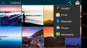
Editing photos has never been easier or looked better thanks to the all new and improved Gallery app. First off, gone is the 3D Gallery app and it’s been replaced with Android’s “magazine UI” featuring big, eye-popping thumbnails and displaying information like friend tags. Also built into the app is some light photo editing tools, giving users access to various “hipster filters” and immediate posting to social sites.
Contacts/Dialer
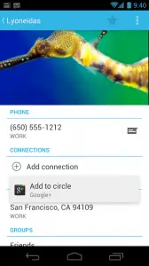
If there was one area I was always embarassed of Android — it was the contacts/dialer. Thankfully, the contacts or “People” app has finally seen a dramatic facelift. The all new People app features the same gestures found in the rest of the Android OS which the ability to swipe left or right to get to dialer, or call logs. My favorite part? The addition of high resolution photos for your contacts. No more blurry pictures of your friends and family when they call you. Google is really attempting to make the contacts application more than just a quick dialer. They’re calling it a “live window into your social life” thanks to social updates and “quick contacts.” Oh yeah — and they’ve also gone ahead and included visual voicemail in the call log “where it should be.” Also added was the ability to reject an incoming call with a text message and swiping gestures for accepting or rejecting a call.
The Rest
YouTube, Maps, Google+ and Music was also mentioned as receiving overhauls but weren’t shown on stage. As far as Android Ice Cream Sandwich’s all new revamped UI and system features, don’t forget to check out our overview of all that good stuff here.
As you can see, Google has done a great job at completely overhauling the UI and how we as Android users will, moving forward, interact with the OS. It’s a more unified experience and something Android has been desperately needing for a long time now. How do you guys like all the new additions?







I was hoping for better MS Exchange support. I want a Galaxy Nexus for work. To get that, it needs to be Exchange friendly.
its is already there…using MS exchange for my office mails on 2.3.3 SGS
Yep – how about letting Voice Search find Exchange contacts? That I’d like to see.
Speaking of contacts, the new People contacts list looks like a flea circus, not a fast way to look up contact info. Think you can turn off the pix? I know what my friends and colleagues look like already.
The photo apps look nice, though.
What kind of support? 2.3 offered remote wipe capability and the ability to enforce a PIN to unlock for Exchange email. I can also look up contacts on the Exchange server.
Where can i watch the entire presentation??
It’s beautiful. Fresh, new, and looks fun. It didn’t OMGosh me, but it put a honest smile on my face, and love for mobile devices. It’s better quality and performance in a sweet package.
looks really beautiful!!!
http://goo.gl/Adp3n
first info about update / upgrade to Android 4.0 Ice Cream Sandwich found here: http://goo.gl/HrLBp
Gingerbread 2.3.5 is now official available on KIES
found here: http://goo.gl/bcQyr
Samsung Galaxy S gets Android Ice Cream Sandwich, i don’t believe it but its seems to be true and not a dream!
http://goo.gl/L1qNl
LG Optimus Speed (called in Germany) will get Android Ice Cream Sandwich after Update on Gingerbread 2.3.4, which is available now!
found it here:
http://goo.gl/k2MSK and here: http://goo.gl/bqBEc
it is exchange friendly
DUC looks interesting. I use a free app for that but this built in app looks much better.
Many Android developers won’t be happy.Basically Google has stolen some ideas from the Market applications and squeezed them into new OS.
And Galaxy Nexus looks like Nexus S…..big disappointment
“looks like the Nexus S”? I think I need to get as high as you were when you typed that.
Pretty much anything Google adds to Android at this point is going to mimic some app in the Market., aside from features tied to new hardware (like the barometer).
What about the SMS app?
Was wondering about that, too. They kept the icon the same (still green amongs ICS’ blue, darnit!).
Probe, mi amici!
can’t wait for the OTA rollout for my Nexus S
As confusing as the Data Controls may be, they are much less confusing than the current “guess and get hosed on billing day” system we currently know and do not love
What’s confusing about them? Made perfect sense to me.
Will the droid razr be upgradable to ICS???
Of course! When motorola decides to release the update for it.
In the photo app the pictures are a bit to big, it shows less photos on screen compared with gingerbread so you have so scroll longer on the 100’s of phones we all have. Should give us the option of LARGE, medium or small, we need the option not google to tell us we need large photo icons.
The dev community might be able to help us with that.
I think there may already be a pinch to zoom out option, that might not have been presented on stage. Don’t count your hens until they hatch.
COMPLETELY agree. No privacy either, everyone in a 15 foot radius will know who’s calling. Pinch to zoom sizing would be even better, all the “tiles” could “snap” into all the possible sizes as the photos fill the screen. i.e. as you pinch the tiles go from 4 across, 2 down to 6 across, 3 down to 8 across, 4 down, etc…
As a new Android user, I’m very happy with this update. I’m more of an ascetics kind of guy and their new font system, Roboto, looks VERY elegant and clean (despite the moniker, though it goes with the whole “android” idea). Seems like they took cues from Microsoft with their Metro UI on this one, which is fine by me. Looks like stock Android is going to be perfect for the masses. I’m also glad they only have three “buttons” on the bottom – and how they’re integrated on the GALAXY Nexus. I hope more phones do this and forego physical and capacitive buttons.
An interface as attractive as this will look great on a tablet. I see great things happening with Ice Cream Sandwich in te coming months
“While I like how Android is putting users in full control of their smartphones, I can see how this will be an extremely complicated process for soccer mom’s and Joe Schmoe’s.”
As long as soccer mom’s and Joe Schmoe’s want to pay big bugs for generous data plans, they needn’t worry about this. But if they want to keep their monthly bills down, they’d better figure this out. Honestly, this doesn’t look complicated at all. Ordinary people look at graphs all the time, you know.
I’m curious to see if they’ve improved enterprise email support and VPN support. Also really excited to see the google chrome sync (finally!). That’s been on my wishlist for awhile. ICS looks to be pretty awesome, some much needed improvements throughout.
What about the SMS app? Any information…
Looking very, very forward to the holding some new hardware, and clicking through this new ICS OS 4.0. Hooray for the Google programmers as they continue to combat against Apple iOS and their wonderful shinny gadgets!
I just gotta say: EASY SCREENSHOTS!! Yay!!
I’m loving ICS so far. Too bad I can’t have it though :(
can you do the update for ic sandwich if your DInc2 is rooted? will you lose root?
how do you get the update?
or should i just wait til someone smart makes sure it works ok? LOL
thanks!
found NEW!!! interesting stuff about Samsung Galaxy S3
http://goo.gl/8fVKo
enjoy!