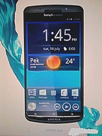
Looks like Sony Ericsson’s dialing in the next generation of Xperia products, if this blurrycam wonder is to be believed. It’s apparently the Sony Ericsson Xperia Duo, a name suggesting this phone will be a dual-core beast. The bezel here is ultra slim and takes a different approach to design compared to Sony Ericsson’s Q1/Q2 lineup.
It’s a largish device, at that, looking like it could be a 4.3 inch monster. And there’s a front-facing camera, in case you couldn’t tell. It’d be a welcome addition from Sony Ericsson who is changing public opinion of them as each day goes by, but the inability to get half of their lineup for first half of 2011 out is worrisome – how do we know this one will even see the light of day? We’ll remain positive, though, because we want to get our hands on this thing sooner or later. [PocketNow]


Sony Ericsson always makes the sexiest looking devices. And it definitely applies for this one as well. I bet that fits nice in the hand for a 4.3″ device.
Like some specs, and release date.
that bezel is awesome
That *lack* of bezel is awesome.
That would be the first non-fugly Android phone by SE. (Except the Arc, which looks quite ok).
Are you kidding? That looks even uglier than the Arc. x10, imo, was and is the best looking Android phone out there. Oh well, opinions etc.
Yea opinions.
As for me, I don’t say anything against plastics, because synthetic materials can have very beneficial properties.
If it looks like carbon fibre or is rubberized or has a matte finish, it can be even pretty.
But whenever plastic is supposed to look like metal (i.E. silvery shiny) it looks cheap and ugly. Thats the main reason I found SE Android Phones so hideous.
But that’s my personal Opinion.
Such an ugly phone couldn’t be designed by SE. Fake.
Why when I saw that bezel was “Apple lawsuit” the first thing that ran through my mind?….thinking about the mockups Josh Topapplesky cooked up to try and remain relevant after his exit from Enapplet.
I think that no bezel at all on the sides is a little too much. I like having some non-screen to grab onto.
Love handles? o_O
I agree. The Nexus One has plenty of bezel and plenty of non active glass and my non-fat fingers still manage to cause problems when a portion of my finger is hanging over the screen (double touching.)
This seems like a design flaw in product design. How do you hold it?
Lmao, this is obviously photoshopped…. The left side bezel is smaller than the right. The buttons are unnaturally small. It is made blurry to purposely lose out on detail.
If you guys think that that phone is real, then you think that this one is real too, right? http://www.concept-phones.com/wp-content/uploads/2008/12/htc_g2_6.jpg
I think it looks like decent design. I just don’t like Sony Ericsson’s history of delivering devices far past the point at which they were relevant. That being said, they make high quality stuff.
i don’t get this dual core trend. The single core phones like the Nexus or Desire are still kicking it without problems.
http://goo.gl/1L6aC