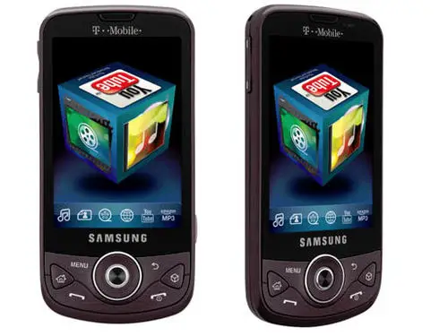
The Samsung Behold II sounded like an ordinary Android phone when it first peaked its head from the depths of the hidden mobile phone world, but soon after learning about the new device, we learned something even more peculiar about it: the Behold II would be the first Samsung Android phone to house the TouchWiz interface (which already has its own implementation on select Windows Mobile phones).

Even more enthralling was the fact that Samsung went with a completely new direction with the Behold 2’s TouchWiz, bringing us cube-based goodness for navigational purposes. For a long time, this was just imagined in images and snapshots of the phone, but Tmonews was blessed with a video from one of their sources that shows the TouchWiz interface in full action.
Don’t be alarmed, the choppiness that you see is because of the poor quality of the video itself: the source assures everyone that the TouchWiz interface is in fact very smooth and usable in its current state. Overall, I’m not sure how I feel about this yet. Being a Linux user, I’ve had my fair share of cubes. While cool, I’d hope Samsung would give the option to disable the cube altogether, as I’m sure it won’t be practical for everyone (giving users the freedom of choice is never a bad thing, either).
What do you guys think about the TouchWiz interface? Feel free to talk about it in the comment section!


I’m switching over to Sprint in a couple of weeks and I was talking about this with a friend.
The Moment should have incorporated something like this with the user allowed to enable/disable it.
Compared to what’s out there 1.5 is just ugly now. LoL
It seems like samsung uncovered on the the main issues that nonandroid users face the first time they have it: the os might be too complicated for them, so samsung went ahead and “simplified it”. By simplifying i mean those fixed menus and the cube, that basically help -force- you to not get lost and find the main features of the phone. However for the more experienced android user, this whole touchwhiz UI is BS!!
I think it looks kool, but in practical application it is more of a hassle than anything else to have to rotate a cube to get to your video, or messaging, or web browser
It seems like the bottom of the screen shows a bar with all six of the cube shortcuts. This would be much easier and faster than trying to find the shortcut you’re looking for on the cube itself. Why even have the cube at all when you’re going to have direct access to the six shortcuts anyway?
The cube seems to be a case of “change for the sake of change”.
i honestly would never want this on my phone.
Nice find with Touchwiz! I am not sure about it- it seems really gimmicky, and not practical. Its a lot easier to just use a menu.
Still customization is good!
I am betting that the sdk they released and the custom widgets that are created will be compatible accross all the samsung platforms.
Honestly, can I just get a nice professional-looking Android phone on T-Mob? This TouchWiz thing screams tweeny to me and I’d never use it anyways.
I’ve had my G1 for over a year now. It’s a nice phone, and it’s presentable. But as I’m looking to upgrade over the next year I’m going to want something that I can really show off to business partners and my friends. No offense to HTC or Motorola but I would not be caught dead with the myTouch or Cliq.
Oh and leaving T-Mob to get the Droid is out of the question. T-Mob’s deals are far too good and their service is always impeccable where I live.
Samsung, have you been seeing these comments? This has got to be by far the most disgusting user interface I have seen on a phone. If I ever picked this phone up, the first thing I would do is strip out the TouchWizUI.
How much longer will T-Mobile users have to wait to receive a decent looking Android device with impressive specs?
The cube is a novelty. It’s cool for about 10 seconds, and then it’s just in the way. Perhaps it’s a bit more functional in this as opposed to the Omnia II, but when I played with it in the Omnia II emulator online, it struck me as being something I would never, ever use if I owned the phone. On that phone, it’s also virtually pointless, because there are buttons at the bottom of the screen for each of the 6 functions on the cube. Why spin the cube hunting for your app, when you can just press the button that’s directly on the screen?
the cube is fucking stupid. has our attention span for reading fallin that low?
I’m with Geoff. While I don’t think I’d quite bash the Cliq so hard I have to agree. T-Mo is all about the tweens with everything they do. Their plans are way better but you end up looking like you have a kids phone at work. But then that kinda goes back to the OEM’s. Why do they make these corny looking phones. I don’t think the IPhone looks tweeny but the kids buy it. So why make these kiddie looking phones to begin with. T-mo has got less than a year to give me something to upgrade to or I might be headed back to Verizon. My wife is already itching to go to shed the whole tweeny feel of T-Mo as a whole. It was ok in college but now in our 30’s…..
This UI is stupid most def.
I’m agree, I’m really hoping and waiting for a sensible phone, with a 4 to 4.3″ inch screen, running Android with useful UI, not something to show off for a few minutes that will eventually get annoying.
And can we also get UMA…. oh to dream.
Not to sound like a broken record but TMO’s Android strategy is clearly putting out a ton of cheap, crappy phones while the competition focuses on fewer, and MUCH better phones. Isnt the RAM on this thing even less than the MyTouch, which has the exact same RAM as the ORIGINAL Android phone? I mean who the hell is in charge here? Looks like Ill be buying my way out of yet another contract. And I im not even going to comment on the Samsung’s “UI”
Wow I thought I was the only one that though t tmobile was making the dumbest decisions on phones. Tmobile is so fucking stupid. How the hell you let verizon come out with eris and droid while we get the cliq. Are u fucking kiding me.I’m 30 years old I could give a damn about social sites. I want a beast of a phone. Them punks already took away the option of using our smart phones as modems. I so want to cancel my service with tmobile because they are disrepcting its older bill paying patrons like me. I think they have a room full mokeys choosing there phones at tmobile. Because no one with a brain would choose a mytouch over an Droid.and now they try to come out with the behold 2.with that wack ass ui. Damn I wish had a HTC HERO! But I don’t want to cancel my service. But I’m on the verge of doing that and taking the etf. Atleast I know with the other companies they come with the best phones.they don’t play around with the customerd and come out with dumb shit like mytouch,cliq and now behold 2. Tmobile is trying their best to be the worst mobile company.doming out with sub par garbage.
This phone is horriable! I cant believe Tmobile puts out another “Toy” android phone! I may become a Verizon Wireless customer after work today (DROID)! So….Tmobile if your listening, come with a real phone next time not a toy..MOTO Cliq, Behold 2, NO THANK YOU! I DONT LIKE SKIN ON MY ANDROID!!
The lady I talked to at T-Mobile today tried to sell me on the Behold 2 saying it was just around the corner. It looks fairly nice and all.. (but I just placed my order for my new Droid). Sorry T-Mobile… but I just couldn’t resist.. and I just couldn’t wait for a GSM Droid or Dragon.
cube looks like shit, no thx.
TMO had better get the Dragon, or I may look into other options.
you all sound like a bunch of whiny bitches cube this cube that don’t buy it no one is forcing you. One carrier will always have something the other one doesn’t ,that’s the way of the market.If you want it all ,then your gonna have to be a little patient . Android is still a baby so, we are lucky to even have the hero or droid or the G1 for that matter this time next year you will see some serious handsets. Things are just getting started so , either your down for the cause or go be a poser with some other OS and stop all the f!@#$ weeping!!!!!
New to TMO and already having a hard time not switching to Verizon. I agree TMO needs to grow up and start playing with the big boys. They have great customer service and plans, just lacking in high quality professional phones ATM. I am desperately waiting for a decent Android phone. Surely TMO MUST have something in the works! Dragon?!
As for the cube, who thinks this stuff up!?! BUT, my friend works for TMO and they already have the phones in stores. The cube is ONLY used when you go to media. It is NOT used for your home screen. And the screen is incredible. So dont knock the phone until you see it in person. I will probably pick up the phone while I wait for something better to come along. The screen alone is worth it!
3d interfaces suck.
No current OS uses it and with good reason.
The movies make it look cool and useful, but in reality it’s ugly and a pain in the ass.