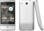
Love it or hate it, all HTC Android Phones thus far have come bless.cursed with a little Jay Leno action. But the most significant chin to date has been the one on the HTC Hero:

But if the rumors and photo leaks found on 8080.net are true, Sprint’s version of the HTC Hero could be much more Letterman… no chin at all!
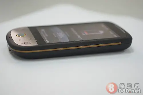
Are you kidding? Is this possible? The folks who leaked the images swear thta this is the same HTC Hero200 that just passed the FCC and is headed towards Sprint in the upcoming months. If this is true I’m sure it’ll create quite the storm of opinions in the comments as people tend to either love or hate the chin. To be honest, I think more people hate it… but that’s just my guess. Personally I like it but don’t have an intense feeling either way.
Many more of the pics found below!
They can swear and promise up and down all they want, but I’m not so sure that this is actually the Sprint HTC Hero. The differences are so blatant and obvious that you would expect HTC/Sprint to bring this to market with a completely different name. I know you’ve got an opinion about this so let us know what you think!
[8080.net (English) via EngadgetMobile]

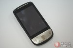

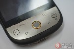

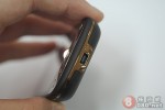
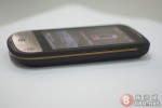






I dont know what that phone is, BUT I WANT IT! it looks oh so good.
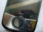
I dont like it and the 4th image isnt even the same phone.
At first I loved the look of it when I first saw it on that Chinese site earlier tonight. However, after further inspection I actually much prefer the design of the original Hero. It has more of a unique, one of a kind feel. This one kind of just gives off a “been done before” vibe. It looks nice, but it’s nothing special. That said, I will take whatever flavor Hero Sprint throws at me.
Wow that’s nice. I’m a fan of the chin, but I’m not opposed to not having it either.
Personally I think the chin instead of what cnet and most other places claim its purpose is (to aim the mic closer to the mouth) I think it serves to protect the trackball on flat surfaces and the screen as well. Idk I like it enough.
This is the phone I’ve been waiting for: a phone optimized for google apps with a great camera, and Sprint’s 3G/4G networks. I like the looks a lot but I hope they also have a pink version for my wife, we will likely get 1 for each of us and it would help knowing which phone is which.
that’s what the mytouch should have been!
Seriously? Screw that!! I LOVED the original Hero design, I do NOT like that fugly thing in those pictures. I don’t even give a damn if it had a physical keyboard, I want the original HTC Hero that the Brits got!
Down with that grotesque thing, up with the original!!
on the 6th image, it really seems photoshopped. i mean the phone part is clear but the screen is really blurry. anyone agree with me?
I personally like the chin but hate the buttons. The new design has much better buttons but missing the chin. I’d go with the latter if I had to pick.
I like the chin because of the way it protects the screen from upsidedown-surface scratches, then again don’t drop anything heavy on it or it will go skywards faster than GOOG stocks.
So is sprint launching 2 phones from HTC in the month of Sept? The TOUCH PRO2 on Sept 8th via sprint.com and telesales. Then the Hero at Best Buy on Sept 15th? Can this really be possible?
That design is horrid. It gives absolutely no identity to the Hero, and it seems a rehash of some of their old winmo phone designs.
The original Hero oozes uniqueness!
Well I kinda like both. I like the chin per se but not the buttons on the original Hero. Especially this weird rocker switch – who would put Search and Back on essentially one button?!
Anyway, I’d like the best of both worlds here… but I guess I’m not gonna get it :D
Oh and Gene is right. The 4th image is that one Windows Mobile phone with footprints (look at the buttons!). I forget the name. You better get rid of that picture immediately, Rob! Windows Mobile??
Hate it. This isnt the phone I’ve spent months waiting for. It shouldnt even have the right to be called a HERO, but more like a ZERO. I looooooved the look of the ORIGINAL hero, even the chin ;(..
If they took the time to redesign the case, maybe we will get rewarded with internal hardware refinements and upgrades.
Well, I dont know if i like it, I definately dont think this is the one, notice on some pages how the bottom is different, one pic looks like touch pro2 bottom. Just a hunch but i think sprint will change, but not this much gang.
If Sprint releases this nonsense of a Hero design, I’ll import a real HTC Hero and deal w/ T-mobile 2G speeds. fail.
Yeah this looks exactly like something Sprint would carry. Looks a little too much like the Pre to me. Not that I dislike the Pre but who wants a different phone that looks exactly like another phone?
Come on the third pic of this phone is not even the same as the rest it has different buttons and a SCROLL WHEEL. FAIL FAIL FAIL
For Martin, Robert Olsen, etc. The original article was showing similarities between the new hero button config and another phone, that is why the picture is different. It is tough in this day and age to find any of the original articles. It is over at 8080.net, needs translation.
I think that this phone is exactly what I was wanting to change, except I don’t understand the gold trim? What the EFF! I didn’t like the chin and was hoping it would be toned down, so it wasn’t bulky in my pocket. I was hoping that they would have kept the white, it was smooth all around, now the camera is set off in the back and the speaker is larger around it….could be good for sound I guess, but I liked the clean lines of the white version (minus the chin).
yeah, also I agree with some above comments, several of the photos look photoshopped. In the sixth image, not only is the screen blurry but everything else really in focus, the line between the aluminum surface and the black screen isn’t straight….it is wavy, which a phone wouldn’t have, it would be straight as an arrow. Potential shenanigans afoot.
I’m on my second chin now. Started with a G1, now on a Hero. Feels wrong not to have one now. IMHO The chin made the trackball easier to use with one hand.
Brushed metal and matte finish look superb!
I would almost be prepared to ignore Snapdragon for this look… sweet
Nah, waiting for Snapdragon…
Personally, I hate the chin, and the Hero has the chinniest chin of all. Not to say that would ever prevent me from getting the phone(I still love my G1), but if this new phone does turn out to be the same as the original Hero except the form factor, I’d take this new one hands down. Even chin aside, it just has better aesthetics.
Personally, I like this redesign, but I’m still waiting for the InstinctQ.
Maybe if the colors weren’t fugly this phone would be purchasable. I was super stoked for the European form factor. I hope this is shenanigans.
It looks soo much better that original Hero!
Pic sprint-htc-hero3 seems to be a completely different phone…..No trackball and different buttons….and one of the buttons looks like GNOME logo ;-)
If the other photos are indeed the new Hero for Sprint, I personally will be disappointed. I think the original with the chin and all looks much better.
Guys, this is clearly photoshopped lol I would not worry about it. Look at this image in particular:
http://phandroid.com/wp-content/uploads/2009/09/sprint-htc-hero5.jpg
Look at the edge between the the buttons and the screen. Don’t be duped.
I loved the original HERO, chin and all! This looks so generic! It is nowhere near as sexy as the original! Other than the gold trim, it looks like any other piece of sh!t phone on the market. If this is the Sprint version, BOO SPRINT!!! HOORAY BEER!!!
UGLY!
The original design is much better.
I recall a video with Horace Luke of HTC discussing the button placement on the Hero. On the video he mentioned the search and back button placement had more to do with where the radio was then an aesthetic choice. Maybe the chin had to go to work in the CDMA radio?
Whatever the hell that phone is, I hope dearly it’s just a concept. The original Hero has the most striking appearance of any android phone yet, and frankly looks better than a lot of phones, iPhone included.
I pray that Android in the US isn’t dealt another blow by having the most promising phone yet, the Hero, come in some nickel-plated knockoff design.
the one in the fourth pic looks like the “iolite”
http://www.aboutcellulars.com/htc-cell-phones/an-unofficial-htc-iolite-comes-with-rumored-specs
So why could this not be the HTC Desire? I mean I know the gentlemen who snapped this was so trustworthy and all (seeing as he leaked this phone) but doesn’t it seem to make a little more sense that this is a different CDMA HTC Phone?
http://phandroid.com/2009/09/01/htc-desire-ungimped-verizon-bound-android-phone/
I mean I know Phandroid said they think the HTC Desire is Google Branded, but that may not be right, or maybe this is a pre-production model that doesn’t have the branding…much like it doesn’t have carrier branding (yet).
Ooooo, Thank God, Sprint’s version looks different than the GSM version. I didn’t want ppl think I have a sprint phone, plus I don’t want wat other ppl have.. IDC, the chin on the original HTC Hero does not look that bad at all. Plus you’ll get better signal since the chin sticks up and the antenna is located at the bottom of the phone.
the original is much better. this version busted. I hope sprint won’t have this version, if they do, I might have to go for the iphone, cause I’m tired of waiting.
man i hope not. that thing is sinfully ugly.
The original hero is much better looking. That sprint thing is damn ugly. Seriously, a black exterior but with a sliver faceplate around the bottom half?? Not to mention the ugly gold stripe around the side? Welcome to the 70’s…
As for the overall shape it resembles the Magic more than the Hero. Although I don’t think this phone is ugly I like the original Hero design much better as it’s got more personality and uniqueness.
Plus I hate gold color on any device, actually makes it look cheap and tacky.
As a whole though I wish HTC would make Android phones resemble their WinMo phones more, as I think they have a great look.
I like the new design better, not a fan of the chin.
omg so ugly, mabye its the color i dont know but i hate it
Maybe that bottom half of the phone is covering something up maybe? doesn’t even look like its a real part of the phone.
This is not the HTC Hero for Sprint. The pictures provided shows two different phones! Dont believe the hype! Sprint will see the same Hero as we have seen since the HTC press event in June. This phone is quite ugly & looks more like it would fit into Verizons line up more than Sprint and at this stage in the game, dont you think it would be branded w/ a Sprint logo if Best Buy is gonna be offering pre sales in 14 days?
it look ok but i want the other HTC Verison
as long it has the same feature im good but they could make a little bit better
this phone look’s just like the HTC Cruise.
I used to hate the chin… but I actually like it especially with the white version… it makes it unique.. this one makes it look like any other smartphone in the market .. Galaxy, touch diamond etc…
I agree with some of you. The phone is ugly, and there is no Sprint branding on it. That doesn’t seem right for a phone that is near release. The fact that it looks very similar to the Cruise/Iolite is odd too. Perhaps the next iteration of the Cruise will be Android-powered rather than WinMo.
I definitely prefer the original design. I wonder what color options sprint will offer… (black only?) I hope any alternate versions retain the original Hero’s teflon coating. Also, for those thinking the pics are photoshopped, look closely and you’ll notice that the wavy line beneath the screen is present in the other pics as well. With that in mind, I don’t think it’s photoshopped so much as I think the metal faceplate was just poorly cut for what appears to be a concept or prototype device.
I personally don’t like it because it looks like the same crappy design of the diamond with that handicapped dpad area. the buttons don’t have individual push and work on a touch area. If this is the case I am not getting it.
I want special coating on the white hero. I like the regular hero.
Personally, I’m NOT getting the hero if THIS is the redesign. I think this thing is truly UGLY. I’ve been waiting anxiously a long time for the HTC Hero to come to Sprint and there’s no possible way I would buy this phone, with this design. I like the original and from what I’ve gathered from multiple sites, it seems that more people are sharing my same views. I’m not going to get pissed, considering this has been confirmed, but I’m hoping that Sprint will release the original version and not this ugly thing. This is strictly my opinion and I’m in no way, shape, or form trying to speak for others.
Edit for above post:
I’m not going to get pissed, considering this HASN’T been confirmed, but I’m hoping that Sprint will release the original version and not this ugly thing.
that phone looks like crap, this can not be the phone because the pics are not even the same phone. plus the people from htc are not that stpid to just throw away there famous chin on the phone, thats half the reason that most ppl like it. because it looks like a g1
If this the sprint hero, than I am getting an iPhone.
I’ve been waiting since June for the hero.
This design is sht. The chin is so distinct.
F that! original Hero look all the way.
chins are horrible…..why do you fools like the original hero?
ugh
three cheers for the chinless design
@Dman:
Well you have to remember, some people like having something distinctive and not “like every other phone out there”.
While the chin on the original model was a turnoff for some, there were MANY people that liked it, including myself.
When I first the original, I thought it was weird, but it grew on me fast. This design looks like something someone just threw together at the last minute.
Seriously, a GOLD trim to go around the trackball? Come on. It just looks cheap and in all honesty, I wouldn’t even pay for that phone.
That’s just my opinion, but hopefully Sprint does their homework on what people think about this design and will decide to keep it the way it was.
I was looking forward to getting the white version with the Teflon coating, not a ugly phone like this. Everyone has a right to their opinion, but this thing is UGLY.
Im a fan of the chin but where is the flash on the camera on all these HTC android phones??
@ CircleofGod, i agree ^^ and hopefully it wont be a $300 dollar phone (including the rebate)
i like both phones either way….like they both have their own ups and downs but if this is the CDMA version of sprints htc hero then where is the sprint logo??????
Sprint will be getting the HTC Hero. It will be called the HTC Hero. It will not be the huge chin version. It will either be a no chin, or a slightly smaller one.
Riddle me this. How com its not on HTC Products page then?
http://www.htc.com/www/product.aspx
@ chubbunny or chubby bunny or whatever the hell your name is. Can you not do research? How the phone is $179 after rebate?
@Disorderlydj
so let me get this straight, You’re going to get an iPhone because the Hero doesn’t have the cosmetic design you wanted? Are you effing kidding me? That is so retarded.. Sorta like your family. lol
Go get the iPhone.. They’re shit already. Old news, trash device. and say all you want about me wanting the iPhone, I’ve had all 3 of them and they all suck. lol
i can’t believe how much uglier sprint’s hero is than the eourpean version! i was really excited to get the phone but no i question its appeal. If sprint doesnt change the look back and maybe just gets rid of the ching but keeps the square like edges a lot of customers will be lost especially if it only comes in that ugly grey!
The new design looks horrible. First it comes out on Sprint and now the design has changed. I could care less about the software. Software can be modified and ported over to other phones, but the design of the original Hero is what I wanted. Now I am not so sure if all the waiting I did for the Hero was worth it… Thanks for nothing Sprint.
What’s so funny about this is it was actually announced a couple days later… which i have not read comments from above so someone probably mentioned what I said. I like sprints version.
If I purchase the original hero, will I be able to use it on the sprint network?
I prefer the original design. The sleek white design reminds me of Apple laptops. I’m not a big fan of the “chin” but I think I could learn to live with it. I find the Sprint version horrid. I think that the curved design looks cheap. I actually prefer the arrangement of the buttons on the original design. I think the worst part of the new design is the metal (or metal-like) exterior. I just don’t like the contrasting metals. I wish sprint would stop adding orange/gold accents to phones (such as the HTC Touch Pro2.) I’ve looked at pictures of this phone on other websites and even though they look better, I still hate this design. I really don’t see it as appealing to women. This phone looks like it belongs on a construction site not in the hands of young hip users.
no chin FTW. you guys are nuts. the chin is fugly.