
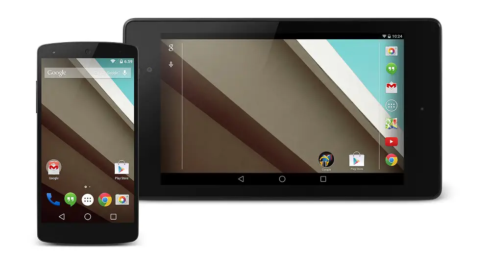
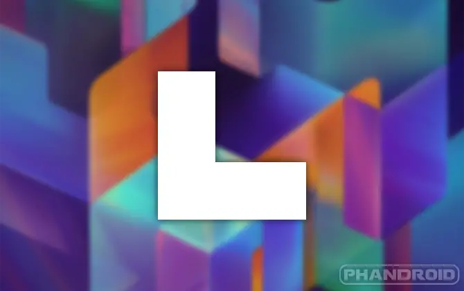
Tomorrow is the big day for Android L, the next version of Google’s mobile OS. The Developer Preview was announced today, but no one can use it until tomorrow. What exactly does Android L add? Well, for starters, it has a completely redesigned look. The first big redesign since Android 4.0 Ice Cream Sandwich. The redesign is a big deal, but there is a buch of other good stuff, too. Check out this handy list of new things you can expect in Android L.
Material Design
The new design of Android is all about getting it ready to be on many different types of screens. The UI is super responsive to whatever orientation, size, or device it runs on. It’s colorful, bold, modern, and sleek. We’re not fans of the new navbar buttons, but everything else looks spiffy.
Better Multitasking View
Google has added something they call “Document-centric Recents.” This means when you press the multitasking button it will show more than just recent apps. It will also show the tabs you have open in Chrome, and other tasks that can be flipped through. This will make it easier to pick up where you left off.
Better Notifications
Notifications will now be shown right on the lockscreen without even having to swipe down on the notification drawer. users will be able to control what information is shown on the lockscreen, so no need to worry about sensitive notifications. New “heads-up” notifications will pop-up above whatever you’re doing.
Project Volta
From the makers of Project Butter comes “Project Volta.” This is new tools and APIs to help apps run efficiently and not drain battery life. This is a very important project for Android. Some apps just consume battery like crazy. Volta should help fix that.
Android Runtime.
In Android L the Android Runtime (ART) will be the new system default. ART offers ahead-of-time compilation, efficient garbage collection, and improved debugging features. Google says it will improve performance of a device with no action required by the dev.
The Rest
Bluetooth Low Energy Peripheral Mode will allow apps to broadcast their presence to nearby devices. Multi-networking will allow apps to work with the system to dynamically scan for networks with specific capabilities. A new camera API will give users the capability to YUV capture at full 8MP and 30FPS. it will also bring raw sensor data to Android. Last, but not least, is 64-bit support for apps.
We will learn much more about Android L by the time it gets a full release. We can expect the update to start rolling out to devices this fall. Hopefully by then we know what the “L” stands for. What features are you excited about? Do you like the new design?


those navigation buttons look like a horrible idea.
the current icons clearly show what each button is for.(an arrow pointing back, a home, and 2 windows)
the triangle still vaguely resembles a back arrow, but a square and a circle don’t really make me think of “home” and “multitask”.
Agreed. Everything else looks pretty nice though.
seems as the same concept with the Playstation controller. how they add the triangle on the side, (back) Circle (home) Square (MultiT.). really not all that hard to understand. perhaps for a very new user for android but, pretty common sense for current users.
Yeah, when I tap on my navbar buttons I don’t have to look at the pictures to figure out which one does what, but I still don’t want a picture of lamps for my home button. The circle that android L has is no more related to “home” than a lamp.
Come to think of it, there are lamps in my home.. I see no giant floating circles around me.
“Go to your home ball. Are you to good for your home.” That home is circular.
Goldfish often live in circular bowls.
even having used android for years and being good at adjusting to new interfaces/operating systems it still took me a minute to figure out what each button does.
and I know that the navigation bar is supposed to have a back, home, and multitask button.
someone without that knowledge would never be able to guess what the buttons might do, while the old icons would still make some sense.
and playstation controller buttons are different from standard android buttons.
playstation buttons have a lot of different users depending on the game you’re playing.
but the back button will always take you back a step, the home button will always take you to the home screen, and the multitask button will always show the recent apps list on android.
I don’t care for the new buttons either, but there’s there’s a simple solution if you don’t know what the buttons do… try PRESSING them… their purpose will become apparent. Heck there’s only 3 buttons, so it’s not like a Gravity scenario with tons of buttons in Chinese.
This is very true, but what’s wrong with if it isn’t broken don’t fix it?
Like I said, I don’t like the new buttons either, the current ones are fine.
Agreed, theyre in the same place as the old buttons. I dont know how anyone with half a brain would be confused. And youre right, they can just press the buttons and figure it out without wasting any thinking about it. Really ? do they need a icon to be shaped like a home to know its home…sheesh. When there were physical buttons they were round, and rectangular yet no one complained about not knowing what it was for. Sometimes i think people just need something to complain about.
What is wrong with the house icon depicting “Go to home” functionality? I think it is very intuitive a good UX design. Most physical buttons
had icons on them as well regardless what shape they were.
I agree with @Trent that if it isn’t broken why fix it?
However at the end everyone will have to get used to them anyway. I think radically changing deging of the buttong is a stir in a different design direction and we’ll likely see more
simplicity and abstraction in the coming versions of android.
I work in usability and user experience. If you don’t know what something does until you press it, the design is an utter failure by a terrible designer.
I like Android a lot. I like Google a lot. But Google’s interfaces are uniformly terrible. This is no exception.
They hired Sony to make the buttons. lol
disagree. The triangle also points back
The home….home? what is home even on a phone? Homescreen? :S Just because we know what it is, go explain to your grandpa why it is called the homescreen…a circle (to circle back to where you started from.
The current recents menu button is or multitasking button….go explain that to a new to smartphone guy…the square looks the part (click it and you will see squares/windows of open apps)
Now helpdesk personel can just say, click triangle, square or circle instead of click the multitasking button….uhh which one is that? the one on the right depending on what phone you have :S
Yeh, gl with that. I for phone think these new icons are great
Chrome tabs in recents will be a nice feature. I often press recents instead of pressing the tabs button in browser by accident when I want to change tabs.
What happens when you have 70+ tabs open? I sometimes forget to close tabs. I get to a website via G+ or some other app and then go back into the app and do not close the tab.
Maybe the tabs will be grouped in recents by app and the tabs fan out horizontally
I wonder why the N5 status and notification bar is transparent but the N7 is black. Themes?
I think the N5 has that Google Experience Launcher built in right? anyone?
Oh yeah that’s it.
There was a slide shown that had about 50 keywords that listed a crap load more new things than the list above.
Like the material design and everything they introduced has potential, but I want to see that list of all the other features. Also I wonder of there still is a notification drawer and how that is. Still no physical volume controls for non bluetooth headsets and android wear doesn’t control volume, neither does google glass. One of my biggest gripes against android.
The floating button isn’t the beat idea, in G+ it isn’t immediately obvious.
I love the idea of “heads up” notification and lockscreen notifications similar to the iOS notifications.
everyone is complaining about the new navi buttons…. the home button for iOS is a circle, you dont see them complaining. Its a button ppl, a button
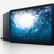
Why is the app drawer button different on the phone and tablet? and what tablet is that? It has better bezels than my Nexus 7 2013.
I’ll be impressed when they move the stupid nav buttons back to the left where they belong.