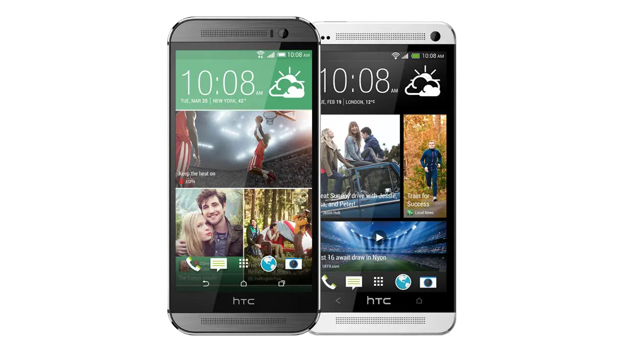
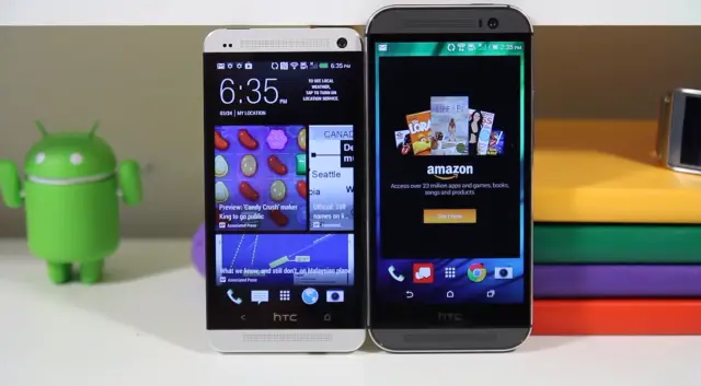
I don’t think anyone would argue with the fact that the HTC One M8 is one of the most gorgeous, borderline sexy, smartphones to date. Featuring an aluminum unibody construction, it’s clear HTC takes the design of the smartphones very seriously. Maybe that’s why for some, it was puzzling to find that — despite the One M8 adding software buttons for 2014 — the smartphone is drastically taller than last year’s model.
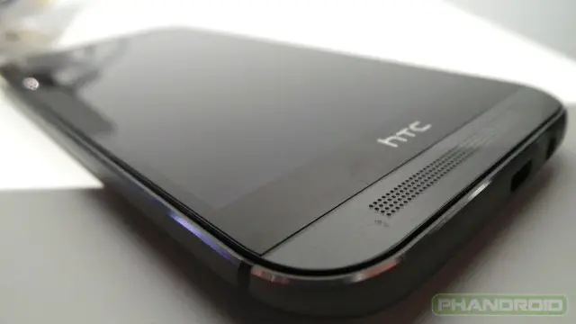
We’ve seen it mentioned in our comments that HTC possibly could have made the entire device smaller by simply eliminating the infamous “black bezel bar” found towards the bottom of the display. It’s a criticism that seems to have made it’s way back to Jeff Gordon, HTC’s global communications manager.
In a public tweet from his Twitter profile, Gordon addresses comments that HTC could have simply removed the black bezel, making the overall height of the device smaller by saying:
That black area with the HTC logo on M8? Underneath is a huge amount of circuitry, antennae, etc. It’s not “empty” by any means.
— Jeff Gordon (@urbanstrata) April 1, 2014
Okay, so we get it. There’s actually stuff behind the black bezel. And while we wont argue with Gordon that the phone — which has not doubt seen countless revisions by engineers and designers — couldn’t possibly have been made any smaller, is it also possible the display could have been stretched out to “cover” the area where the bezel lays? Gordon claims that by stretching the display, it would have screwed up phone’s aspect ratio. This is true.
But perhaps the real problem lays in the HTC opting for software buttons on the M8 (which we admit, are just following Android’s design guidelines). It seems that, in trying to address complaints about the original One M8’s odd 2-button layout, HTC plugged up one hole in their dyke, only to find a new one spring forth.
For some, you simply don’t get the hoopla being made over bezel-gate 2014. And that’s fine. For others, we’ve reached a point in mobile tech that all we have left is to nitpick over the fine details. What may not be a deal breaker for some, will drive someone else to the point of madness. One thing is certain — there is no perfect smartphone. When it comes to the HTC One M8, no one is saying it’s not a great smartphone. In fact, it’s possibly the best phone to date. But at least HTC knows what they need to improve for next year’s model.





Bezels are big but not enough to cause an outcry
I’ve always wondered where the bezel-blowers are when it comes to the iPhone. That thing is bezelicious.
Those are magical bezels though. Totally different.
How could I forget? :P
My response was more sarcasm at making fun of those who dont like bezels and try to rationalize them
Chris ive never had issuea with them but if the screen were bigger theyd be complaining about battery life. Everyone has to jave something to gripe about, the simple solution to the original problem would have been to make the HTC in the middle the home button and make the 2 buttons the back and menu
Bezels actually do protect the screen
Nah, the glass covers the display and bezels.
You are right. When a phone is dropped, it hits a corner first most of the time. Edge to edge glass would result in all of that energy being transferred to the screen, increasing the chance of breaking. The glass-free areas with the speakers are like crumple zones that protect car occupants.
I’m surprised Apple hasn’t sued HTC for infringing on their bezel patent
Some people do complain about the bezels on iphones. The problem here is that the M8 should be smaller and when people think about extra discomfort their hands will have reaching across that screen and frame, the bezel becomes an easy target. (Nobody wants to get rid of those awesome speakers)
Screw the speakers. I need my phone for browsing, texts and calls. Music will just eat up battery life I need for more important things.
Texts calls and browsing eats the battery much much more than music
If there were no bezels, you wouldn’t even be able to comfortably hold on to it!
Just referring to the top and bottom bezels. All that wasted space (granted, the bottom has to house the home button).
Seems to me that the statement is a PR thing. We’ve seen executives make excuses similar to this for past smartphone designs that drew up questions. Bezel is the same size as last year, so my question would be, what additional “circuitry, antennae, etc…” could there possibly be, as compared to last year’s model. And, in addition to that, last year’s bezel actually had capacitive buttons connected to it (so, wouldn’t that mean just as much circuitry, if not more)? I’m with you, regarding the bezel Chris and I don’t think it diminishes the look of the phone at all (still very, very nice looking), but just seems way too puzzling to me. If I were to recommend something to HTC, it would have been to keep the bezel and the capacitive buttons (rather than going with Google on screen software keys), but instead make the “Home” button, the “HTC” logo. That way, they won’t have a 2 button configuration. They could have the standard 3 button configuration that Vanilla android uses, still have the bezel hiding all the “supposed” circuitry and antennae and they’d have a solution that would work for all the complaints. And what better way to incorporate a logo into a phone, than making it the Home button?
Totally agree w/the lame PR statements,ranks right up there with “You’re holding it wrong”……
Yup. I remember Samsung making a PR statement regarding the Note 8.0 bezels, saying that the bigger bezels allowed for easier means of holding the tablet, while reading! There have been a ton of other “justifications” made in the past. I wish I could find all the bad PR statements that have been made, justifying bad decisions. There was another OEM I remember saying that taking away more bezel would make the phone more difficult to hold?…LOL.
Verizon already got a lot of backlash for this on the note, a simple home button and a HTC logo on the speaker grill would be better imo(not covering the speaker holes)
Yeah, but that’s because they are a service provider, not the actual phone manufacturer.
Those complaining are fanboys of other manufacturers, mostly Samsung and Apple. In order to feel like part of a team to assuage their insecurities, they will nitpick irrelevant nonsense, seemingly unaware of the stereo speakers. Oddly, many of them are the same ones who laud the enormous Galaxy Notes. Somehow, their hands and pockets shrink between phones.
Wrong. People complain because the bezel makes the phone look stupid. Without it the phone would pretty much be as close to perfect as you’re going to get.
Nope ..I’ve been with HTC for quite some time and this just doesn’t make sense.
I don’t like the bezel at all but I still believe it’s the best phone on the market atm. LG is still my favorite at the moment but HTC is now a close second because of this. I used to be an HTC fanboy but I gave up on HTC a few years ago after they left my sensation hanging on sense 3 but they’re really making a comeback
Who cares as long as that God awful button screw up is fixed. It’s definitely taller but height doesn’t effect handling nearly as much as width. It’s felt fine when I played with it and I’m coming from the much shorter nexus 4
This is one reason why I call happy horseshit when people start talking about how well designed this phone is. I don’t mind the black bezel from a cosmetic point of view (as I really don’t care about cosmetics at all), but the M7 felt a little too long for my hand, and this one is even longer.
Definitely. HTC could have better organized the inner components to shorten the length. Those radios also could have been placed below the screen. Just a bs excuse in an attempt to justify an even longer device.
Im sure they could have, but they want to bring the phone out within a certain price point. Same hardware+smaller phone = higher cost.
You ever call sad horseshit?
To your final statement, that’s what she said. Seriously tho I agree as on actual functionality it’s not very feasible to have huge bottom bezels.
This is BS. So many other phones have similar specs and are much smaller in size. There is no VALID reason for that height or bezel. HTC could learn from Sony and their Z1 Compact if they need to learn how to create a phone with top specs on a small frame.
Plus, nobody wants to stare at that HTC logo all day.
Exactly. The moto x and the G2 are perfect examples. The G2 has a bigger screen in a much smaller package with a larger battery. I am sure some of the added space is from the front facing speakers but you should be able to do better.
The G2 is still a huge device. And like you said, it doesnt have 2 amped up boomboxes on its front
It’s not that I don’t give a f$&% about the boombox speakers, it’s just… I don’t give a f$&% about the boombox speakers.
Maybe with the backlash they’ll fix it for the Mini and Max models. One can dream.
Difference between all other phones and the HTC One M7 and M8 is the fact that the HTC’s have amplifiers for the dual front speakers.
I believe him, but it is still a shame.
I appreciate it, as it gives me something to hold on to when picking it up.
There’s something brown on your nose there. Bro, it’s just as good if not better to hold without that jay leno chin.
It’s hilarious that you call “appreciating a design decision” brown-nosing.
There really has been a few times where I have picked up my phone by the top and was annoyed that my thumb hit the top of the active screen. That’s not an issue when grabbing it by the chin.
Same goes for my lady. O_o
Here’s an idea..how about making the phone a little bit thicker and make it smaller height wise. I’m sure everything would then fit.
MUST have thinner phone!! Lol
I blame the inclusion of an SD card slot.
haha
HTC have claimed before that the thickness of the phone depends on the battery so I doubt it has much to do with the SD card slot.
Agreed, long and thin isn’t always the best way to go.
The phone already got thicker why? Who knows. If its because they added 200 mAh to the battery then can you imagine how much of a brick the next would be if they made it thicker for the phone to be shorter?
I’m not sure if you are serious or not, but that extra 1mm is really adding to the thickness of the m8. If they made the phone 10-11mm, I dont think it’s thick at all. My moto x is 10.4mm thick.
Did you mean the extra 1mm isn’t really adding to the phone?
The M8 is 160 g (5.64 oz) vs the Moto X’s 130 g (4.59 oz). If the One X was 10.4mm thick it would feel so much different compared to the Moto X.
1mm from the m7 to m8 isnt a big deal at all. And even if they added an extra 10mm, it still wouldnt, granted the weight. I’d rather a thicker device then a really tall device as long as it stays under .5″
The speakers obviously take up a sizable amount of real estate. Perhaps I’m in the minority, but, the dual front facing speakers are more a marketing tool than a beneficial feature.
The design of the G2 is a prime example of a decent speaker design.
Totally disagree. More than often, when I’m holding the G2 (or Nexus 5), my right hand actually covers the speaker. I hate it.
I think front facing speakers are a godsend on a smartphone. Being able to watch YouTube videos (which can be sorta quiet), and play games with the sound hitting both ears is HUGELY beneficial. A killer feature in my opinion.
I definitely agree w/the covered speaker on the NOTE 3,it was annoying as hell,but,I don’t find that to happen as much w/the G2.Perhaps the speaker placement is slightly different between the two (G2 & N3).
As I said,I’m probably in the minority.As long as I can hear the thing,it’s all good,I’m not expecting a surround-sound experience from a phone,nor am I watching anything for such an extended amount of time (movies/TV shows/etc…) to where the ff speakers would be on the top of my gotta-have list.
Either way,the front facing dual-speaker design isn’t going anywhere.
Too bad.I’d take a bit more screen real estate over dual speakers all day long.
Exactly, and that’s why I’m totally turned off with stuff like gaming on my G2, those speaker positions are horrible
It’s certainly beneficial (and impressive) to have speakers like that but quite simply there are lots of people that neither play games nor listen to music on their phones enough to justify such a feature when it compromises the device’s appearance and design in such a way.
i guarantee you that those people are in the minority. more and more people are using their phones to watch youtube videos, play games, and listen to music (this one especially).
I can live with the logo bar on the M8, but the engineers better be in the lab designing the M9 to be more compact
Id be aiming for something like this:
https://phandroid.com/2014/01/20/htc-m8-one-2-concept/
*wipes drool off keyboard*
*wipes additional stuff off of keyboard*
Crumbs…pop…grease…
Oohh myy!
“Your aim sucks devil dog!”
THERE YOU GO HTC! Slap the HTC logo on the grill,both grills for that matter if you must & call it a day…………….
The logo comes with another thick black bar… How many logos did you want? Haha
Yeah, someone should tell HTC that the universal ban on embossing logos on speaker grills was lifted long ago…….
There should be a ban on slapping something like that on a phone. What, are they Verizon now or what?
Yo dawg we heard you like logos…
See? No giant bezel necessary. Case and point.
maaaaaaan, now this is what i was looking forward to, this is beast, if the M9 look like this are better, ill get rid of the the m8 ill be getting next week when att start selling it
That’s totally what it should have looked like…
If they come out with a phone that looks like this (without the 4MP camera) I would buy this!
The only problem is that HTC doesn’t know how to make a compact device without a great sacrifice.
Can’t be the best phone with a still mediocre camera.
Yes it can. It just can’t be the best camera.
I agree. This phone is sick! Let people whine all they want! The fact is, it’s a sexy phone, best HTC phone to date! And I like the camera. I can appreciate HTC going in a new direction. HTC for life!!!
Until.they die, soon. HTCoffin
Everyone phone does something mediocre
Ok we get that there is a reason for the seemingly empty space. Homework for 2014 get rid of that seemingly empty space. Literally all they have to do is keep the same design and eliminate the black bar and people would probably fall all over themselves to buy one. O yeah how bout you put a legit camera on the back too.
Exactly. Figure out a way to get rid of the bar (if Motorola can make a round smartwatch, I think HTC can find a way to do something different) and stop playing games with the camera.
Looks really stupid to me, absolutely no reason to be taller than last year’s model. An HTC fail!
Bring back better designed phones with a proper camera and you’ll get my attention.
Slim down the BoomSound speakers or something, the M7 was decent, but now that it’s longer, no thanks
The only boom HTC will be hearing soon is the one the demolition company will be causing when they get rid of all their buildings after they fuc& up a few more times after the bezel/boom(sound)gate thing.
U guys can say all u want about the phone. Lol. I am a proud owner!!! Best out by far!
That’s all that really matters. Congratulations on getting a nice phone, lots to like.
Too bad your only other smartphone was an HTC One (M7)
Until u actually hold the M8 u really don’t know how well designed this phone is… The bezel “issue” pretty much goes away
The “issue” will be in front of your face all the time. Unless the case covers the bezel (and those oversized monstrosities on the front they call speakers) HTC can go climb a wall of dic&s.
But then you try and take a picture…
Perfect timing on that one!
“Bezel gate 2014” funniest thing I’ve heard all year! Hilariously stellar, I’m still lol!
Also, what happens if I’m found guilty of conspiring to bezel-gate 2014?
I am one who truly believes that HTC could have easily made an even better looking phone without the bezel, and that it was within their abilities no doubt. Touting how well they can design and engineer phones, but defending this design is silly imo. That’s Peter Chou’s ego displayed right there below those software buttons, blowing up this phones “head”as far as I’m concerned…
DITTO on Chou’s ego w/the butt-ugly LITE BRITE case. He likes it, therefore, everyone else must like it. NVM the fact that it doesn’t rest comfortably in your hand when opened…..
If sales & profits aren’t turned around, I’d say his walking papers will be issued by years end.
Then perhaps he’ll take the double-chin design w/him…..
I think the phone is gorgeous and easily the best looking phone in some time
(Thunderous one-man applause at reading this).
Thought the same thing.
HTC – “There are components underneath the front. We couldn’t make it smaller. There was no extra space.”
Phandroid forum members – “Why didn’t they just make it smaller? Completely different phones are smaller.”
Are you Einsteins the same ones who ask soldiers with PTSD ” Why don’t you just get over it?”?
I’m pretty sure it was suggested that in the case it couldn’t be made smaller, they should have just kept their capacitive buttons.
What Jordan said.
They obviously don’t know how to design a phone.
I still think this is one of the ugliest phones made to date. I’ll be passing this one by and waiting for something better. And no I’m not a Samsung fan boy. I just think this phone is butt ugly.
You already have a big HTC logo on the back of the phone that is enough. They could have used that space in front to increase screen real estate and push the the software buttons further to the bottom.
Did you read what he wrote?
Of course he didn’t
“no one is saying it’s not a great smartphone” OK I’m saying it, the camera SUCKS.
Agreed
This is so glaringly obvious, it you wander is anyone awake at the wheel over there.
It just doesn’t make sense. Why in the world would you opt for on screen buttons when you know you are going to have that black bar there?
I agree. It would have been much easier to justify capacitive buttons (but for Pete’s sake use the standard Android layout). This just seems like the lazy solution. I’m not suggesting making it work would have been easy, but it’s would have certainly been more innovative to say “how can we do this” instead of “we can’t do this” (Exhibit A: Moto 360). And if it truly is impossible, go the sensible design route and go with capacitive buttons. Unless of course they went with on screen buttons with the plan of reusing the phone for WP8.1, but it’s still a poor design decision for a phone that prides itself on design.
People that are still bitching about the bezel must not have actually held the device. You don’t even notice it. But please, let the negative comments continue. Life wouldn’t be as great without them.
Too tall for 4.7″ of usable screen space.
“I don’t think anyone would argue with the fact that the HTC One M8 is one of the most gorgeous, borderline sexy, smartphones to date” yeah I would definitely argue that. Compared to the m7 and more simple stuff like the moto x, it is way too tall and round to be “one of the sexiest phones”
Not only that, but it just has too many surface changes/transitions. From the screen to the black glass border to the metal boarders top/bottom to the chamfered edges around outside, etc.
It’s too busy.
I bet the space under the giant black bezel is where they keep all those extra pixels that should be used in the back 4Mp camera.
Damn. lol
Oh no that it sir, you win the internetz for the month !
That “win the internet” was never funny.
The real problem is HTCs phones are so long and skinny that a 16:9 screen cant fit on it properly. If they would had made the phone a little wider and shorter they wouldn’t have this problem. Apparently they want that slim and trim look I guess.
Um… that’s not how you spell “dike.” When you use a ‘y’, it makes a term that I’m sure isn’t what you intended there.
doesnt bother me. phone has amazing design.
Useable screen estate is about the same as on M7. Easy to see this is perceived a flaw when the device grew so much bigger. But with more and more apps supporting immersive mode it will, hopefully, become a lesser problem over time. Typing one handed, particularly reaching the top keys, remains an issue. Skipping this generation for that reason, staying with M7.
Fixing one issue raises more? Reminds me of something…
this is pretty damn accurate!
I hate programming so much. =.[
But it’s a job that I wouldn’t trade for anything else. Because that feeling when you get it to work… =.]
They could simply have kept the touch capacitive buttons, but opt for a more traditional configuration a la One X.
Problem solved-
So the S5 has a larger screen, larger battery, and a smaller body. The N5 has almost as large a screen (0.05″ smaller) and a much smaller body.
So HTC decided to make a disposable phone (batteries only last for 1 to 1.5 years of daily charging without losing significant battery life) that prioritizes something else over screen size and battery size.
Was it worth it? I don’t think so.
The s5 screen is bigger by 0.1inches. The s5 is wider than the m8 and slightly shorter, and doesn’t have front speakers
Size wise, they have incredibly similar dimensions.
i challenge your definition of the word significant
Losing about 1/4-1/3 of the capacity after only 1-1.5 is significant to me as well. This is what I typically see in our phones. My wife’s phone is about 2.5 years old and only holds about half the charge it use to.
i’ve had my nexus 4 for about a year and a half, and my battery seems to be on par as what it was when i first got it. I used to get 13-16 hours with 3-4 hours of screen on time before, and that’s what i get now generally. And now i get about the same but with about 3 hours of on screen time. Not as close to 4 as it used to be. I’m not saying there isn’t any degrading of a battery at all, but sometimes there are other factors.
My mom’s old Evo 4g, started getting much worse battery life, and even when we swapped out her battery for a new battery it helped slightly but the battery life still sucked more than it did. SO i’m thinking other factors could contribute as well.
Here’s the latest concept at http://www.nexus6price.com/latest-nexus-6-concept-a-curved-phone-in-the-making
If getting screen bigger would mess up the screen resolution then just add some width to the screen to keep the resolution intact. If you are gonna have people complaining about the phones size, at least give them a massive screen to play with. Now what about the 4MP camera? Hmmmm…
The m8 is a 13MP dual camera.
I believe it’s 4.1mp. The second camera is for depth information. Just my 2cents
Just checked GSM, and you’re right. Where the hell is all the 13MP buzz coming from on other sites?
I toyed with one in a store and it is a HUGE improvement over the m7, that being said. I love my m7 to death, but its camera is garbage (at least on AOSP ROM’s w/o Zoe. Don’t know if Zoe fixes it)
The 13mp rumor started with everyone thinking the dual cameras would be used to create larger files. I had also heard that the 13 would be primary and the second would be 4mp ultrapixel for low light. Neither were right unfortunately.
Laaaaaaaaaaaaaame. Cements my belief that I should hold my m7 until the m9 comes out, or the m8 can be had for free like my m7.
I cant imagine this upgrade is worth the cash if you have a M7. The M7 is a good phone, other than a bigger screen and the second camera I dont see much here to worry about. The speed difference wont be noticable and HTC has already said they are updating the M7 to the M8 software. wait for the M9 would be my advice. Good luck to you
battery life?
I wish I had an answer for you on that, I don’t have both to compare. I believe they did increase the mah and the new 801 is more power efficient that the 600. If you need more juice it may be worth that look. All depends on what you need vs want.
After I saw it I ended up going with the LG G2. Only minor complaints (VZW related) and nothing that root didnt fix.
Just ditched my Nexus 5 for LG G2, couldnt be happier.
“i dont buy a phone for the way it looks, looks dont matter”… next post “i cant stand the way the bezel looks, that’s why im not buying this phone”… -.-
A big part of the reason many hate the huge bezel is not looks, but how it makes the phone larger and harder to use. I mainly use my phone in landscape mode so that huge black bar coupled with the already large chin with boom sound makes it harder to use. I don’t mind a phone that big, but it should have a bigger display for all that real estate it takes up.
i mean if that’s how you feel that’s how you feel. I just personal disagree that it’s any harder to use.
I guess it’s safe to assume you don’t prefer phablet devices?
the htc one and the s5 compliment each other perfectly. if you don’t like one chances are you’ll like the other.
For the life of me I cannot fathom the depth of antipathy I’m seeing for the bezel. Who the heck cares? It’s a great looking phone. If it meets your needs, go for it. If you’re leaning in another direction, by all means, don’t buy it. But yeesh, “bezelgate?” Really?
Honestly, it’s not that big of a deal. It’s the same size as the last phone’s bezel, and that’s honestly tiny! I think people just need to see it in person…
It’s a puzzling flaw in an otherwise near-perfect design.
“Bezelgate” is the author being amusingly facetious. In the future he should probably use the “/s” tag for the shortbus crowd.
I legit laughed at some of these comments. HTC knows how to engineer phones better than anyone imo. Its also the best looking. If they could of eliminated the black bar then trust me they would have. Obviously there is a lot going on internally. The black bar doesn’t bother me and neither does the “height” of the phone. Some of you guys cry about every little thing. Sure the camera isn’t the best but it makes up for it in different ways. I had the m7 and this phone is waaaayy better. I like the on screen buttons they work better than capacitive. This phone just flies no hitch stutter or lag what so ever. Best phone I ever owned and I’ve had 8 HTC phones.
Please tell me what makes up for the crappy ass 4MP camera?
lg g2 esque battery life, lag free experience, top notch screen, beast speakers, couple of features to that enhance a picture, even if the raw photo itself isn’t as good as its competitors, being able to quickly blur out the background is a smooth artist touch, quick and easy copy and paste to make dumb memes of your friends, design of the phone, a couple of new gestures.
Might not be phone of the year, but it has enough pro’s to outweigh the cons.
4MP camera?
LOLLLLLLLLLLLLLLLLLLLLLLLLLLLLLLLLLLLZZZZZZ
i bet they were going to have capacitive buttons and then changed to on-screen at some point in development and didn’t want to redesign it
it’s called a unicorn for a reason…
They could have had zero bezel, made the phone a millimeter thicker, and had room left over.
I’m imagining a bunch of virgins pushing up their glasses & complaining. If it’s not a nexus the masses will find something to whine about.
I thought the black bezel was stupid at first too, but then I realized that without there would be little room to hold the phone without touching the screen. Think about it…
Anyways, I’m a big fan of the softbuttons, and still wish the bezel was a bit smaller, but not gone entirely. Love that htc logo for some reason
BGR’s working for Samesung by the way
glad they didn’t do anything more on hardware or we’d be looking at a gigantic iphone.
they’re even worse with the bezels.
Should have looked like this
It’s not surprising that to meet their thinness goals, they had to move circuitry 2 dimensionally, like one of those old Chinese puzzles with the sliding tiles. The question is, with the minimal upgrade in specs, why does the phone have more circuitry than last year’s phone?
Does it have something to do with the fact that the phone will work on almost any network, so it has a whole bunch of different radios and antennae?
Or how about centering the screen to reduce the sense that the phone is lopsided. I’d take it with a little more bezel on top from an aesthetic viewpoint.