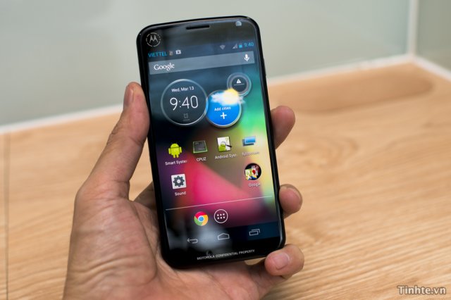
First, let’s just get this out of the way: this is not the fabled X Phone. What it is, though, could be a sign of things to come for Motorola under Google’s direction. This apparently midrange prototype handset (that may or may not be barreling towards a release at some undisclosed point in the future) takes a drastic design departure from more recent Moto offerings. You know, the ones that Google said lacked any “wow” factor.
The device does seem to have Google’s fingerprints all over it. The handset borrows from a similar design language as the last couple of Nexus handsets. The front-on view could almost be confused for a Galaxy Nexus or Nexus 4 if it weren’t for the Moto ‘M’ in the upper corner. The rear of the device is rounded and departs from the recent trend of Kevlar-infused back panels, a hallmark of the RAZR line.
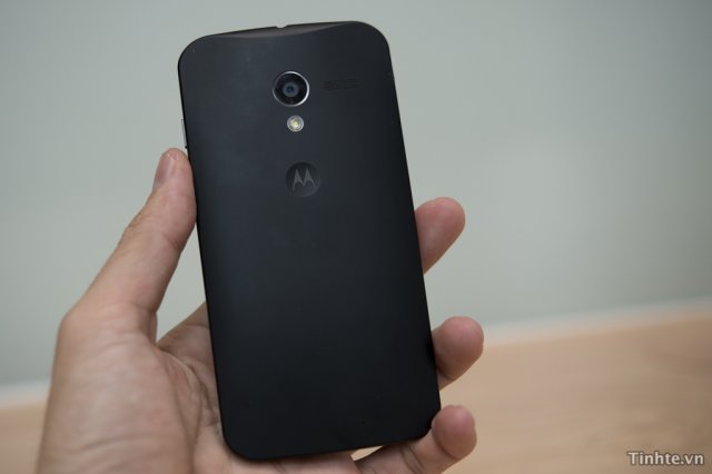
In terms of software we are looking at a mostly stock experience. Yeah, Moto is still including their pretty terrible clock widget, but they continue to pare down on their custom UI in favor of Google’s standard treatment.
If this phone truly shows Google’s influence, then it might offer a hint at what we can expect from the X Phone later this year. Until then we will remain in the dark on Google’s exact handset strategy, if they even know for sure how to handle Motorola.
UPDATE: Looks like this was, in fact, the Moto X (aka the Motorola X Phone) leaked months in advance of anywhere else. – Chris Chavez

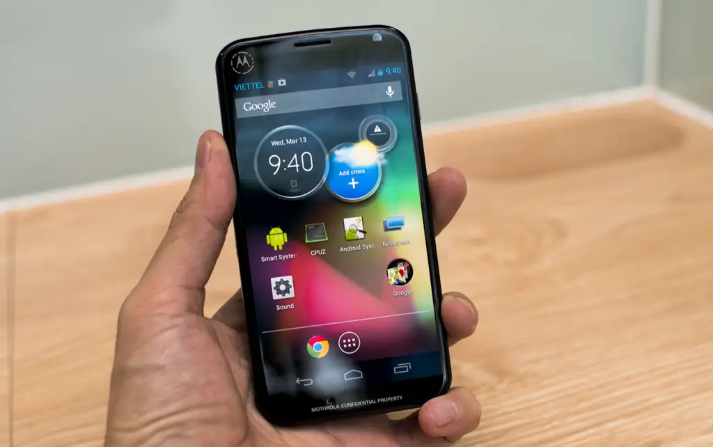






The words “ugly” and “cheap looking” come to mind.
It makes me think that Google will keep X Phone as flagship while mainstream Moto will be downgraded to the cheapskate’s market. What a sad story! I need to hold on to my RAZR, because no matter what some idiot said it does have WOW factor. Looks like my next phone won’t be Motorola, which is sad. Oh well, back to Sony!
way to jump the gun there skippy. A demo phone doesn’t equate to every single phone they have in the pipeline. Must be part of the “oooh noes.. the sky is falling” kids. Poor fella. Lastly, sony? Really? Sony? Poor fella.
I have 2 RAZRs, original and HD, and both look better than this thing.
Hideous and childlike.
This is the phone for your teenage daughter.
Compared to the Galaxy S3, this looks premium and nice quality materials http://goo.gl/XOz6I
It does look cheap and bulky but I hope they continue to go into a more ergonomic design which this shows. I hate the sharp edges on all Motorola’s. People hate on the Galaxy Nexus for various reasons, but its a comfortable phone to hold.
Yep, certainly looks like a Nexus 4
I never really liked motorola’s s styling except for the atrix models which this kinda remind me of a little. I don’t think its that bad at all.
Seriously? Don’t get me wrong, I hate the camera humps, but I’m so tired of effeminate round edged phones like samsung and apple.
While rather crude, at least motorola devices look business worthy. The only good looking phones in my opinion are from sony and nokia. The Optimus G is pretty nice too.
I want a nice square, sleek phone. I don’t want my next device to look like it should be inserted somewhere or was recovered from Steve Jobs’ ass.
This could be a Motorola Nexus prototype. It has the look of both Nexus (on the front that is)
Thank god. Motorola phones (to me) are just not good looking devices, at all. I will be very thankful if the X phone looks nothing like current moto offerings.
I like the direction Moto seems to be taking with this…It definately has the “Nexus” look up front while the back, to me, has an HTC look going on. Notice at approx 3:40, there looks to be some type of unfamiliar side scrolling tabs or something on the display…can anyone explain what that could be?
I believe those are the lock screen widgets that recently became available in 4.1.2 or 4.2 – can’t remember which
I like it, as long as the back isn’t plastic.
He’s saying that it has a sim slot on the left side, 2 gb of ram, 720 p, no volume hard control, you can’t open the back to replace the battery, he thinks that it uses super amoled or oled.
Thanks for the translation!
All sounds great! http://goo.gl/3ehjp
The glossy plastic strips aren’t fantastic, but thank goodness there is no ugly kevlar and gold buttons. Finally decent looking handsets from Moto!
i prefer the clunky, techy kevlar look of the current RAZR models
(i have the Maxx HD myself)
the phone in the video looks like a samsung/htc mix, not very original
oh well, i’m much more interested in what KLP will bring, or whatever versions of Android the X phone will have
So the glass is angled on the left and right?
usually angling means it happens on both sides, physically, C-low.
looking good moto don’t make it exclusive to vorizon
They did not move the 3 button at the bottom out of the screen! Come on now!
It looks like a galaxy nexus with a Motorola plate on the back
I like the look of the Moto clock widget. I’m using OneMore Clock Widget yo mock it on my GNexus. What’s wrong with it Kevin?
so basically a moto nexus.. *finger twirl*
At 2:08 (give or take a few) you can see where it says “Motorola Confidential Property” hmmm….
If by “wow” factor they mean make it look like half the rest of the phones out there, including the iPhone, ugly and boring, they hit the mark. No accounting for taste, I guess.
Dat girth!
Wow me by making your phones ip67 certified and taking a note from HTC about camera quality, Google. I want the X phone and plan on it being my next phone.
Personally I prefer the look of the current Motorola RAZR models to this. I am not a fan of my Galaxy Nexus or even the Nexus Line because I feel Google cheaps out on the hardware design. If I feel my GNex compared to a Galaxy S or the RAZR Maxx than the GNex just fails to compare. Same with the Nexus 7, I loved the hardware, but the case just felt so cheap to me. But when you hold an ASUS Transformer, it feels much nicer. Please Google, don’t cheap down Motorola.
I’m going to stick with my atrix 2, thanks for ruining this Google
I hope this isn’t what they consider “wow”. I hope this is stays as some mid-range device. Not trying to be mean, but it’s the only way I know how to say that. So oh well.
I like it
X phone or gtfo. Seriously though, where is that dang thing?
Non-removable battery? That’s a dealbreaker. WTF, Motorola/Google? Some of us actually USE our phones and don’t drool over how many hours we get of suspend/screen-off time between charges.
No Micro-SD card is also a deal-breaker. It’s not just about total storage size… it’s about safe, automatic built-in backup in the event of a hardware failure on the phone itself (and don’t give me that “back up to the cloud” crap). Pop the SD out, put it in another phone, restore with Titanium, and you’re back up in minutes.
I so agree, regarding both deal makers. Those are the two must-have features, no exceptions. Unless the ROM is AOSP or reeeal close, unlocked bootloader is added to that list. At this point in time, it looks like that leaves me Sammy or some nexus? The s-pen and screen size have me wanting a note 2. When I’m dressy
Bumped wrong buttons: when I’m ready come August, mebbe MotX will contend?
you know what’s more of a dealbreaker? No hardware volume keys.
If the X phone comes looking like this… I will be very disappointed. Seems like Sony is the only manufacturer (aside from nokia) that realizes the chassis is just as important as the software and internal components.
Looks tons better than Moto’s current lineup of Droids, hope the X phone looks very NEXUSesque.