The first time we supposedly got a look at the Nexus Prime on video, it turned out to be a fake of epic proportions. Well, it appears we finally have a glimpse of the device and new software Samsung and Google are set to announce in October 11th. This is a pretty significant UI update, relatively speaking.
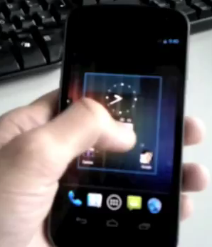
In the video we’re treated to a few different things. We’ve gotten a look at the newly-designed launcher that brings it more in line with Honeycomb’s UI. We still have the search bar embedded into the top of the homescreen but it appears to have a white box outlining itself to make it easier to see than before.
New animations for flipping between pages of apps in the app drawer are present. You scroll side to side like in Honeycomb. At the bottom of the homescreen is the launcher dock, something we imagine can be customized. There are two slots for apps on each side of the app drawer icon.
Everything takes a noticeable turn in style from green to blue – again, like Honeycomb. We’re not sure how you feel about this but it’s yet another example of how Google wanted to unify tablet and phone OS into one with Ice Cream Sandwich. We’re not too mad about the new direction in style.
As you can see, the phone itself won’t have capacitive buttons for home, menu, back and search and are instead replaced by software buttons at the bottom. While some may be going “ugh” at the lack of physical buttons, it was pretty quick to get used to on tablets and I’m sure phones will be no different.
We’ve also got a new lockscreen. Again, it’s a “ring” based lockscreen like Honeycomb’s with a twist. You can drag the ring over to the left to immediately launch the camera. You can also drag it to the right to a lock icon, but we’re not exactly sure if this is for unlocking or relocking the device. It’s an open lock so we’ll assume the former for now.
Finally, the camera app has certainly got an upgrade. We didn’t see much there but it looked like it belonged with everything else on the device. It’s a quick video, but we appreciate the lack of blurrycam and we’re glad to finally see what’s in store for the Android world come October 11th.
Oh, and according to the leakster the specs BGR posted yesterday are supposedly the right ones. If you don’t remember, they alleged it would have a 4.65 inch 720p HD Super AMOLED display, 32GB of internal storage, 1GB of RAM, a 1.2GHz TI OMAP4 dual-core processor, a 5 megapixel rear camera along with a 1.3 inch front camera, 1080p HD video capture, NFC and more.
Goes to show why everyone shouldn’t trust their own anonymous source (unless, of course, a new Nexus certainly is coming after that – bum bum buuuuuuummmmmm.) Let us know what you think below! [Source, Thanks to everyone who sent this in!]




here just take my money take all of it
LOL
I want to say that, but I’m really hoping that dudes hands are giant because it just doesn’t look big enough.
i hope this isn’t the final product.
that looks like crap
Sadly, I agree. I don’t like it at all.
Ice cream sandwich pics!!!!!!
http://stiri-telefoane.mobilissimo.ro/samsung/nexus-prime-intr-o-imagine-clara-in-premiera-pe-mobilissimoro_11172.html
I just realized that I can pretty much get this same exact phone with a TMO Galaxy S II running Cyanogenmod.
Only real difference is the curved HD screen but I think I can live without HD since the GSII is a PLUS screen and not Pentile Matrix.
You of all people should know that since it’s an HD screen; Pentile Matrix won’t be a problem at all.(It will be so crisp, and clear.) Plus it’s a Nexus device so you know the dev community will be quite large.
I wouldn’t give in to the GSII that easily, or you might just end up being disappointed.
B2L thx for your reply. I’m saying Pentile on HD will be bad but that Plus on WVGA with RGB WON’T be bad.
What things do you think could end up disappointing if the GSII gets Cyanogen? I may not be on top of the fence but I’m still holding on to it.
Well I don’t think you will be disappointed with Cyanogen, it’s typically my rom of choice. But it always seems like there are plenty of bugs and problems with it, in the past two years with different devices there hasn’t been one time that everything was working.
If you are big on rooting you may be more interested in this device because of different rom, and kernel combinations. They are both very similar, but this will definitely have quite a few features that the GSII is missing.
All I am saying is maybe you should wait before making such a big decision.Unless you are dying to upgrade, as soon as possible. Personally, if this doesn’t turn out well I will be holding out for a Tegra 3 device.
Awesome!!! Can’t wait!
Can I haz?
Bummer… looks like they canceled the press event…
It’s not registering taps sometimes and a couple times it looked sluggish. smh
Sluggish, no. But I agree with you on the screen taps. He seemed to need to press harder than what seemed natural.
That build may be a month old for all we know
He seems to be having trouble because he is trying to use his left hand to control the phone when he is right-handed. I have the same troubles at times.
Nice Bezel
It has to be the Nexus S running 4.0.
yea he just HD’d the screen and somehow got rid of the buttons…
How do you know that the screen is HD and when I lock my screen on my Nexus S the buttons completely disappear. The Nexus S running 4.0 may come with a way to disable the capacitive buttons, I don’t know. It does seem really weird how the bottom bezel is the same thickness as my Nexus S.
okay but on that phone in the video…. the buttons are ON THE SCREEN and there are only three so i fail to see how you are not seeing that there are NO buttons on the device itself…
I see that also but that wouldn’t be hard to disable the bottom buttons and add on screen buttons so it is very possible. For me it is easy to see because first I’m looking at my Nexus S and you have to have the right light in order to see that it has buttons on the bottom and second I know that some apps can give other buttons control of certain features like making a trackball unlock your phone if your power button is not working. I’m sure that Google or anyone who makes a rom can do this.
OK now I think it is the Nexus Prime but I’m not changing my theory, I noticed that when held at the same angle with a well lit background the power button on the Nexus S sticks out WAY more.
the bottom bezel is too slim to hold buttons… even if the were “turned off” there just is not enough room for buttons, sorry, it just is NOT the nexus S its a new device
i was almost with you on this one, but the phone seems to long to be a nexus…could be the angle…honestly, i just cant wait to see it in person!!!!!!!!!!!!!!!!!!!
I know so I’m working on showing everyone a side by side comparison. Hint hint this is the Nexus Prime, the screen is bigger.
I call a fake!!! Lol
Its because hes not left handed. Watch how awkward his thumb movements are, add in a big screen and he simply is having a hard time reaching and properly hitting buttons.
So technically, it is a 4.3″ display, since the screen will be partially taken up by buttons. Wasted space.
well when you watch a video I would assume the buttons dissapear.
yea just like they disappear in honeycomb, they won’t disappear because then you have now way of getting out of the app
but if your watching a video and want to quickly go back to the homescreen then how would you without hardware or soft buttons?
reappear when you touch the screen.
And when a fullscreen application locks up on your phone… what do you do then?
don’t know, but I would guess that the buttons go away when using full screen apps or video. So that extra space would be usable. and if it’s “only” 4.3 inches, oh well. That’s plenty big.
But when you want to go full screen you have the extra real estate. Think of it like the YouTube app for Android, you touch the screen to show the controls again.
There’s no on-screen navigation in camera app. Do you have to lock and then unlock the phone to exit camera? :D
on the left side of the shutter button looks like a scroll list, probably an option to exit there.
Well just like in Honeycomb the buttons get replaced as tiny dots, I assume the same happens here.
This thing looks like a zune hd UI. I’ll stick to my much nicer looking and more responsive bionic for now …
hahahahaha! Thats funny!
I didn’t watch the video, but I hate it anyway!
At the 39 second mark, look at the screen carefully…..The reflection looks like Steve Jobs……Or Jesus…..You decide.
Probably Jobs. He was an Android fan after all. He talked about it so much!
Well the Nexus Prime is a miracle in itself sooo.
what have you been taking???
Model number- tuna?
wow, i cannot effing wait
Exactly. Notice how the buttons disappear in the camera to give you a bigger viewfinder? I love it.
i was about that mention the same thing lol i really really really want this phone if it has 8 megapixel camera and a sd card slot… if not at least sd card slot will make me happier.. if they leave the sd card slot out like the nexus s… huge huge disappointment for every android fans out there right???
32GB would sate my storage appetite for a while, but I agree it would be annoying if they didn’t have at least a micro sd card slot.
I suppose they integrate the home/back button into the camera UI then…would be tricky getting out of the app without them.
If thats how the OS looks gross thank god for custom roms
If that’s how the OS looks, I won’t need to use Theme Chooser with CM7 anymore. It looks fantastic!
Yup, I cant wait to ditch Sense for this. Actually, I might just shell out and upgrade.
oh i’m with u brother.. i’m using sensation 4g and i’m hating this stupid sense ui every one bit!!
You’re all crazy. This is a humongous makeover/beautifying of the OS. And of course a Galaxy S2 with CM7 can produce similar speeds: it’s extremely close in specs, and is utilizing a custom ROM! Plus, this will be open source again, meaning that we will have numerous optimizations and visual customizations building on an already well-upgraded software platform. What else were you people expecting?
wow this is exciting!
G3 ?
My phone is ready.
I still don’t understand how VZW isn’t getting the pimped out Nexus the rest of the carriers are (what I think are more in line with the GSM Arena specs). Not that this won’t be a great phone, but come on VZW.. First you disappoint with no SGS2. Then you hint we’re getting one with LTE, giving us no reason to look forward to the Bionic. Now you’re giving us a phone that is a step behind every spec category when stacked up against the GSM Nexus? Paying the premium price, I expect the best. It would be nice if VZW made it so.
Oh well, still looking forward to getting this thing in my hand to make the final decision.
end rant
Am I the only one completely UNDERWHELMED by watching that video? First, what the hell is up with all that bezel at the top and bottom??!!
And unless they’re stating the 4.65″ screen size based on taking the corner-to-corner measurement, INCLUDING all that dead-space bezel… Then that screen looks closer to being 4″ than 5″.
I need to just stop checking on news and rumors with the Prime, until it’s actually OFFICIALLY announced. All this BS back and forth with BGR and GSMarena, etc… is just running me through a roller coaster!
Those were my thoughts too regarding the size. That seems no bigger than 4″, I am beginning to set myself up for dissapointment by expecting to be wow’ed…
It’s more like a “normal” 4.3″ phone. But could be a little bigger. We’ll see.
4.65 is always the diagonal of the screen
What of the SGH-i515? I think Kellex has it right, the Verizon version will be a different phone. I think it looks nice; the guy can’t do two things at once obviously, so I will wait to pass judgment until I can handle myself…hopefully soon
So in a few short posts all of a sudden we go from wrong specs to right specs to wrong specs to right specs. So which is it? I like the Exynos specs. Not the OMAP specs. Why is it so freaking hard to get the Exynos in the US?
There was a comment made by someone over at Androidandme and at 1:14 of the video you can see him press the power button with this thumb on the left side of the phone. Now the phone that Samsung has teased us with has the power button on the right side just like every other galaxy phone. So this phone cannot be the same one that Samsung is trying to announce. I rest my case. Still have more to see whenever this thing really gets announced guys, no worries!
No, you got it all wrong. I have a Nexus S which also has the power button on the right side near the top. I use the phone with my left hand and when I go to press the button I put my thumb on the top left to brace the phone and then I press the power button with my index finger. Watch the video more closely and you can clearly see him press with his index finger.
Exactly right. geez people will believe anything they read.
Why is it that every time an early video of someone test driving a new device looks like they have no clue how to use an Android? I assume it’s because all of these losers are iPhone users?
By the way, to whoever said earlier the guy was using his left hand and thumb. He’s not doing anything that would consider him to be ambidextrous. He’s doing completely basic operations anyone should be able to do with both thumbs without any hesitation. He’s just “android challenged”.
Wow…the most anti-climatic video ever! I hate these videos. They give us nothing!!!!
I want my god damn moldy slice of bread already, stop feeding me bread crumbs!
Personally that looks damned amazing to me. You guys are weird.
I’m with you.
Here here!
Looks like we’ll need every bit of that 4.65″ screen size, since the menu buttons will permanently occupy a big chunk of the screen.
Looks like crap
I just ice creamed my pants!
I swear trying to please any of you is virtually impossible. Go build your own phone and we’ll bash you too
Samsung has confirmed they’re delaying the launch in memory of Steve Jobs: http://allthingsd.com/20111007/samsung-google-cancel-launch-event-out-of-respect-for-steve-jobs-sources-say/
That’s pretty humorous. I note that the iPhone is still releasing on October 14. In memory of Steve, no doubt.
Looks like Milky made Ass Of The Day xDD
So thats why the old guy died. Pretty smart if you ask me
I don’t really get this. Yeah they give you a bigger size screen but It’s taken up by the 3 “button” things at the bottom and how would they bring this to phone like the HTC EVO 3d/
From what I understand, the on-screen buttons are optional. It simply gives the choise to the manufacturer to have either physcal or on-screen buttons. (Or both, I guess, if you really wanted to.) When current phones are updated with ICS, the on-screen buttons should be left out. But since the Nexus phone is supposed to show the new features of the OS, of course they’re gonna use the on-screen buttons. Personally, I rather my buttons not eat up on screen real-estate.
Almost everything he did seemed to take multiple thumb touches. Didn’t seem very responsive.
It’s not real.. It’s cm7 with a custom icon dock… Look at the screens “turn off” animation… I’m sure within a day or two it’ll be exposed as a fake… Also the sleep button is on the wrong side like mentioned before.. Nice try tho
Nope power buttons on the top right where its supposed to be. pfff
They delayed it because of Steve Jobs’ death…
They have only delayed the unveiling. No one has said anything about the launch date.
Side views side views SIDE VIEWS!! Dx
I just hope with all my heart that whatever phone comes to Verizon has specs closer to the Exynos rumor, since that phone sounds like it would be an absolute beast. If the phone on Verizon has a dual core 1.2 GHz OMAP chip, I’m not sure I’d get it. I mean, that’s not really anything too groundbreaking. Am I the only one who feels that way?
This thing better have an led for notifications.
Such a great phone, yet 80% of the people who buy it will just use it for texting. @_@
is it just me or does anyone else not like the google search bar static on every single panel? Cant we free up some desktop real estate and jst make it a widget?
It looks to be a nice sized screen, but the desktop looks so tiny and cramped since so much of the screen is taken up by the notification bar, search bar, software keys and launcher tray.
I agree I hope you turn off the search bar. the launcher is also crappy looking, looks like a bad theme job.
if its going to a verizon exclusive device does this mean we wont get it in the uk?
He is clearly struggling to simultaneously hold the camera and operate the phone with one hand. Please reserve judgement on responsiveness.
But look how smooth that UI is. I’m so psyched, I don’t know how anybody could not like this update.
I was going to comment on that. I guess your right and will hold judgment. It was jerky, multi-touches to get something done. holding the camera with the right hand and then doing everything with the left is not easy.
maybe, jut maybe! Google wants to include a feature on ICS that they were going to introduce on a later update……. just saying
That was amazing, i seriously, SERIOUSLY, cannot wait for this. They have stepped up the look feature for sure.
It is not going to matter how cool it looks if Samsung is building it; from everything I have researched, all Samsung phones fail when it comes to reception. I just bought an Epic 4G touch and I am going to return it because, while it is a beautiful phone and fast…it’s signal is awful. A big fast screen is useless if it takes me forever to download what I want to look at. This isn’t just a E4GT issue, from what I can tell it has always plagued Samsung phones.
I got a Galaxy S II and have no such issue.
things to have Q4 2011 NEXUS PRIME, PSVITA and GALAXY TAB 10.1
Not a big fan of the page-style app drawer. It is too iPhone-esk. Thankfully there are homescreen replacement apps to remedy that.
Doesnt look that exciting to me. Just looks expensive.
Just another crappy shit samsung phone, that will ne forgotten ,and on sale for 100.00 bucks one month after its releases…I would like to say goodbye to all. I am going back to iphone and going to strap cherry bombs to my samsung nexus and galaxy s 2! I hate how unreliable android phones are.htc makes decant ones.