

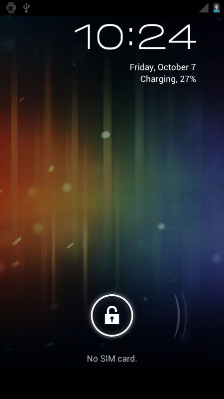
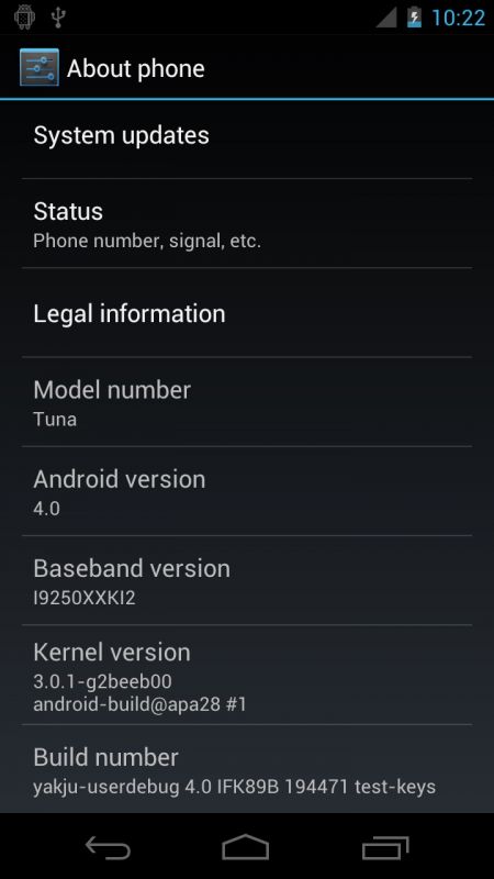
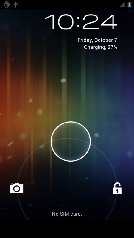
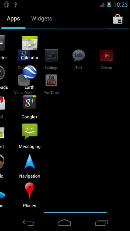
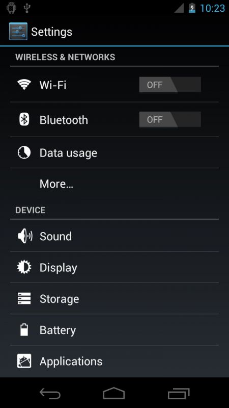
Romanian sites seem to be on it today! Mobilissimo have gotten their hands on some new Ice Cream Sandwich screenshots for us all to enjoy. We’re getting a look at things such as the new app switcher (same one that’s in Honeycomb), the new settings menu and generally just high-resolution images of the stuff we’ve already seen in the video earlier. I won’t say much more than that – just take a look below! [via] [Update]: And here’s the gallery I forgot to embed.


Looks totally pathetic. If this is ICS, then YUCK!
Really? I think it looks great. Perhaps it will look better in motion.
+1
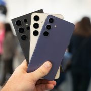
That is the Nexus S, isn’t it?
Not sure but certainly doesn’t look like an HD screen.
The whole size of the phone, the front camera placement and even the thickness of the top and bottom bezel matches my Nexus S perfectly. It looks like someone put 4.0 on their Nexus S and disabled the capacitive buttons.
I’ll bet $0 that this is the Nexus S.
Looking at the pic while holding my NS it looks very similar but not exactly the same. Either thats the reflection or there is metal around the side of the phone unlike the NS and the FFC looks to be farther to the right than on the NS. Then again I could be imaging it
Yeah that camera placement is bothering me.
Where is my money?
It doesn’t look like the Nexus S at all.
What money? ^_^
I just noticed something. This has to be the Nexus Prime because I held my Nexus S at the same angle and I noticed that the power button doesn’t stick out as much as on my Nexus S.
Thats definitely the nexus prime as its not the nexus S it doesn’t have the 3 leds/ light sensors to the left of the mic.
Yeah I think your right. This has to be the Nexus Prime because I held my Nexus S at the same angle and I noticed that the power button doesn’t stick out as much as on my Nexus S.
The sensors may just be hard to spot because it has to have them somewhere on the top but I did notice that also and the placement of the camera is farther away then on my Nexus S.
I still can’t tell if that is metal along the sides but I hope it is.
looks gorgeous! by far the best looking gui on a smartphone yet!
The worst gui as always…
Looks awesome if you ask me! Also this prooves that yesterday’s mockup is fake, the statusbar icons are different on these.
The mockup yesterday was already admitted to being fake, by the guy who made it.
…and even never meant to be real.
Do you even know what a mockup is?
Am I the only one who finds these ugly?
I find the multitasking screen to be horrendous. THEY SHOULD HAVE IMPROVED UPON WEBOS’s CARD BASED SYSTEM. The rest I’ll cover up with GoLauncher
They probably couldn’t do that as HP still holds those patents. Also, WP7 Mango has a similar card-like multitasking, and I am sure they have some kind of rights on that too.
Me too..
that’s purrrrrty
Looks exactly like the ICS leak from a week ago that Chris reported on…. loving the blue !!! so much better than the green in gingerbread.
Quentin, i know its off topic but has there been any word on the next G phone, G3 or G-Infinity….hoping its out next year when my contract is up…one year in with the AWESOME G2
hehe what’s the little Android figure on the notification bar doing?
Probably debug mode so they can take screenshots without root using adb… just a guess
It looks like crap, google needs to get their asses in gear and start revamping their interface. SPB shell 3D looks better than this junk.
This IS a revamp you idiot. If you don’t like it, use a launcher replacement.
I agree this just looks nasty. Android has to start making their ui look more uniform and not windows like.
You obviously don’t own an Android phone and possibly not even Windows. This looks nothing like Windows.
That said, the windows UI is uniform; all OS level things look the same. WTF are you two going on about?
All I can say is that I hope Motorola brings thing to the Bionic bone stock. The design language shares a lot of similarities and with the imminent Google purchase, I’m hoping they’ll have the sense to leave well enough alone. I’m optimistic that the use of skins will diminish slightly since manufacturers weren’t compelled to skin Honeycomb too heavily.
This looks like the best Android experience yet, likely the most amazing phone hardware in existence and people are still bitching? In my opinion, everything looks more cohesive, smooth and elegant then ever before. What the hell were you people expecting?
For those that are complaining, I don’t understand you. This is what Android is and has always been… just much more polished and apparently (FINALLY) lag free. What the hell? Why are you here? Why aren’t you on Gizmodo.com?
+1
Looks great to me, but I plan on holding out for Sense 4.0!!!
The GUI doesn’t look much different than Gingerbread. I’m not a fan of the blue, but I’m sure somebody will make a theme that switches it back to green. I wish it was easy to do within the OS, but oh well.
really, It is easy!
https://market.android.com/details?id=com.jrummy.list.tmobile.themes&feature=search_result
Galaxy Prime! http://www.gizmodigit.com/wp-content/uploads/2011/08/Samsung-Hercules-Aka-T-Mobile-Samsung-Galaxy-S2.jpg
I’ll take two plz.
I am trying so, so hard to like this. The phone icon, app drawer icon and folder icons are hideous.
I wanna see the notification drop down so bad. Hope it’s improved. It’s time to be able to dismiss individual items (without cyanogen)