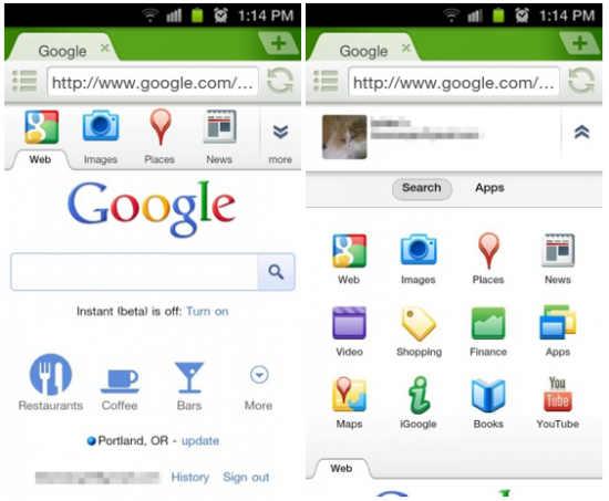
Have you gone directly to google.com on your mobile device lately? If so, you’ve probably noticed that Google’s “pretty-fied” it up some more. If not, well, we’re telling you. They’ve redesigned that all-important “More” tab at the top that’ll give you a list of Google’s many services. The most popular services in grid layout. The services have icons associated with them that sort of pulsates when you touch them. It’s a simple change, but a very effective one and makes using Google’s mobile site that much better. It’s visible on most of Google’s mobile web pages. [Droid-Life]






what browser is that?
Dolphin Browser Mini
Thanks!
This doesn’t seem to work on Dolphin Browser HD or Mini or the stock browser or Opera, at least not for me. Might possibly be because I’m outside the US but I’m not sure.
For Dolphin Browser mini, hit menu and go to toolbox>user agent and select “Android”
For Dolphin Browser HD, hit menu and go to more>settings>Dolphin settings>user agent and select “Android”
Loveeeeee Dolphin Mini <3
Doesn’t work so hot on Captivate built in browser in portrait orientation.
Tabs at right are clipped. No capability to scroll horizontally.
Works okay in landscape.
this “update” makes it freaking useless. it loads the images after scrolling up so the search box moves when you try and select it, so you tap news or images instead of the search box.
for the first time I’m forced to use another search engine. Frustrating beyond belief.