We’ve all been there. A slow data connection leaving us with patchy visions of the world around us thanks to missing tiles in Google Maps for mobile. The excruciating frustration of knowing the part of the map you need to see happen to be greyed-out. Google felt your pain, so they completely overhauled the way Maps draws up its maps for mobile. The key is the implementation of vector graphics.

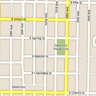
While the full details are actually pretty interesting, it’s a lot more than I can completely explain here. I will just put it this way: Maps went from needing 360 billion tiles to cover the world in 20 static zoom levels to buttery smooth, orientation friendly vector graphics that get drawn from scratch to suit the part of the world you need to see. This may have been an issue before, but the current generation of high-end smartphones make the new method more efficient. And zooms are no longer locked in at static levels (see the comparison above with the older version on the left and vector graphics on the right).
If you want to know exactly how Google made this happen, I recommend reading the source link below. And then be glad at all the hard work these people sweat over to finding information so easy for the rest of us.
[via Google]








i absolutely love the new Google update. Scrolling through the map feels so smooth and fast. this alone is why it’s worth going Android
Yeah, I love showing off how smooth & fast it is, the 3d buildings, and then I point out how my phone is in airplane mode. Just amazing.
Wow Madrona….. brings back memories.
I don’t have a left and right image above, just top and bottom.
I am not getting 3d buildings, is it because Denver perhaps is not done up yet in 3D? I have latest google maps on Epic 4g. Also, how does it show the map in airplane mode? do you have to have pulled up the map while u have data connection then it caches it when you lose service?
i wish they would do this with the web version (desktop/laptop). the mobile version is faster than the web version on my pc which is a quad core w/ geforce 250gt and 20/2 mbps internet speed.
Does the vector drawing help with battery chewing? I know the GPS alone can constantly chew the battery, but what about this method of drawing the maps?
@Craigmier Try NYC for 3d, it’s cooler to look at than most anyway. You need to be zoomed in and tilt the screen at least a little bit(drag 2 fingers down) It caches data for areas that you have been around. For instance I live in St. Louis, and it I’ve looked at several neighborhoods on maps, but then I can turn on airplane mode and look at other neighborhoods that I’ve never looked at closely, but it downloaded the data for. If I get too far away, I can’t look anymore, but it seems like it has the whole metro area downloaded. It also seems like they would download data for an entire route if you are in navigation mode, so even if you have to reroute, it would have enough of a cache to do it offline. Pretty darned sweet.
@Craigmier- Only downtown Denver is in 3D. I live outside of downtown and thought the same thing until I loaded up Lodo and the buildings popped up. You also need to make sure you’re zoomed in close enough, because the pictures will disappear if you’re too far away and go back to the regular map.
For 3D buildings you have to be…A) Looking at the center of a major city (only about 100 cities have 3D buildings), and B) Zoomed in to 500ft scale or closer.
@ Bob: I would guess that the CPU/GPU are using more power than before w/ the vector gfx rendering, 3D rendering, on-board calcs, etc. But, you’re pulling a lot less 3G data, so you’re saving power there. It might end up being a wash.
I have nexus one and I can’t find it on the market in lebanon
What makes it not so good? It’s 100% sensor usage once you exit the app…
List of Cities in 3D here: http://www.google.com/mobile/maps/3d/
download is available at XDA.com ^_^
For your PC/Laptop you should just go ahead and install Google Earth.
@Ricky ofcourse you won’t, you have to be in one of the supported countries for purchasing apps in the market (thought this is not a purchasable app but i dont know why google is doing this)
sure it’s faster & smoother, any idea how to get it to show more detail and make the fonts faster? It’s a real pain in the neck to try to “browse” the maps.
I want to vomit every single time someone uses the term “buttery smooth” in reference to technology. Seriously. Stop please.
Think this will ever be available on BLACKBERRY ????
You gotta zoom in to get 3D buildings.
Would love seeing this in applications too, like SportyPal and c:geo, would really help :)
@16 yes..in 2020
Oh and btw, do yourself a favor, get an Android phone…lol
Got the new Nexus S, kicks balls but still haven’t seen any 3D buildings??? I’ve searched all over the US and nothing yet?
Raleigh, NC has 3D grafix! Big time!
@David I agree about the Nexus S, they were almost sold out in Houston in one day. Check out the center of Houston if you want to see the 3D maps, its sweet.
^ LOL @ jealous Blackberry user.
I know enough about vector graphics that I pretty much knew how they did it when I first ran the update, but it still blows my mind.
There is no technical reason Google couldn’t port this to iPhone, or other smart phones. But if they keep it Android exclusive, I guarantee people will buy Android phones based on this feature alone, once they see it.
I second the above comment on “buttery smooth”. Please stop.
The 3D is a tad overrated, given that in the UK it only covers unimportant cities, and hardly anyone has a phone which can rotate (and there’s no non-multitouch way of doing this; say with a button to toggle rotate on and off) but the fact this version is done with vectors is nice, as is the compass-mode that the iPhone has had for years.
So how about “smooth as a lubed shaft?” (A mechanical part, sickos….)
Hey i own a desire z but when i try to use the google map, it states that the it is currently unavailable in my location. Why is that so?
Sickos? You have to be a _real_ sicko if you don’t think of anything sexual when you hear that… which I noticed that you did, so you’re safe.
The new Traffic color code needs to be fixed.
The fourth color code in the new Google Maps is nearly imposable to see. It was red and black blocks (0MPH to 5MPH) that was much easer to see. Now it is just dark red, and next to the regular red (5MPH to 25MPH) it is nearly imposable to see the difference between the two.
In New York traffic, it very important to know if the traffic is stopped or up to 5MPH(now dark red) or running 5MPH up to 25MPH(regular red).
Traffic at 25MPH at rush hours is not bad, but 0MPH to 5MPH is very bad. In the new Google maps 5.0 is almost impossible to see the difference between the tow with out zooming all the way in and looking very closely at the map. And we cant do that wile driving.
Bing has beend doing this on iphone for months. Looks great.