See past editions of Android Wallpaper
Happy weekend! It’s time once again for more Android Wallpaper. This week we are diving into the world of minimalism and “flat” design. These are words that get thrown around a lot these days when it comes to design in technology. Everything gets labeled “flat” or “minimal.” If you want your device to match the trend we have some wallpapers for you.
What exactly deems a design “flat” or “minimal?” Usually these words describe something that is very simple, without textures, gradients, or shadows. We have selected six flat and minimal HD wallpapers that should look great on any device. To get one of these on your phone, tablet, or PC simply tap or click the download link underneath each image. On the next page you can right-click or long-press to save the image to your device. We hope you enjoy these wallpapers as much as we do. Let us know which one is your favorite!
Push new Android Wallpaper to your Android device with this IFTTT recipe.
Tools
Kite
Clouds
Ripples
Binary Rain
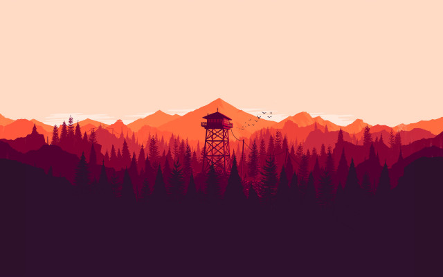
Firewatch
Download from Campo Santo (various sizes)






Binary rain would have been so much cooler if the rain looked like a 5 column truth table
Great simple wallpapers, just how I like ’em. Thanks :)
Flat & Minimal, just how I like my women.
You have bad taste in women.
I have a bad news for you
love the forest patrol.
Man what launcher is that how did your icons arranged that easy? Looks good!
Thanks! it’s just nova launcher with click UI icon pack, the new beta version of nova lets you attatch icons in between rows/columns.
Damn that’s awesome man
Here is my Homescreen I like the Forest Patrol wallpaper as well. Using Go Launcher 5. The icon pack is Cryten by Vertumus.
I like the wallpapers. And their resolution is that of my samsung galaxy note 10.1 2014 edition :)
Forest Patrol is artwork from Campo Santo’s upcoming videogame Firewatch.
the GPU’s in these phones need to be rolled back. we’re in 2d hell again. i dont get this at all. the world is 3d, with depth and light/shadows. why do i want my phone to look like paper?
“Minimal” and “flat” doesn’t necessarily mean 2d. There’s often a lot more depth in minimalistic designs (take the last wallpaper, for example). It’s just that each “layer” in 3d space is flattened out, making things more organized, and in many peoples’ opinions, more artistically appealing.
I agree & coincidentally I just bought the icon pack NEON GLOW from the Google Play Store last week:
https://play.google.com/store/apps/details?id=com.samerzayer.theme.neonglow&hl=en
Can you say Black-Light posters? :P
Admittedly this is on the other end of the spectrum,but,looks great on a hi-res screen.
Sometimes complicated or photographic backgrounds interfere with widget visibility or label visibility. Flat or simplified designs are also becoming the newest default graphic design (replacing the hyper glossy, glassy, 3D Web 2.0 style of the past decade) so it fits nicely with apps and the internet.
Also, “Flat” in this sense does not always mean a lack of the third dimension. It primarily refers to a lack of fake gloss and reflection, like how paints come in flat, eggshell, semi-gloss, and gloss. Simplification often leads to layering and removal of the 3rd dimension, but not always, so it can be flat and 3D. English just happens to use Flat in many meanings (lack of effervescence in drinks, lack of reflectivity or gloss, lack of a third dimension, etc) and this use stumbles over a couple at once without being very specific. It’s kind of annoying.
Wish you had something dark. Been messing around with black, whites, and greys
Only the mountain tower looks good. The rest look like a child made them.
your nick seems like a random string of letters by a child
yours looks like a baby’s first words
Really cool you like our key art from our upcoming video game FIREWATCH but please please please don’t rename it “forest patrol” and not link to us or give us credit.
Whoa… yeah that wasn’t cool of them. FWIW, the key art is awesome and has been my wallpaper since seeing this article. :)
Thanks for the heads-up! I updated the post with a link to your site. Great work!
Thanks!
Thanks for the wallpapers.