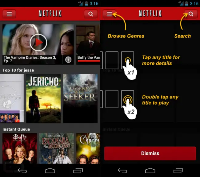
Some people are claiming to see new user interfaces in their Netflix for Android applications despite Netflix not having an update in the Google Play Store. That would, of course, be explained by the fact that Netflix likely uses an HTML5 webview for its main content pane, a setup that would allow them to update several UI and functionality elements without having to submit an update to the Google Play Store.
The new interface apparently delivers a side-scrolling experience not unlike what we’ve seen on tablets, the desktop, and other devices. It has a darker look and feel, and new options to single-tap a movie/show card to show info on it or double-tap a card to play are present. Even on a fresh download of Netflix I was presented with the old user interface, but enough users are reporting the changes that this just might be true. Let us know in the comments if things look a litle bit different from you. [Droid-Life, Google Play Store]




I got the new interface. I personally preferred the old one, maybe because I was use to it. But yeah, definitely different.
I got it a few hours ago on my jelly been leak powered s3, I thought there had been a fault with the app thinking my device was a tablet. But I hope they do update it to this look as the old android cup cake style phone ui was getting exceptionally dated. But after closing the app and reopening it, the ui reverted back to the old phone one and I can’t get it back :(
I have it. It’s nicer. The top buttons are all pixelated though.
OK, scratch that.. it actually changed back. I HAD the new interface last night.
Yep ! Different UI over here. It caught me off guard. I am very pleased !
Just checked and i have it here too. Looks prettier and a lot nicer compared to the other version
Took them long enough. If I had to choose one Android application that sucks to use the most, it would be Netflix. Yes, it’s worse than Facebook.
I’ve got it… Looks great! Very happy to have a scrollable queue on the home screen.
Still doesn’t have landscape rotate though. And now with the larger pictures & horizontal scroll for lists, you see fewer things at once, making the desire to rotate the screen even greater.
Looks nice and bright though.
Yep, new interface here as well.
I have it too on my GS3. Much needed overhaul with the now old UI really showing it’s age on phones with much higher resolutions.
I got it last night, it’s pretty, and user friendly. Still slow as balls though, and it’s not my phone or connection (VZ GNX)
I also have the new interface now on my EVO 4g LTE…just checked after reading this post and I as well have it
I had it this morning, but as soon as I left the app and came back to it, the new UI changed back to the old one.
Yeah I got the new interface as well. Yay for new things!
Stick to the Holo guidelines, please. This isn’t ios with leather trim and denim everywhere.
Finally something I would call an interface. Much better than the crappy
old one. Now to drive my parents nuts by seeing how much data I can
suck up until the bill gets really high.
New interface showing on mine!
On a Droid Bionic w/ .232 ICS if it helps anyone….
Yes, got it now. Oh yes, I like this much better. Way to go Netflix.
I received the update, so much better
I’ve gotten the tablet interface on my Galaxy Note on and off since I bought it several months ago. I’m not sure what caused it to change back and forth between the phone and tablet interfaces but it seems to be stuck on the tablet interface now which is a good thing.
Already ditched Netflix. Screwing over customers and and over again. Plus they rarely add anything interesting/new.
still sucks on Asus Infinity
not on my stock vzw gnex.
Believe it or not but i had that interface for about a week or so back in February on my HTC Desire HD,
yep, me too
looks good
That’s cool and all, but i would prefer it if i could just watch movies in HD on my S3. How about focusing on that instead of playing with the interface. Last i heard the only device that can use HD Netflix is the Razr which isn’t even in HD. How’s that for logic?
I see the interface too.. this is nice interface similar to the tablet though
I’ve been considering a Netflix account but URGHHH that’s not Android, that’s clearly iOS and it’s ugly.
Really dig their instant streaming — i ditched their dvd’s awhile back and don’t miss it. Instant has a ton of stuff for me… auto updates what I’ve seen / where I left off between my pc, tablet and phone – nice !!
I checked this morning, and I had the new interface on my original Droid Inc. It was very smooth, and actually offered scrolling in 2 directions at a time, something I haven’t seen on very many other android apps. However, when I check Netflix again at lunch it’s back to the old interface. Boo!