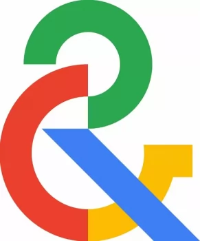
Google is getting ready to replace the traditional museum emblem on the Arts & Culture app including a freshly registered ampersand design.
Two brand-new Google trademarks with the phrase “stylized ampersand” have surfaced online this morning. The sole distinction between the two entries is that the former uses the recognizable four-color design of Google, whilst the other uses plain black.

Image Source: Wikipedia
The logo doesn’t exactly explain why Google would want to utilize this new ampersand style on its own. Fortunately, it appears that Google themselves placed their artwork on Wikipedia recently and listed it as the 2022 logo on the page for Arts & Culture.
The current year was also added to the new picture upload, indicating that the app would soon use this updated logo. The app’s logo is still as it is right now. Given that the majority of its applications use its iconic multi-colored appearance, Google may feel that the old logo is a little out of place.
For the time being, both iOS and Android users of Google’s Art & Culture software are still utilizing the museum’s logo. Just how much longer we will have to wait for all the design change to take effect is unknown at this time.
Google have a rich history in supporting arts and culture content across the internet. Google Doodles have often highlighted key people across the arts. On the 31st of August, Google Doodle celebrates Peruvian author Julio Ramón Ribeyr’s 93rd birthday he was one of the only Latin American fantasy writers who used the medium to discuss social issues. While today also celebrates the independence of Trinidad and Tobago.


Comments