5 Things the Nothing Phone (1) Gets Right
The launch of the Nothing Phone 1 has shown that there’s still room for interesting and creative ways to approach the art of making Android phones. It’s officially the second hardware product to come out after the company’s Nothing Ear 1 wireless earbuds, and promises to provide value to consumers willing to take the plunge.
The phone seamlessly combines established hardware principles with a unique design and style, resulting in a device that features a new take on familiar smartphone concepts. As such, it’s only natural for enthusiasts and consumers to take a closer look at what the device offers in terms of usability and overall value in the long run (oftentimes with much debate and scrutiny).
With that said, we had a chance to go hands-on with the Nothing Phone 1 during the company’s launch event in London. We’re going to take a look at some highlights of the handset, and see what it manages to get right – let’s get started!
Design
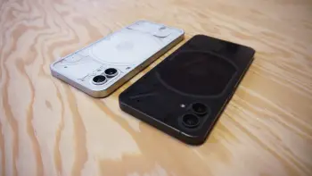
Perhaps the thing that stands out the most about the Nothing Phone 1 is its rather unique design. While the overall shape and form of the phone do come with some familiarity, Nothing has decided to differentiate its flagship device from the rest of the competition by including some pretty unique hardware functionality with the phone’s Glyph Interface.
Found under the completely-transparent rear panel, the Glyph Interface is a set of LED lights, specifically designed to provide users with notifications from messages, calls, and other forms of communication, as well as added features with compatible apps. It’s completely customizable based on individual user preferences, and it’s refreshing to see a company introduce a new approach to notification LEDs on phones.
It also helps that the phone features Gorilla Glass panels on both sides, in addition to the aluminum frame and IP53 splash and dust resistance, which adds a bit of durability for day-to-day handling.
Display
Flipping the phone over, we’re greeted by a 6.55-inch display. It’s an OLED panel with a 120Hz refresh rate, which made for a very vibrant and fluid-looking scrolling experience. The screen brightness maxes out at 1200 nits, which is more than twice of the maximum brightness level on phones like the Google Pixel 6 and 6 Pro.
Thanks to the OLED display, colors on the screen were vibrant, and the screen was responsive as well – I had no lags or freezes scrolling through the user interface and going through the different device menus.
Software
I was pleasantly surprised that the phone ran on a very clean version of Android. Dubbed “Nothing OS,” the software inside the phone is as close as you’ll get to what Google offers on its Pixel devices. Aside from a very few number of additional Nothing apps and built-in software features, the interface was very clean, with barely any pre-installed third-party apps (unlike what you’ll find on a ton of other Android brands).
Of course, certain additions like font changes and built-in settings options were present, which do help the phone’s user interface stand out a bit. But as far as customization goes, Nothing OS isn’t a heavily-skinned affair like One UI or MIUI for example. For smartphone owners used to a more simplified UI like on Pixels or Nokia phones, this will be very ideal.
Despite the mid-range Snapdragon 778G+ 5G chipset inside the phone, the clean software will also help in providing an overall smooth and fluid user experience.
Cameras
In terms of cameras, the Nothing Phone 1 focuses on giving users actual useful hardware. There are no unnecessary depth or macro sensors on the phone, and instead it comes with a pair of 50-megapixel cameras on the rear, which consist of a main sensor and a secondary ultrawide sensor. Meanwhile, the front of the device has a single 16-megapixel front-facing cameras for selfies and video calls.
Image quality was good, at least based on the few sample photos that I was able to take on the phone. For video, the phone will be able to record up to 4K resolution footage in 30FPS. There’s also gyro-EIS onboard for added video stabilization.
Price and Final Thoughts
The Nothing Phone will be available at a starting price of around £399 for the 8GB RAM + 128GB variant, although you’ll have to spend a bit more if you’d rather have the version of the phone with more RAM and storage capacity. This also puts it around the same price as other mid-rangers like the Samsung Galaxy A53 and Google Pixel 6a, which come with their own sets of pros and cons.
Folks looking for a relatively-affordable phone will definitely want to take a look at the Nothing Phone 1. So far, it manages to get a lot of things right, although its biggest weakness is arguably the mid-range processor. By comparison, a phone like the Pixel 6a costs around the same price, and comes with the flagship Google Tensor SoC. It does miss out on other things however, like a large display with high refresh rate, for example.
In the grander scheme of things though, personal preference will ultimately decide whether or not the Nothing Phone 1 fits into your needs and budget, in which case you should check out the phone and see if what it offers is the right match for you.