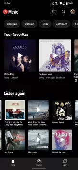
With a new grid design for the “Listen again” shelf on Android and iOS, YouTube Music is shaking up the visual humdrum of the Home feed.
To present albums, playlists, and songs from your history, “Listen again” previously used a more condensed carousel — compared to YouTube Music’s normal one — with little cover art.
Welcome to the Grid
YouTube Music currently uses a 32-grid design with a total of 10 items. It’s only barely taller than a typical carousel, but it shows six works at once (rather than two). The Listen again grid is much more compact than the previous density champion, “Quick selections,” which displays four tracks at once.
However, behind the cover art, you only receive the name of the song/album, not the artist. As before, tapping on a song, as indicated, will start playback immediately. Meanwhile, on Android and iOS, the tablet version of YouTube Music continues to has a tiny carousel.
It helps to distinguish the main stream and appears to be widely available on mobile devices. This also cuts down on the amount of browsing you have to perform in the app. So keep an eye out for the update when it lands for you!


Comments