
Android Auto has long been an amazing system. Whether it’s on a head unit installed in an old car that may have had a tape player from the factory, or it’s a feature integrated into a brand new car, it brings the fluidity and functionality of modern smartphones to your car in a driving-friendly interface.
Let’s be honest: Car interfaces kinda suck. Aftermarket head units usually have cheap, flashy interfaces that tend to have rough animations and minimal function. And factory car interfaces… don’t get me started. Some manufacturer’s current interfaces feel like they’re straight out of the Windows XP days. Laggy, slow, and with maps that can’t even come close to keeping up with Google Maps. And this all costs extra money!
Android Auto allows you to plug your phone into your car and get a custom driving interface running right off your phone. This not only means that your powerful phone runs the show, but your phone apps like Google Maps and Waze can run on your car’s display. Google can also update this system with improvements and fixes at any time without any input from the car’s manufacturer. It’s an awesome system, but it isn’t without its flaws.
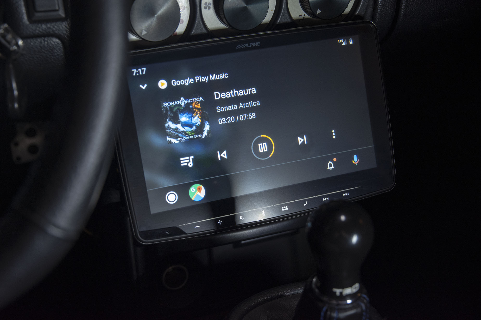
The original Android Auto interface just looked bad. Bright whites, pastel colors, and gradients made it look childish and out of place in a car. Not to mention that you had no access to media controls in the map view unless the head unit manufacturer provided those functions as physical buttons. Many functions were hard to reach or were hidden entirely. And did I mention it was ugly?
Thankfully Google has fixed almost every complaint we’ve had with Android Auto with the recently released user interface redesign. Gone are the pastel colors, replaced with gray and black. The now playing screen has been refreshed with a modern UI and some nice animations. It finally looks presentable in a luxury car, more so than many OEM systems.
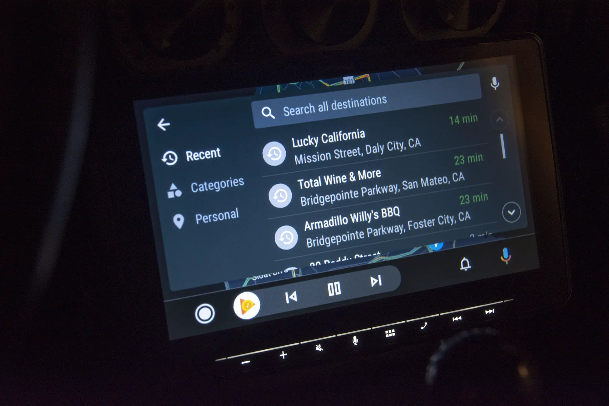
When you leave the now playing screen, whether it’s heading to the new home screen or using maps and navigation, you now have basic media controls in the bottom bar. You can pause and change track no matter the physical button arrangement. Switching back to the media view just to pause the music or change the track plain sucked, and this is now fixed.

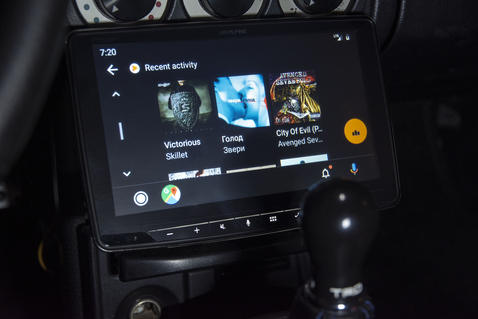
However, it also introduced some problems. The old homescreen was very useful, showing some commonly used cards like addresses you may need, phone numbers you need to call, and a really handy weather card showing your current location’s weather. All of this is gone. The new homescreen is an array of icons for various apps and it’s mostly useless. The weather icon speaks the weather to you, which is safer for driving, but doesn’t have the same ease of use. Any shortcuts to something you may need are entirely gone.
Nonetheless, this redesign was sorely needed and is very much appreciated. The revamped UI, the dark theme, and the nice new animations all transform the Android Auto experience into something that can truly compete with a factory infotainment system. And with the same Google Maps and Google Play Music integration it’s always had, it beats any factory infotainment system in function.
Thanks for the major update Google. Now please, bring back that card-like homescreen that provided useful suggestions I often needed.


Comments