

A few months ago we saw Hulu make some pretty huge changes to the UI inside their app, and now it seems Netflix could be looking to spruce things up as well. It’s nowhere near as dramatic as what we saw with Hulu, but it’s something.
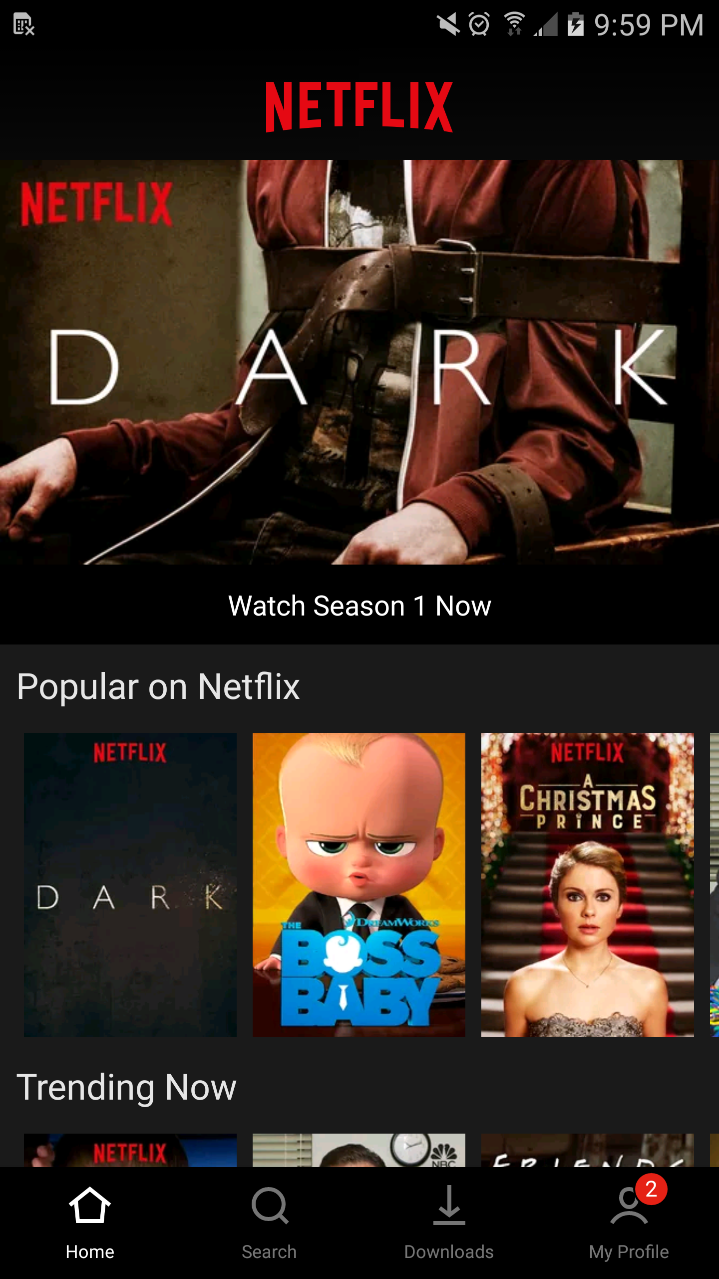
A user on Reddit posted a screen shot of the newly tweaked UI which now features a tabbed bar at the bottom of the screen to quickly jump between home, search, downloads, and profile. As it currently stands, both Android and iOS versions of the app normally feature a slide-out menu. This new version looks more akin to something you’d find on iOS and is most likely only being tested as not everybody is seeing the changes with the latest version of the app currently on Google Play (version number 5.10.1 build 25262).
The same user also reports that new, larger “Skip intro” and “Skip recap” buttons are also present in this update with slightly tweaked behavior (you no longer have to wait until the next episode to be presented with the options) as well as thicker timestamps. It seems like a small change but for anyone who spends any length of time in the app, it’s sure to be welcomed. That is unless anyone out there prefers the old slide-out hamburger menu?


Comments