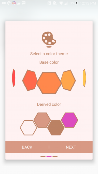
Any Samsung Good Lock user knows how frustrating the device’s theming options were. You’d pick a primary color, and Samsung would spit out an array of related shades and accents based on it.
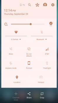
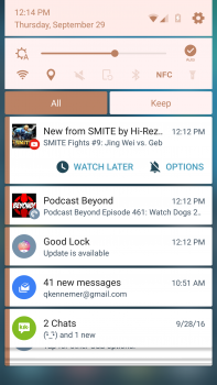
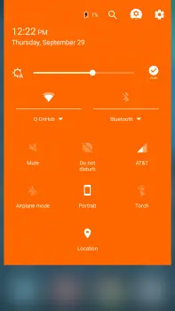
It was their attempt to make theming “easy,” but in reality, it tends to pick awful shades and applies them unpredictably. For instance, I would love to use a sharp shade of orange, but when I select that particular color on Good Lock, here’s how my system looks:
WTF, Samsung? And where the hell did pink come from?
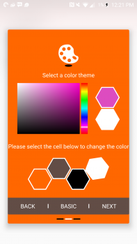
Well, thankfully their latest update makes everything right. You are now able to select specific colors for all of the accent points, so you can make your notification shade look exactly how you intended and not some combination of pastel colors vomited out at random. Let’s give it a whirl, shall we?
There’s even a color picker!
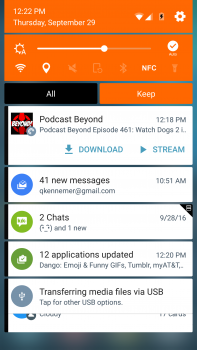
Ah, much better. Well, I have some tweaking to do, but at least I know I can get the colors I intended to get into my UI. Thanks, Samsung. For those who want to escape that living hell like I did, head to the Galaxy Apps store to grab your update.







Comments