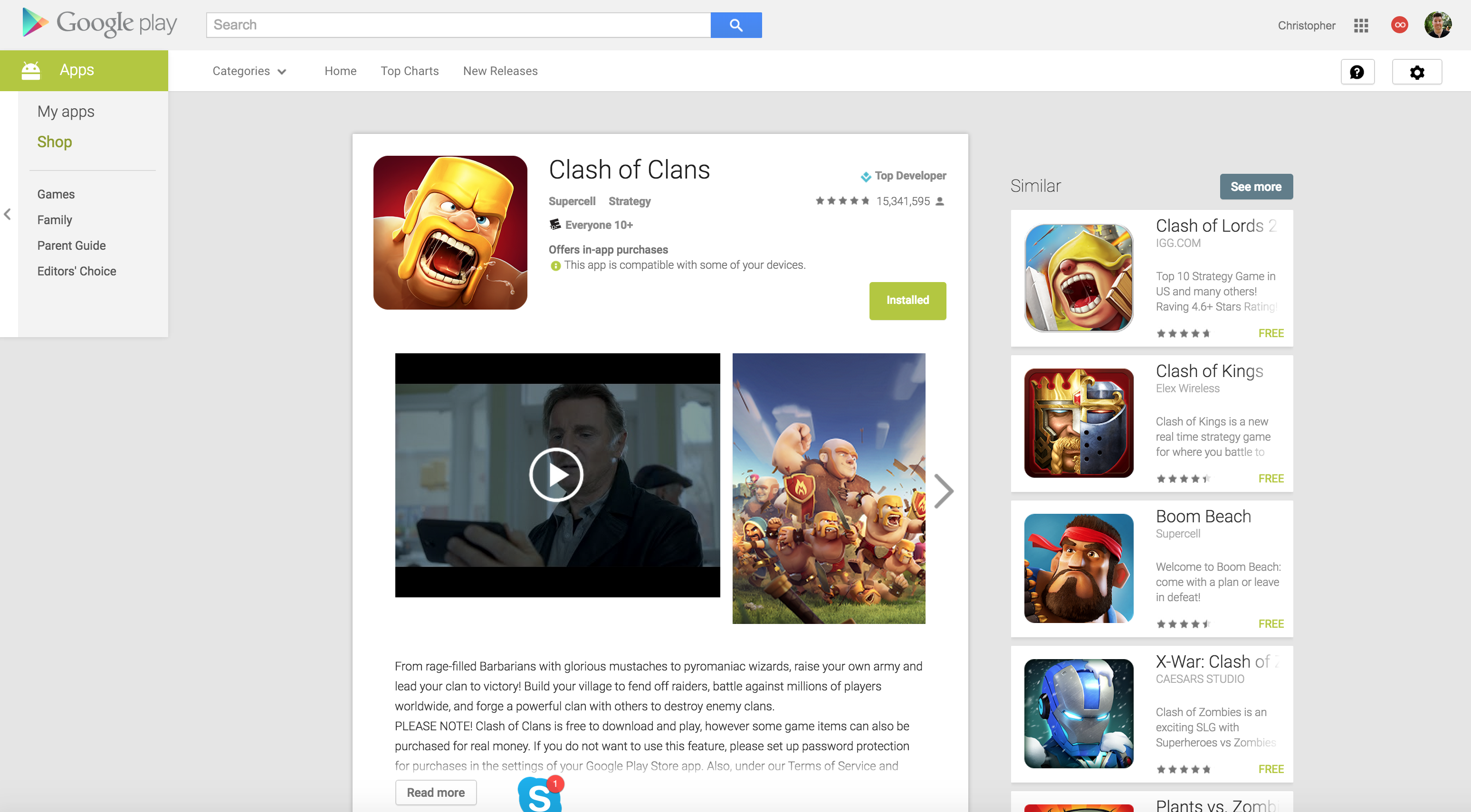
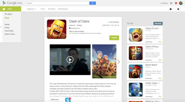
If you’ve visited the Google Play Store from your desktop’s web browser today, you may have noticed a slightly retooled app/game listings page. Not everyone is seeing them just yet, but we’ve received enough confirmation to suspect a wide rollout is already underway. These are the same pages Google was testing for apps and games awhile ago, but now they seem to be rolling out to everyone. You’ll notice a much more narrow column view with tons of wasted space when viewing on something like a widescreen desktop display.
Last time Google made changes to the Play Store’s web UI you guys didn’t like it one bit and while we’re sure this new interface looks great on a tablet, phablet, or smartphone in portrait mode, it feels incredibly awkward and out of place on our desktop. In other words, we’re not digging this new look and we’re sure many of you will feel the same way. Of course, changes like these are always met with some resistance and typically take some time before we all get used to it and it’s back to business as usual. In other words…




Comments