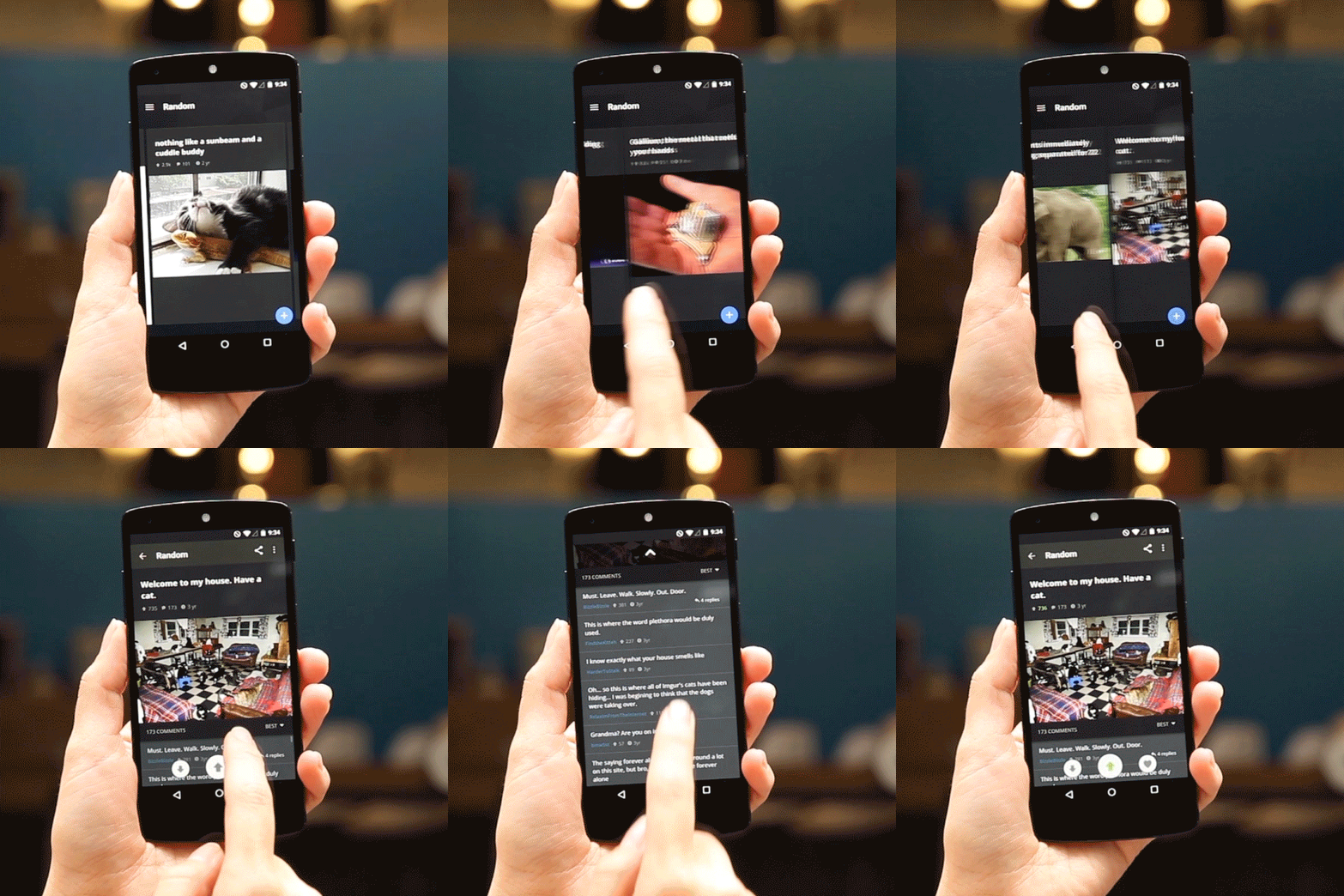
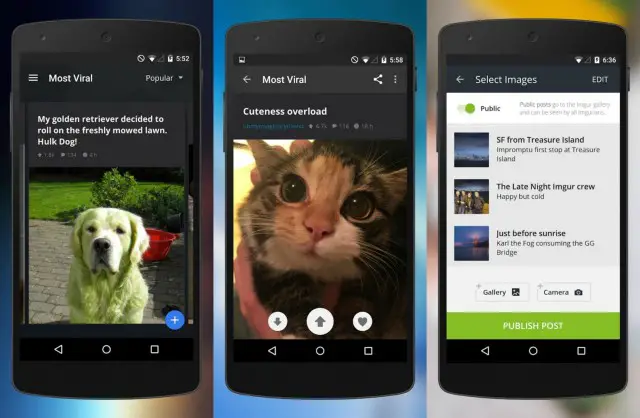
Big changes have arrived for the Imgur app on Android. On one hand, we love it. It’s super fast and responsive. This is thanks in part to the app finally being coded from the ground up to work natively on Android. That’s a really big deal as the previous app was clunky and suffered from constant gallery refreshes. The new update on the other hand is gorgeous, with a little Material button (FAB) in the bottom corner to quickly take a snapshot or upload images.
But here’s what left us reeling: they’ve completely done away with the previous grid view, replacing it instead with a card-based gallery that only displays only a single, full-screened post at a time. Honestly, I’m completely baffled by the move. As a long time Imgur user, I’ve grown accustomed to scanning over pages of images in a handy grid view. It’s the way you view images on Imgur’s full-fledged website. But this… this is something else.
Thankfully, there are other options for those looking to browse Imgur on their Android device the way they always have, with countless 3rd party apps available on Google Play. Some are better than others, of course, but if you’re not digging the look of the official Imgur app, join us in making the transition on over to Opengur. You’ll find that app linked down below.
Oh, and Imgur also announced they’re cracking down on NSFW content on their site. To be clear, they’ve always had a “no NSFW” policy, it’s just now they have a new team dedicated to addressing content that’s been flagged on their site.








Comments