
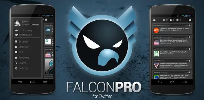
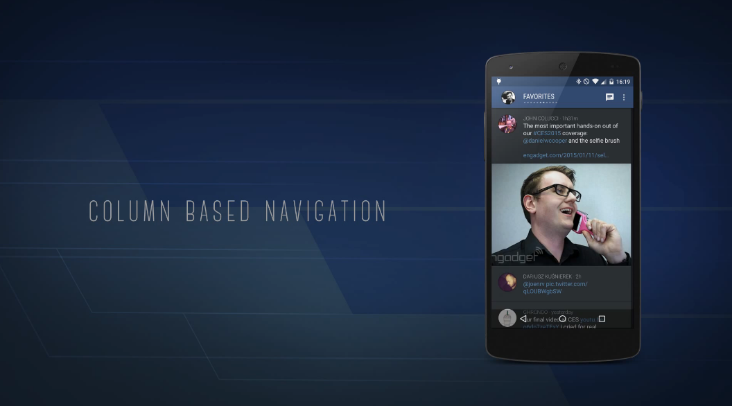
Falcon Pro, the insanely beautiful and functional Twitter client that has been much maligned for Twitter token limit issues in the past, has finally made its return to Google Play. This is version 3, and it focuses on one big element: design. Material Design, to be exact.
The app was beautifully crafted by rockstar developer Joaquim Verges to fit in with Google’s new vision for application design on Android and across the web. Falcon Pro is chock full of the familiar stuff — hamburger sliders, a healthy helping of white space and more all make for an application that look and feel the best an app could on Android right now.
But it’s not all that it seems. The app’s early hours on Google Play netted a 3 and a half star rating, unusual considering Verges usually draws a chorus of applause and praise with what he does. Diving deeper into the app reveals that it’s thin in one big area: features. There is no support for direct messages. There is no way to reply all to a Tweet. There isn’t even a settings menu.
The original crop of Falcon Pro apps were praised as much for their flexibility and deep feature sets as they were for design, but that hasn’t translated in this new rendition. It’s sad, really, because if it had even half the guts of its older counterparts it would probably shoot to the top of the list as the best Twitter client out right now.
 Alas, it doesn’t, and that’s why folks aren’t particularly willing to shower the Google Play listing‘s ratings section with a heap of praise and 5-star reviews. It’s natural for them to feel this way considering the comprehensive experience they’ve come to know and love, but the developer says this app is being built from a completely new code base, and if you know anything about development you know that isn’t easy.
The app is free to try, albeit in a very limited way (you get access to select public Twitter lists, but that’s it) so give it a go. If you’ve read this and decide you want to get in on the ride early you can unlock full access for $3.99 for the first account you use, and you can also opt to pay $1.99 for each account after that.
The developer says it was done this way to limit an influx of people authorizing multiple accounts and using up the 100,000 tokens he’s afforded. All the better to make sure as many different people as possible have a chance to use the app, we’d say.
So it’s not all sunshine and roses, but if we know anything about Joaquim Verges it’s that he works fast and relentlessly, and we’re sure it won’t be long before the app is loaded up with all the features we’ve come to know and love.


3.99? Then when his token limit is up he will just revoke everyone’s tokens again and then current paid users will be SOL. Same as his last app that I got burned on. Sorry but 3rd party twitter clients are not smart to be spending money on. It’s Twitter’s own sandbox and they dont like people playing in it. Sad but true.
Those are all accurate and valid points, but it’s only $4. That’s as much as a beer or a latte, etc. If you use Twitter and like the app, it’s worth it, even if it only lasts for a year.
Fair point it isnt much money. I just cant justify it myself knowing there will most likely come a day I will log into the app and find out it is useless to me. He is a good developer and I wish Twitter didnt have this token limit but it is what it is.
It looks like his token limit will come much slower because for $3.99 you can only use one Twitter name. Extra names cost more money therefore as an individual you cannot take up multiple tokens with multiple Twitter accounts unless you pay.
A little expensive for a third party Twitter client. I’ll stay on Talon :)
I don’t understand why developers feel the need to implement that dreadfully hideous material “design” garbage that nobody in their right mind asked for.
Speak for yourself on that one, i’m happy that android is finally starting to look good
Your on your own with that opinion. Google introducing Material Design is the best Android update to date with design consistency across the board!
Just look at Google Inbox and see how terrible it is.
Don’t know what your talking about, I happen to like #Inbox!
A desktop site using a mobile skin and crippled feature set of the app its replacing is not a good thing.
Then just use the Gmail app. Inbox isn’t bad just a different way to view your email.
I already do (and I couldn’t use Inbox if I wanted, since Google decided to go the IE6 route and make it only available for Chrome).
And it’s a poor way to view your email since it doesn’t even offer an easy way to view your folders or delete a mail without needless clicking and digging.
Inbox is still available in the play store for smart phones? It not suppose to show you your folders that you created in Gmail but instead group your email together based on sender/content. You can use their default categories or make your own. Its just a different way to view your email, its not for everyone. Myself included.
Personally I’m happy to see more apps adopting the design. Android has lacked a unified design language for a while now. Material Design actually makes apps look great while remaining functional, especially considering Android devices continue to grow in screen size.
The problem with it is that it’s just lazy and uninspired. It’s effectively a mobile skin slapped onto a desktop site in a similar way that a site installing Twitter Bootstrap and calling a day is.
The calendar app is awful now. You used to be able to see your whole week’s work of appointments. With Material, it’s down to five days. and everything’s squished together.
And adding songs and looking for an artist’s discography is takes more steps in the Music app.
Yeah, just installed the new GCal and it does suck that month to month view is gone. Didn’t even notice it though, since I don’t use Google’s Calendar app.
The month view isn’t gone, simply tap on the month on the top and you’ll get view of the entire month.
Yeah, but you can’t see the appointments on those days like you used to be able to see. The only full view of stuff you have is list-like.
Have you tried the widget? It would provide you with the view you’re looking for. I use Google’s calendar exclusively for that reason.
It’s better to have a design consistency within the apps methinks. And since the majority seems to like it (Me included) it isn’t gonna stop fortunately.
It’s not really consistency when less than 1% are on Lollipop.
Do you expect everything to adopt it quickly when it barely came out? You do know they still require to redesign current apps and wait until the update rolls out to all brand or until people buy new phones…
It’s the opposite for me. Any app I use which has implemented Material Design now has a dark theme and also looks better.
Fenix for the win!!
I love Google calendar, inbox and material design.
But this app itself is buggy af. Using emoji crashes it and typing certain words also.