HTC’s still cooking up their version of Lollipop, but if you’re hungry and want a little taste then this is the most we have to go on for now. LlabTooFer was able to get their hands on the software ahead of time and gave us a look at what to expect.
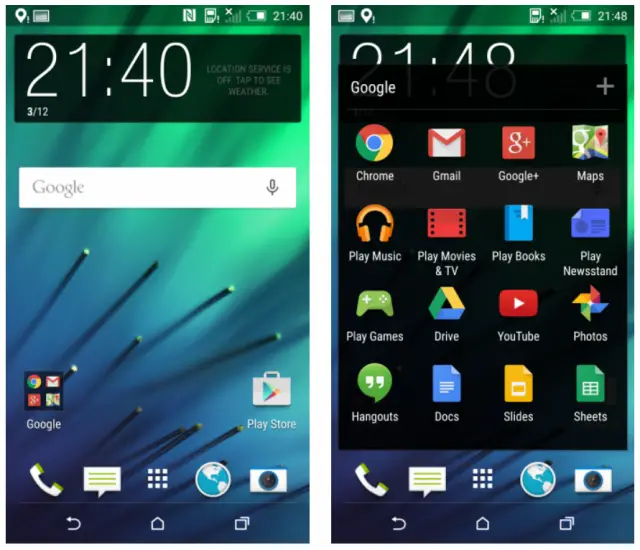
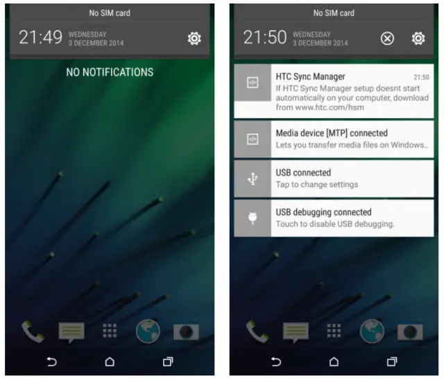
Judging by the home screen alone, you might initially write the update off as lazy work by HTC — it really doesn’t appear anything’s changed. But that couldn’t be further from the truth as HTC has actually adopted quite a bit of stock Android’s features. Namely, the notification bar looks more in-line with what you’d find in AOSP with HTC going for a light background instead of the dark currently featured on their phones. They’ve also put notifications right on the lock screen.
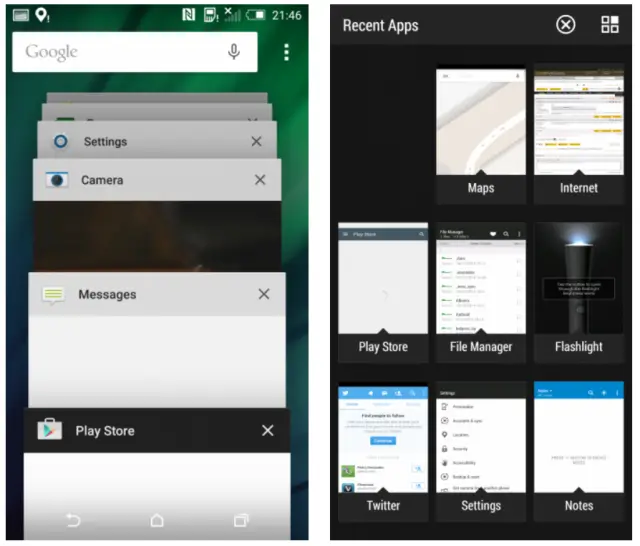
HTC also fully integrated Lollipop’s recent apps switcher, a rolodex-style cards interface that gives you a visually appealing interface for jumping between your most recently used apps. The last bit HTC borrowed from AOSP was the ability to search for specific settings inside the Settings app. Nothing huge there, but it can be a huge help for folks who often find themselves lost in a sea of toggles and checkmarks.
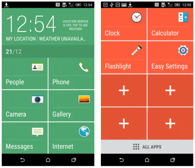
Beyond all that, HTC is looking to bring something of their own. It’s Easy Mode, which makes the user interface much simpler to use for those who might find the default smartphone experience too daunting for them.
Easy Mode’s interface will put the most important apps right in your face, with a button to access all apps sitting below all that. You can add and remove apps at your own discretion so those who opt to use this mode do get a bit of customization. It should be easy enough to switch between the two modes, so those who start off using Easy Mode can graduate to the full home-screen experience to lay things out exactly as they want it.
Unfortunately that’s all we know at this point. We still don’t know when, exactly, to expect Android 5.0 Lollipop for the HTC One M8 or HTC’s other non-Google Play phones, but their 90-day guarantee means we aren’t far off from seeing it make its way to handsets everywhere.






That actually looks extremely boring and I’m a fan of the recent sense skin.
Me too, but apparently this makes things smoother
What the? This IS the recent skin, you are talking about. Still Sense 6. It’s always been this way. New version of Android doesn’t mean a new version of Sense. Once M9 comes with Sense 7, M8 will get Sense 7.
No, maybe I should of been clearer. I’m a fan of the skin that’s on the htc m8 right now. I believe their lollipop skin looks weird.
Looks great! I’m excited
Easy Mode is not new, guys….
HTC gets animation for recent apps? Like it had in 2012 when it was just eye candy? And a light theme for quick settings? Like it had in 2011 when that was bloatware?
Hooray – thank goodness that Google is finally giving HTC direction. They think of everything. :D
I see what u did there
Was not expecting a huge leap in design… The One M8 is fine as is, there version of Lolipop with Sense 6 looks fine… The new Hima/M9 will be a true work of art
Its ridiculous that we on the Moto X 2nd gen for AT&T are still waiting for 5.0 when Verizon has the same phone and have 5.0 already. And now looks like HTC is going to beat Moto/AT&T to 5.0. that surprises and irritates me
They already make a smartphone for people who find the smartphone experience “daunting”, its called the iPhone.
Easy Mode looks just like a renamed Car Mode. Honestly I find it all pretty ugly. I’m hoping to stick with CM. Maybe they will give us more visual options.
M8 dev edition is in certification stage shouldn’t be long!
What about the Unlocked M8 version? Will that come before the carrier and around the same time as the DEV edition? Thanks
Samsung is going update his older versions with Android Lollipop like Note 2,i want to know will HTC update his older versions