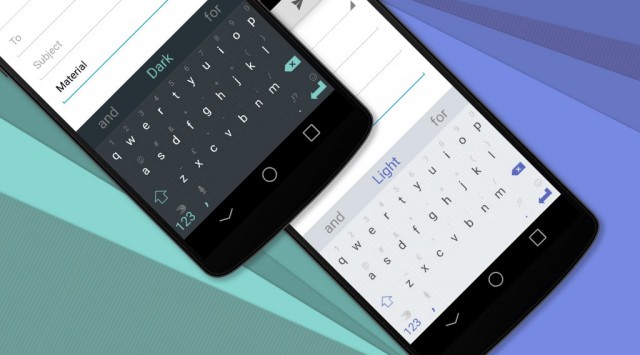
We can’t say we’re fans of all of SwiftKey’s keyboard themes, but the latest two additions to the SwiftKey store have our mouths watering. Two new themes will match the look and feel of Material Design. It doesn’t totally fit — for starters, the presence of borders around each key is a sharp contrast to the lack of lines in the default Android 5.0 Lollipop keyboard — but it’s very clean, very neat and looks very pleasing to the eye.
I mean, almost anything is better than some of the other stuff they’ve been putting out lately. Themes cost $1 each, not a bad price to pay to give a new coat of paint to the one app you know you’ll use every single day. You’ll be able to find them within the SwiftKey Store inside the SwiftKey app.
[via SwiftKey]







meh, I liked it better when swiftkey was a flat fee and updates including new themes were FREE.
I like it better as a free app, and I guess most people do too, because that’s what they did.
Anyone try out the Lollipop Keyboard from xda?
They are pretty plain. Don’t scream material design to me either. Gonna stick with the free themes, but thanks for the update.
That’s actually how the Lollipop keyboard looks in stock 5.0. Or at least that’s how it is in the developer preview.
This is almost what I’ve been wanting with the symbol images showing. I just don’t want the key borders.
Ugh. I don’t know why they had to add key borders but I’m instantly regretting my purchase :(
For some reason, I can’t handle keyboards without the boarders. I tried using the Material Designed Google keyboard for awhile, and I just missed keys way too much.
Maybe I’m just weird.
It’s still the best theme they got. Was using Chalkboard before this.
It does look like they had to make the letters/symbols smaller to accommodate the key borders, which is bad imo. I need to see!
material design themes for this should be freebies. whatever, I’m getting ready to dump swiftkey anyway. the swipe feature on it sucks pretty bad.
I used to be a big SwiftKey fan but they jumped the shark a while back for me. Google’s keyboard works & looks great… plus, you know, it’s full of googliness.
They all bug me in little ways, that’s why I switched from Google Keyboard to this. However, I think Google may have bugged me slightly less.
I think Google’s Swype style input is definiatly the best, but for regular typing (which I tend to use more) I prefer SwiftKey. Every now and then I bust out the Google keyboard for Swype typing, but that’s only when I’m going to need to be typing with one hand for awhile.
That’s gross….
Very funny. Its generally because my hand is covered in KFC grease that I don’t want on my phone, but whatever.
You already saw my other comment about KFC…
I think I have a problem.
My swift key has been lagging for a couple of days now…
Swiftkey people, I hope you are listening. You did something unfair to paying customers. When you transition to the free + In App Purchase model. You compensated your paying customers with a free premium theme pack. The trouble is that this pack is ugly! Personally I find it useless. I wonder if you had designed that premium pack to get rid of your paying customers. It would be more fair if you grant them a credit of 10 themes and let them pick the ones they like.
It wasn’t really unfair. To you and me, the app was worth 4 dollars. You still have the app. It still works just as well.
I have no problem with apps I buy going free. I don’t feel entitled to any kind of compensation. I don’t see why people do. If I go and buy some KFC, and the next day they have a sale and you can get a 20 piece bucket for 3 dollars, I don’t go in there and say that’s unfair. I don’t feel like I got ripped off.
I just go buy more KFC.
Mmmm… Chicken…
It’s like getting a coupon for free KFC chicken. You go in, but they say you can only have wings or thighs…no breasts or drumsticks. Most people would want breasts………..and chicken. ba dum ching!
http://i.imgur.com/V0IMIjp.gif
Chicken is the best.
It tastes like chicken.
Lets not forget the unfortunate who purchased both the tablet and phone version before they merged them.
These should be made free, without question. Once Material Design becomes standard along with its Material Design Stock Keyboard.. when using a third party keyboard, keeping the same design should be a no-brainer. I shouldn’t have to buy a separate keyboard design/layout, with an in-app purchase, to keep the same look as a stock keyboard.
Most 3rd party keyboards don’t look like the stock keyboard. Swiftkey doesn’t normally look like the google keyboard, why should it now?
Your missing the point. They are offering stock-like keyboard designs with in-app purchases. Im fully aware most keyboards do not look like stock, and unless the keyboard has a specific function (like SwiftKey) then chances are they are supposed to ‘not’ look like stock, as is the point. What SwiftKey has done is made Material Design-Like Keyboards and instead of making them free to match (what you already have), they put them at $1 each. So to put that in perspective, you already have this design with stock Material Design, but to get it with SwiftKey, they want you to purchase it. It doesn’t take a genius to see the issue here.
That’s not true though. You’re trying to make it sound like Swiftkey is selling something that you already have. You don’t. Look at it in terms of custom launchers. Say I make a launcher that looks like the stock jellybean launcher, but it has themes that I also make, which I sell. Am I supposed to give away the Kit Kat theme, just because people already have a default launcher that looks the same, but has completely different functionality?
Taking the same example, what if I make a Blinkfeed (htc) themed launcher. Am I supposed to give it away to everyone with a HTC device, but not to those with a Samsung device? I mean they already have a launcher that looks the same, so I should give it away for free, right?
Of course not.
Listen, i understand what you are saying but you still, again, are missing the point. You are trying to make out that SwiftKeys model of selling you a design to match what you have is OK.
“You’re trying to make it sound like Swiftkey is selling something that you already have”
No, i am simply saying SwiftKey itself is about the apps functionality.. not its looks. Functionality first, looks second. SwiftKey has made a model using this as a selling feature. If you want my personal opinion then YES, 5.0 users WILL have this keyboard and if they want to keep people interested in their app they shouldn’t be charging for the Material experience.
“Say I make a launcher that looks like the stock jellybean launcher, but it has themes that I also make, which I sell. Am I supposed to give away the Kit Kat theme, just because people already have a default launcher that looks the same, but has completely different functionality?”
While this analogy is not exact i understand what you’re trying to say, however there are so many things wrong with this. You’re trying to tell me that people would knowingly make a jellybean launcher, and sell a KitKat theme for it. First.. show me this launcher, id love to see an example of someone portraying your business of apps. Second, if you want people to keep using your launcher with KitKat then yes! Its not rocket science. And even if there were a launcher, its just an example of bad business and a bad model that will fail. You have also failed to tell us anything about this “Launcher” you are giving as an example. What’s its functionality? Because if it’s a launcher that only installs in-app purchased themes and nothing else then it sounds like your opinion of whether or not a theme should be free is biased to your profit margin. If its a launcher with different functions and features then themes are second, and even if you sell these themes.. everyone knows that if you’re selling something people already have with stock (take that as you will) then its just crazy to make a launcher without that as a standard free theme. It means some people will uninstall and or not use your launcher/app and try something else (as some already have with Swiftkey) and that’s again, not something any app developer wants, hence my original statement of this should be free without question.
“Taking the same example, what if I make a Blinkfeed (htc) themed launcher. Am I supposed to give it away to everyone with a HTC device, but not to those with a Samsung device? I mean they already have a launcher that looks the same, so I should give it away for free, right?
Of course not.”
This is a terrible analogy. If you’re selling a Blinkfeed (htc) themed launcher, WHY would anyone with an HTC that has blinkfeed install it? Im sorry but i cannot even understand this.
Let’s pretend for a second that for some reason, someone with BF wanted your version (which apparently is the exact same) and so they decide to install it. Should they have to pay for it?
Well thats up to the app developer Dwight.. its not a standard of what you believe. If you want to charge HTC users for a BF that is the exact same as the one they have, then go ahead, but only an idiot would purchase such a thing. Now is your BF different? Does it have different features? If so, well now that’s a different story, but lets say it does. You are talking about one specific style of HTCs phones skin and the feed on them. You are not talking about what is about to become Stock Android 5.0 on future devices until its next major update. Something that people will most likely want to experience. Something people will leave your app/launcher, to experience.
People purchased (now Free) SwiftKey for its model of being a great predictive Keyboard. In fact, SK has become so popular over time because of this alone, and they know it. Somewhere along the line recently, they have changed their model to be a free app with in-app purchases, specifically keyboard designs. What does this mean? It means anyone can now obtain the app free, and can install custom themes for the keyboard. This by itself is a decent model… it makes sense to get people hooked on your app and when they want a change, but also want your apps functionality, they will opt for a new look (new design).
There is nothing wrong with this, in fact its a very popular business model. Usually they start off free.. but hey, that’s another story for another day.
Where this falls short is by crap like this… and you can bend and skew this any way you want. SwiftKey released keyboard designs which are supposed to resemble/copy/look-like the Material Design ones that you will be receiving STOCK on your phone.
People who like the new standard will be wanting to use it. So, what does SwiftKey do? They use their model of offering custom keyboard themes to sell Material Design themes for their users at $1 each. You could argue many things like they are doing you a service by offering you a new design for you to spend you money on. You could say, good job SwiftKey for enabling us to purchase the Material Design Keyboard look with your app because we love your app, but we want what we already have. At the end of the day, its about money, plain and simple.
This really hits home, again, with users like I, who purchased and supported SK from the beginning, only to be told they are now a free app, and that’s that. Free keyboard pack? Can’t choose which one? Oh well, sorry, thats life. No, that’s bad business. They could have not offered anything, that’s for sure, but this was more insulting than that.
This keyboard design is ON Android 5.0 and will be standard! It will be a familiar keyboard with most Android users very soon, and taking that people want this and saying we will charge them for this look is ridiculous. Its one thing to not have the design, but to have it and charge for it is what’s happening here.
In the end, SK will do what they like.. if they want to charge people for this, they will, and we have proof of that right now. My objection was simply that its a poor decision. It doesn’t look good on them (which people have pointed out). It has made people leave the app for the Android keyboard for people that either dont want to or can’t purchase it and with Android 5.0 being around the corner and people wanting to experience Lollipop, they will lose users over this.
Like i said, this should have been Free. It makes sense for if nothing more than keeping people in their app.
TL;DR, SwiftKey wants to charge you for Material Design instead of offering it free as a business decision to keep users from switching back/to Android Keyboard who want the Material experience
Stop making themes and focus on making your keyboard fast. It muist be the slowest keyboard out there.
Just purchased the Material Dark theme. Pretty nice.
Cool but I think I’ll stick with TouchPal.
… For a price. ¬_¬
This move pushed me to try out Google keyboard. And I’m probably staying with it. Glad I didn’t have to pay to get the “material” experience.
I paid for Swiftkey 2 years ago but the Google Keyboard is much better. I haven’t used Swiftkey in over a year.