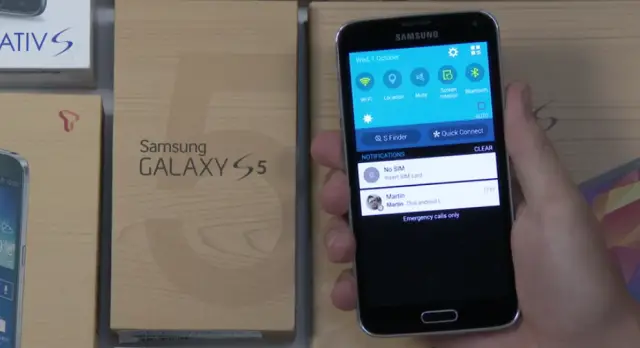
It’s not often we get an early look at new firmware, but the folks at SamMobile have acquired a Samsung Galaxy S5 loaded up with Android L and what will be the latest version of TouchWiz once the duo finally arrives. The new changes have been previewed in a very extensive 8 minute video that gives us a look at almost every corner of the operating system.
Right off the bat you can tell Samsung still infused a lot of their own stuff inside Android L. They’ve customized just about everything they can. The most standout change is the move from an overwhelming amount of blue to a healthy amount of white, a color trend Android L as a whole has been built with. Many of Samsung’s apps have been built with the latest design language changes proposed by Google, though don’t expect them to follow them to the T.
The notification pane sees a great deal of work with notifications showing up as floating cards, as does the recent apps switcher. It honestly looks very nice, and should be a fresh change of pace for those who were starting to grow tired of Samsung’s long-used design.
Of course, the software isn’t likely to be final and there’s a good chance we could see a lot of changes by the time Android L makes its way out of the oven. There’s no tellinghow soon Samsung will be ready to deliver the goods to everyone once they’re finally available, but if this video is anything to judge by then they’ve made a great deal of progress and shouldn’t have problems keeping up with the Joneses.






I can’t get over how ugly Touchwiz is.
I am confident the UI designers are color blind.
Welp looks like I’ll be returning to Nexus. This looks horrible!
Every time I see Touchwiz I’m glad I bought a Nexus 5
Exactly why I stopped buying Samsung phones it’s OK on tablets but horrendous on smartphones
I can agree with the tablet part. TW definatley excels on tablets. I just hate that Samsung decided to go with physical buttons on the tablets. Makes it a pain to hold the tablet in a specific orientation.
So much better than any version of touchwiz yet, though.
Lg g3 has a better UI but I like sense better they just won’t get rid of the bezel and make the screen bigger 5.3-5.5 inches
I can’t leave Touchwiz because it has so many features and shortcuts it makes navigating the phone and changing settings extremely simple and convenient. Can’t judge by its looks entirely, try using it for a few days and you’ll get dependent on the features and shortcuts.
After being in the Galaxy S family since the S2, Thank you Samsung for helping me make up my mind. Nexus 6 or Moto X.. here i go.
Nice! I’m loving it. TW had come a long way from it’s ugly original appearance. Definatley one of the best custom UIs in terms of features and ease of use.
Haters gonna hate, but I’ll gladly take TW
Lag lag lag.
That’s odd. It has the old “Samsung apps” which was replaced by “Galaxy apps”