While most won’t be able to get their hands on the all new Moto X until later this month, we walked away from Motorola’s Chicago headquarters with one in hand. Naturally, the first thing we did was pry that sucker from its cold cardboard tomb and power it up to get a closer look at what consumers can expect when they unbox the device for the first time.
The packaging is nondescript, opting for the traditional as opposed to the circular box that the Moto 360 smartwatch will come in. But what’s in a box? Well, the smartphone, to be frank.
The new Moto X at first glance looks a lot like the old Moto X. It keeps the same design language down to the little accents, but there are a few differences worth noting. The first is a larger display, which sees a bump up from the first generation’s 4.7-inch panel to 5.2 inches (we also get an increase in resolution from 720p HD to 1080p). Metal has also become a primary build material with an aluminum frame wrapping the device and aluminum accents that include the power and volume buttons.
Still, the larger size and the added metal don’t contribute to a bulkier phone. At it’s thinnest edge the new Moto X is a mere 3.8mm thick, while it expands to 9.9mm at it’s thickest. This increase is accommodated by a gentle curve (much like with the original Moto X) that has the ergonomic benefit of producing a rather pleasing handfeel (yeah, I just said handfeel, which might be worse than mouthfeel).

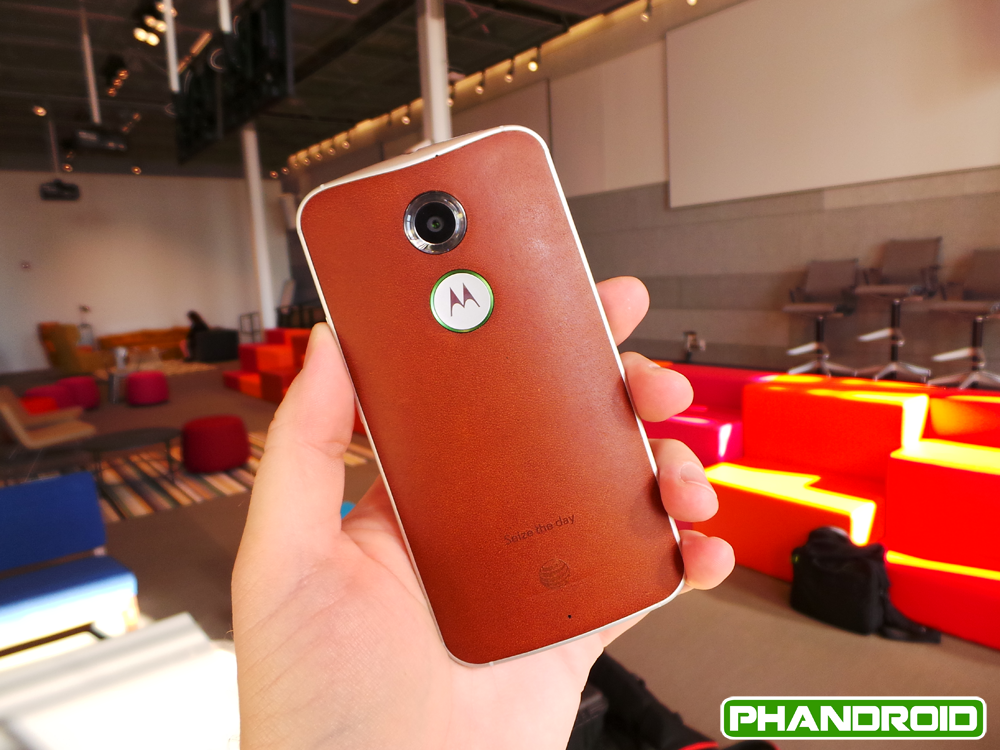
Moto Maker is back with device customization, and this time around Motorola has added leather options in addition to the woodgrain and plastic finishes available for the first Moto X. While the model we unboxed was a standard Verizon edition with a soft touch back, the leather may just be the best finish option for the Moto X we have seen yet. We can imagine the leather picking up a nice patina as certain areas get worn down and shaped by use, adding a truly personal touch.
Internally the specs have seen a bump in most areas. You get Snapdragon 801 processing with Adreno 330 graphics, a 13MP camera with an innovative dual-LED “ring flash,” and a 2300mAh battery. Added IR sensors enable enhanced gesture interaction; perhaps the biggest software upgrade is the ability to change the “OK, Google” voice command to a custom trigger phrase of your own choosing.
Much like the name, a lot about the new Moto X remains familiar while experiencing the benefit of mostly subtle upgrades. It’s the ultimate iterative update, but we don’t mean that in a derogatory way. The new features are just the sort of thing Moto fans were asking for. There is a certain understated beauty to the device’s design and feature set that doesn’t disappoint.


I like the phone. Nice build quality, specs are right in line with most of today’s flagships. Battery could have, and should have been larger. But I guess we will see how it performs in the real world. But this is obviously not a worthy upgrade over my OnePlus One so I will have to pass.
From what I’ve been reading,the new and improved Moto-X seams like a decent upgrade from its original! But, with all new phones that come out I’ll wait a couple 2-3 months after release to see what people think of it!
Thanks for the quick look Chris!
Will a 64gb version be available? 32gb isn’t enough for me. There is no MicroSD expansion on this, right?
Nope :(
Eventually, right?
Nope. Just the G.
Doesn’t sound like it will be at first, but it could come later (crossing my fingers).
I know the 64gb version of the original moto x came out like 10 months after the initial release. Man, I don’t want to wait that long!
That’s what I’m hoping, may only be available in the developer edition though, which doesn’t include MotoMaker.
Well, I’m going to wait this one out unfortunately. :( I really think this phone looks great! It’s gonna be tough holding out!
As much as I want to get it on launch day, I’m going to wait a few weeks and see how things turn out. The Note 3 is currently doing me well, I just have new phone envy.
The developer edition does include moto maker this time around. They mentioned it in the video.
I just read an article that said there would be No Developer editions for Verizon, the way it was stated it seemed like there weren’t going to be any dev editions at all. Doesn’t really matter to me because I’m on T-Mobile :) If I could get a 64 GB dev edition that can be customized through Moto Maker that would be sick!
I gotta calm down a bit it , it either this or the z3 so no ir blaster on the new X or Z3?
Nice to know about the supposed increases in reception, can you guys include a comparison when you do the full review? With the inclusion of 700mhz band 12 and that this could really improve my coverage once it’s rolled out for T-Mobile.
This makes me want to get rid of my nexus 5 for a moto X…the leather so far looks so nice
This!
Does the new Moto X have NFC?
Of course, what phone doesn’t? iPhones aside lol
There is no way this battery is going to be acceptable. Moto promised “all day battery life” on the original X and in 4 months I never saw that. Here we are once again and the same promise. Problem is, other OEM’s are now promising 2 day battery life. 2200mah just isnt going to cut it. Also, not crazy about the size of this thing. I was looking to go smaller with the Moto X. They do a great job shrinking the bezels so I could have lived with a 5 inch screen.
Looks like it will be Z3C for me.
well, they did upgrade the charging capability.. 15 minutes for 8 hours talk time usage is not too shabby.
I’ll be fifteen minutes down the road, with a fully charged battery that can handle 4 hours of screen time and who knows how much talk time by the time you get that 8 hours talk. Wonder how much screen time that equals?
That’s why they have the Moto PowerPack which is 1,500mAH and fits on your keychain.
I saw that and it is really funny to me. Anyone who says they don’t want or need a removable battery can now get this larger-than-a-removable-battery-sized extra battery pack to carry around. That is brilliant! Uh, wait a minute…
I dont have an issue with non removable batteries. I have the GS5 and before that the GS4, 3 and 2. I have never swapped a battery. What must be done though is to put a big enough battery in there to begin with. Moto has made a crucial mistake here which, IMO, will doom this phone from day 1.
Agree on the battery size. As a daily battery swapper/almost never plug charger, only a Moto X Maxx or droid Maxx could lure me away from a removable battery. And to go non-removable AND small on the battery? Yup, I also think they screwed up there.
Removable batteries are nice, I’ll give you that, but this thing has added value of being able to find your keys or your phone if you ever misplace one or the other. If you lose both you’re kind of screwed though.
The only time I want to be charging my phone is when I am sleeping.
the early reviews say this has better battery life than the predecessor.
No thanks. I’ll just order another 2013 Moto X if mine breaks.
Would have liked to see the screen remain under 5in. Then all the things like the battery and omission of an SD card slot would be more easily forgiven. Wouldn’t really mind if the screen stayed at 720p too to help with the battery like. Moto was probly aware that any phone with less than 1080p screen wouldn’t be taken seriously though.
there is something ugly about this phone….I’m not impress with the design of it. Good luck Lenovo.
Agreed. The front face is pretty ug. Like a nicer Amazon phone.
Good lord, that brown leather version is fuggggggggly.
No wireless charging, no thanks. I have the DNA now and don’t want to switch to a phone that doesn’t have wireless charging.
I had wireless charging with my s3 and I don’t miss it one bit. I hardly ever used it. I prefer to just plug it in. I just don’t understand the need for wireless charging… What is the big benefit to you? I personally don’t see any.
this has everything you could want in a new Android phone.
I have to totally agree with you, and im someone who isnt a fan of stock android. But this phone is a major win.
It seems like that earpiece kinda sticks out, like the stereo speaker grill at bottom, doesn’t that hurt when you put the phone next to your ear to talk with somebody?
Google play edition? How’s the in call volume speaker? Loud!? Nexus 5 in call volume is horrible, g1 was horrible. Might go with the m8 gpe. Good sound
The big Moto logo and camera makes the back look ugly. Who the F designed this?
That black standard Verizon version is gorgeous.
“Charges out at 1.1 mA.” Well, that’s going to take a while.
Does anyone know if I’ll be able to change the back casing? Leather sounds cool on paper but I don’t want to get it and not like it and be stuck with it. Plus I heard there may be a carbon fiber version in the future.
The logo looks a lot better than the one last year. I think the overall design is better and that screen is gorgeous w/ google launcher out the box.