It’ll be a while before many of our favorite Android apps are given the Material Design treatment, but that doesn’t mean we can’t dream about what could be in the near future. One concept artist — Emmanuel Pacamalan — has decided to put together a reel of what he thinks Instagram’s app could look like with the new design language introduced at Google I/O this year.
My first thought? Absolutely stunning. Not that I thought Android was ugly (well… it was until Android 4.0), but it’s the kind of design that could make people change their opinion about the lack of well-designed Android apps. Eye-catching animations, colors that pop and efficient use of white space all make this Instagram experience seem ten times better than the one we actually have right now. Fingers crossed that the folks at Instagram (and/or Facebook) are taking notes.
As easy as it is to salivate over the future of Android design, we wonder just how fast Material Design can take off. After all, there is still an alarming amount of apps out there with designs that feel like they belong in the Gingerbread era. Doesn’t hurt to dream, though, so take a look at the concept in the video embed above.

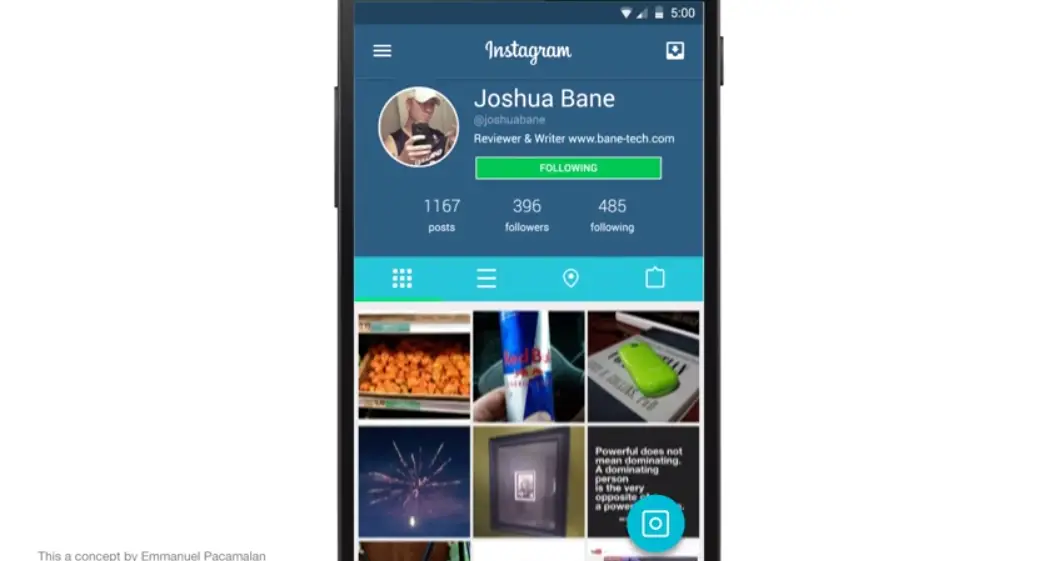




Too much cyan…
I totally agree. They need to keep it white in the profile section and the bar maybe make it brown with white text. Use all the colors of the app icon and utilize them well. Something about variations of blue is always over saturated when it comes to social apps. Very annoying. Be different. Other then that visuals are nice. Just the color scheme was off.
Love it!
That video was awesome
I feel as if I’m the only one that’s not really excited for L and material design. I do like the animations and think that its spices things up a bit but the direction Google is going and suggesting developers go with the color pallet I feel is really for lack of a better word ugly. Idk maybe its just me but I like the more subtle and plain look of android now. Well those are my two cents.
Yeah, it’s just you.
Considering how long it takes Instagram/FB to update apps… Dream on. Maybe in a few years they’ll catch up to good design.
Anything social media is garbage. Down votes incoming.
There, you had your moment.
Nah, we respect the mentally deficient.