Talk about the all new HTC One M8 at AndroidForums.com!
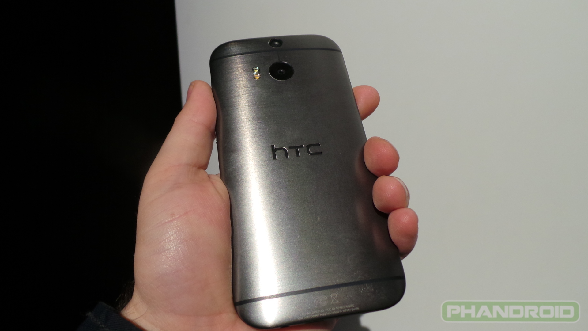
Looking for hands-on with the all new HTC One M8? Look no further, as we’ve already gotten some up-close and personal time with this bad boy in New York City. The device was just announced this morning, and brings to the table a healthy suite of improvements over the original 2013 model it was named after.
Beefier internals, ambitious new camera features and one of the coolest cases we’ve ever seen were all unveiled, and we’re bringing you an even closer look. Touched on in this video are the cool Dot View case (which you can find more details about in the hands-on right here), new camera features, BlinkFeed and Motion Launch, and more new goodies added as part of HTC Sense 6.0 (which we regret to inform you HTC is trying to call the “Sixth Sense”).
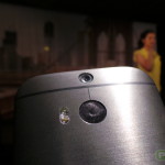
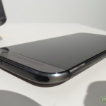
All in all, the device you see above and in the photos below seem to be quite gorgeous at first glance, even if not quite as gorgeous as the original HTC One was in its heyday. Can’t go wrong with a zero-gap brushed aluminum construction, though, which makes this thing feel like one of the most premium pieces of technology you can find today.
Want to know more? Just hit that big play button above to be whisked away to smartphone bliss, and stay tuned for more coverage about the HTC One M8 coming up shortly (including our full review in the days to come)!


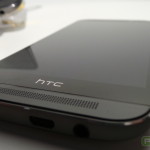






It’s good to see HTC getting back on track with the One last year, as well as this years version. Had I not gotten pulled into the Note world, with the Note 2 (2 years ago), this might have been a device that I’d consider…especially with their bringing back the microSD slot. Still trying to figure out why they needed to keep that extra bezel on the bottom, with the HTC logo. Seems like such a waste of space. If they really needed to keep that branding, why not design it into the software that the software home button is replaced by “htc” instead of the actual home graphic.
“Still trying to figure out why they needed to keep that extra bezel on the bottom”
Sounds like they changed the acoustic design of the speakers, which required more room behind them. Between that, SD slot, bigger battery, etc, they probably need all the room for internals.
How about just quit trying to figure it all out? Seems pretty easy to do. Not really worth trying to figure pointless things out
4MP Camera and they removed Optical Image Stabilization, it’s a shame as the phone has allot going for it but they made no real improvements to camera, it’s the same sensor which did horribly in camera tests against last years phones.
It’s going to fair even worse this year, such a waste.
Noticed he dodged the question about the back camera specs? He didnt want to say its a 4Mp camera. It is marginally better in low light; but hugely deficient in resolution.
It is a lot better in low night. Using any other phone with being in a special night mode and see how good it is.
No Duong, like DavidB23 said it’s marginally better in low light “Night” than some other phones.
Look at the link below which is a camera test at night, its beat by the 8MP iPhone 5s camera and joint 3rd with the Nexus 5, Xperia Z1 and LG G2 and only just beats out the Galaxy S4 and Note 3 which both behave strangely in low light.
Also check out end score, HTC One M8 comes in last place.
http://www.phonearena.com/reviews/Camera-comparison-HTC-One-M8-vs-Samsung-Galaxy-S4-Galaxy-Note-3-iPhone-5s-LG-G2-Nexus-5-Nokia-Lumia-1520-Sony-Xperia-Z1S_id3626/page/4#44-Apple-iPhone-5s
The HTC employee is just staring at the camera like a creep lol.
HTC bad bezel design. Well blame Peter Chou, he didn’t have to approve of that crap
Try building a phone or taking a phone apart before making stupid comments like this.
Hey, I got a few words for you, kiss my A$$ I comment how ever I want to comment, I’m still buying it, but that black didn’t need to be there. Nah shut the heck up
The original htc one looks ten times better, i will pass.
He knows what he’s talking about. The camera features are awesome! Definitely day 1 purchase, just need that Tmo release.
Yeah dude. 4MP!! WOOHOOOOOO!!!
The level of sarcasm is high with you sir lol upvoted!
Speaking like someobe who know nothing about camera. Next you will tell me a 10 mp DSLR is worst then the Z2 because it has 20 mp
“We added microSD card slot based on consumer feedback”
Let me guess, you also added a lot more wasted surface with that huge bezel
“based on consumer feedback” right?
Thanks a bunch HTC!
I had been waiting for this !!
more at: http://www.edutechs.in/
for people complaining about the bezel, I know it kinda sucks but there is a reason for that design choice. HTC didn’t just add the extra bezel to anger everyone.
I just wish they kept the buttons in that HTC bezel then. Why not have more screen real estate? It’s still nice though…
totally agree, but I think android as a whole is going towards on screen buttons. the s5 is an exception
If the app is written correctly then you will see the buttons disappear and take up the full real estate, just like in immersion mode.
In the web browser I used the buttons were in a fixed black bar. I think It was chrome.
that camera demo does make it look cool – must resist…
some neat features here but $600 is too much money for me.
Looks like the touch response on this phone is great! Better than the Z2 from what I’ve seen.
Went to the verizon store and it doesn’t seem as long as it looks online. In pictures or videos. I still don’t like the wasted space with the HTC logo but I found I stopped paying attention to it the more I played with it. Its a sharp phone. I’m still going to wait to hold the S5 and then make my decision.
Good to know
Why do people keep saying wasted space? Don’t you understand that’s where they put the necessary parts for the screen and the amp for the speakers. Think of a sub woofer, the extra space is needed. Geesh, if the space wasn’t needed it wouldn’t be there. Hopefully in a year or 2 the tech will be to a point it’s not needed.
Also, trust me when I say the S5 if junk. Played with it today at my local Best Buy, they only had 2 white models on display, they said they were 1 of only 100 test stores to get them. The screen is decent, but the phone is ugly, and feels like a child’s toy. I wouldn’t even care if the S5 ran circles around the One, it’s too ugly and cheap looking for me to ever carry.
I’m not fan of the plastic either but I always put cases on my phone so I will not be able to enjoy the metal finish anyways. The problem with the onscreen buttons is that the screen size is diminished enough to be a concern. In a Web page the onscreen buttons are in a black bar on the screen above the htc bezel. This makes the content portion of the screen smaller. The S5 has the buttons in the bezel permanently allowing the whole screen to be used for content. Again I was impressed by the M8 today and looked better than I was expecting. I’m still going to wait to feel both in person though. Too close to call!
Yea you should definitely check out the s5 for yourself. It’s a really kool phone , I’m just holding out to try out the m8 myself before I decide which one I want
I like M8… http://shoutaword.com/samsung-galaxy-note-4-ready-to-roar
What a looker! The M8 will definitely make waves. It will give tough competition to the Galaxy S6.
http://www.bloggitech.com/smartphones/galaxy-s6/