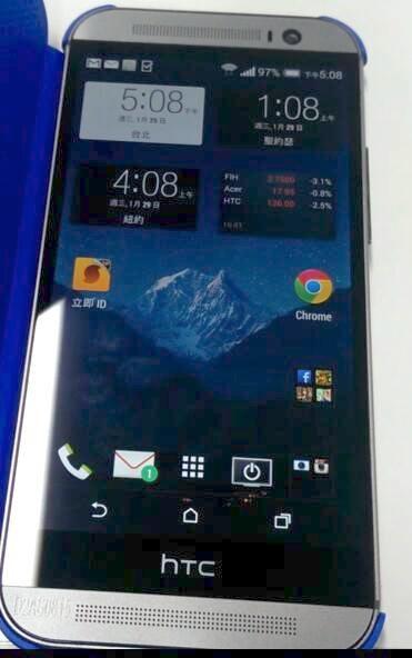
Here it is, folks. All previous leaks be damned, this could be our first real look at the upcoming HTC M8 (One Plus, One 2). Off the bat, you’ll notice the slightly modified upper speaker area (the front facing camera is scooted over). This actually lines up perfectly with a previous leak, in which someone was able to nab a picture of an alleged mold of the M8 back in December.
Oh yes, and appears as if the fact that HTC is now using software navigation buttons had no impact on reducing the bottom bezel, now occupied with little more than the coveted HTC logo. It’s not quite how we pictured the M8 would turn out, but we’ll reserve final judgement until we have it in our hands.
Yesterday we got what appeared to be a closeup look of the back of the device. Keep in mind nothing at this point is set in stone, back when the HTC One first leaked it looked much different than the final model. Let’s hope that with all these leaks, the pressure is on HTC to, at the very least, will hurry up and announce a date for the unveiling event.
[via @HTCFamily_RU]


They could have, at least, reduced the size of the HTC Logo and surrounding bezel. Oh well, I’ll still probably be getting the phone unless the price is stupid.
What the heck is with the bottom bezel? Wasted space! Excited for the on screen nav buttons but not with the huge black bar at the bottom. Hope its not the real phone.
Guess this one’s off the shopping list for me. The HTC One was the absolute limit on size for me (barely fits in my hand) and this looks like it will be even bigger.
Plus it has the same sized bezels on all sides…. FAIL!
You guess that “one”? =.3
Bottom bezel! No..! Why bother HTC with on screen buttons then!?
Yeah, I’ll take a pass on this one if it is legit. Guess HTC will have one of their regular financial quarters again.
LOL THIS ONE IS SOOOOooooooo FAKE!
The tip i sent in wasn’t this one and looked much more like a real one…
Link please
They really need to get rid of that bezel. It’s like a screen within a screen. They’ve been doing that for years. Cut that out man. I don’t see the point of having your logo on the front and back. You can be very successful with a clean look and just having your logo on the back. I honestly think they think that looks cool. It did before, but it’s really not needed.
it’s Fake. With on-screen software buttons, there is absolutely no way they’d leave that bezel in just for the sake of the htc Logo.
I hope (and pray) you’re right.
yeah.maybe(and hopefully) a freaken
out-of-this-world professional job at Photoshop….this cannot be…
This is HTC…
If there is a God, He surely wouldn’t let that huge bottom bezel be there.
It’s pretty ugly if this indeed is a real leak
Was thinking the exact same thing
No way that’s real (or at least final) with that bezel.
Also why does it have Samsung’s WiFi icon?
Just talked to Peter Chou and Iron Man, they both confirmed this is fake.
HTC has bitten off more than it can Chou by trying to improve on the One by doing what they did here.
I see whatchou did there
:P
The only reason I can think of leaving the HTC logo bezel is so that Apple can’t sue them claiming it looks like an iPhone when the phone is off. That, and of course brand recognition (since most people cover the back with a case).
Its fake zoom in at the top you can clearly see its photoshopped with ditorted pixels around the features
Anyone make out the faint imprint next to the lower speaker grill? Zoom in & the last 3 digits appear to be “815”.
If this IS real, then HTC just isn’t getting it. That bezel where it says HTC is pointless. If LG can do what they did with the G2, then it is not a hardware limitation, it is a “design” choice made by HTC. This is a step back for HTC if it is real, and the radius’ on the corners have changed and it looks worse imo. I am going to be really disappointed if this is reality. I want an upgrade to my One, not a step back on the physical design. Really hoping this is fake. Prolly just some Sammy fanboy trolling us hopefully.
That bezel could be the fingerprints scanner
Damn. I was interested in this but I guess I’ll pass. On-screen buttons are gross. They easily could have put regular ones around the HTC logo. And are they trying to out-long the iPhone? Grr. Disappointing.
My first thought was the phone ratio reminded me of the iPhone 5. The black bar where the HTC logo is located is just so large. Can they not figure out how to make the HTC logo stand out over the speaker grill? I won’t officially judge until they officially unveil it.
My question is, why do they have to have an HTC logo on the front? It’s like, Verizon level thinking here..
Your clearly the one actually out of touch. On screen buttons makes much more sense aesthetic and design wise. Its also a very very welcome change coming from HTC. Capacitive buttons are disgusting and your opinion is in the minority. Whats more of a problem here though is the awe-inspiring htc surrounded by a half inch thick black bezel.
Cool story, bro. I still think on screen buttons are retarded.
The thing I like about on screen buttons is they actually glow when you touch them. This is a nice visual confirmation that the button has been activated. With capacitive buttons, if nothing happens, you don’t know if it’s because of the app or if your finger isn’t activating the button for some reason. With KitKat, apps can now be programmed to hide the onscreen buttons too. This lets apps use the whole screen when those buttons aren’t needed. With a simple swipe from the top or bottom of the screen, they show up again. However, they need to use the extra space where the capacitive buttons would have been for the screen if they are going to use on screen buttons.
Capacitive buttons have haptic feedback.
Minority according to what? Sales figures suggest otherwise. This circlejerk over virtual buttons is only found on tech sites.
If they add another row of icons I am shooting my left hand off.
(that’s the hand I wave with)
What’s the problem with virtual buttons? In this image (which is clearly a fake) the bezel is still there.. but if that bezel is gone, then you have MORE screen space… when the buttons are there you have equal functionality and usability as the capacitive buttons, and when you go full screen you actually get more screen real estate and dont have issues of accidental back/home presses with games that have ui elements near the screen corners.
I fail to see any negative. I’ve wished capacitive buttons would go away for a while now, and I’m glad to see them gone, but I would genuinely like to hear a non fanboy/confrontational explaination of why capacitive buttons are better, because I honestly cant grasp their benifit over virtual buttons.
If this is real the bottom bezel can be where the fingerprints scanner is because rumors is that there is a scanner there. People are so quick to judge.
This is the first I’m hearing of said rumours. Still doesn’t make that black bar any uglier.
Anyone else notice the black artifacts around the HTC logo at the bottom? Kind of looks like somebody has crudely MS Painted something out of the pic.
Yup. More than often early prototype devices have numbers and barcodes branded on them to prevent leaks, and easily identify them. Standard procedure.
Ah of course. Good answer Mr. Chavez.
I regenerated the scrambled pixels
it says
:property of:
:C-Chavez:
Hail no!! I would actually not like this if that’s the phone. Making the screen larger and keeping the EXACT amount of bezel? It’ll be ridiculous in size.
I hope HTC does not go through with that. =.[
Megabezel is back
Back in black! I hit the sack!
this cannot be it..it is redundant!!!! why offer on screen buttons, yet keep same bezel?? may as well just kept the capacitive buttons and gave me back my screen real estate!!!!!
HTC!!! if you need a logo..paint spray or air brush it over the bottom speaker!!!!
Thats exactly what I was thinking!!
Come on HTC, the goal was software buttons and LESS screen room being stolen.
If this is it, then I’m disappointed. Yet again.
If this is real, it is a MASSIVE disappointment. This can’t be real, it’s too bad.
Hello LG G3.
I dont think HTC will make a device like the HTC One and turn around and release this ugly monstrosity… Have faith!
Haha look at all the HTC fan boys finally realizing what most of us realist have been saying. HTC is friggin clueless.
Of course pending if this is the real deal
hold this down vote for me
that lower bezel is ugly. i have to have my screen in the center. having it off like that “barf”
I loved my HTC One, however, if they didn’t shrink the bezel, and left that huge wasted space wtih HTC written, it’s a huge mistake and just too much wasted space. Hopefully the battery is much larger than the OG One and they left it at 32GB internal storage and added SDcard slot.
Looking at this pic again, this really is a HORRIBLE photoshop job
What if someone posted this to super troll us HTC goers? I mean, *why* would they bring this out?
I didnt wanna say anything… but since you mentioned it– I swear I see Chris Chavez in the reflection on the screen
:D
Ha ha you wish. Looks like yet another failed year for the Taiwanese Co.
All that effing bezel.
You could say: “Dat bezel.”
dat bezel doe!
Yo, if HTC actually leaves all that bezel with no significant purpose, I will not even test there new device, I don’t care how powerful it may be, and that’s bad because I love HTC, but they will lose me to Sony, or Samsung
After having played with quite a few X’s you should really at least look at them. There is not much bezel either.
It’s not the all around bezel, it’s a usless empty black strip at the bottom of the phone, now if it serves some type of purpose besides being a spot for a Logo, then yea, yes of course, I’ll see what’s up with the phone
I want to believe this is a photoshop job. The corners are more rounded which looks terrible. It looks way too long. No more chamfered edges. The speaker grills are not the same size, which ruins the symmetry. And, like everyone said that huge black bezel with the logo is awful. I’ve been holding onto an upgrade for this phone but if it looks like this I’ll just get the original One. But hey, it’s all metal ;)
This is the GO Theme default theme. Can’t believe they would use that to show off the screen with something so customizable.
So let me get this straight… They placed the buttons on screen, just so that they could fit even more bezel around the screen… FAIL
Maybe that bezel is on screen and you can swipe it away ;D
Virtual buttons.
LOL!
That is all.
Nice try =P
This might be the One Mini 2. Looking at the phone it doesn’t look like a phone with a 5″ screen. It might be really but whatever this is has a smaller screen that what the m8 should have.
no replaceable battery? no microsd?
looks like my $750 in cash for phone and batteries and case will go to Samsung again….
I hate samsungs cheap plastic…but the tech is sound…
HTC wants to keep playing hard to get with great phone but deal breakers like no microsd card and no replaceable batteries…they can keep making great phones noone buys till they go out of business…forcing the market with cash…to buy into their iPhone-like one way or the highway mode isnt working for me and my $750 bucks…
I’m using T-Mobile’s GSM network at MetroPCS so I pay cash for my phones -no subsidy…
So you have to give me what I want- not what you want to give me at that price HTC…..
your phones beautifully crafted but – those dealbreakers are actually deal breakers.
I have a Galaxy S4 in my pocket- but it would have been a full price HTC One if but for HTC recalcitrance…
Guess I be rocking another plastic phone when S5 comes out…. you made me do it HTC….
I didnt walk away from you- you walked away from me….
Cool story bro!!!
Use cases though in real life – most people dont use the microsd slots… so its pointless to put them in. It just creates another possible point of failure for a trivial addition. Kinda the same with batteries, very few people ever mess with their own battery. I get thats its cool… but its difficult to make nice solid aluminum case then break the structural stability of it to make it openable. You degrade build quality with removable batteries… look at pretty much every phone with a removable batter and the flimsy ass cheap plastic back they always have (to make up for weight and size)
What were they thinking?
That bottom bezel is just terrible.
If this phone really comes out with the HTC logo on the bottom(wasted real estate), It will be the nail in the coffin for them….way toooo much bezel for 2014 flagship, also the corners are too rounded…I love my HTC One but if this is real Im going to have to look at the S5 or oppo/lg/sony has to offer.
This is fake. The top and bottom speaker grills aren’t even aligned. This is a bad photoshop job.
Err Einstein… tho it looks fake, the speaker grills ain’t aligned cos of the front facing camera.
Have you ever seen a HTC One?
I definitely see what you’re talking about. Looks fake to me too.
You can tell this is a fake just look at the corners not diamond cut like the One it looks plastic…looks like the HTC One max photo shopped..good try though
Thats clearly a blue snap-on case…
It’s one of those Asian clone phones
мʏ ɴeιɢнвօʀ’ѕ ѕтeք-αυɴт мαĸeѕ $69 αɴ нօυʀ օɴ тнe ʟαքтօք. ѕнe нαѕ вeeɴ օυт օғ աօʀĸ ғօʀ 9 мօɴтнѕ вυт ʟαѕт мօɴтн нeʀ քαʏ աαѕ $145з7 ʝυѕт աօʀĸιɴɢ օɴ тнe ʟαքтօք ғօʀ α ғeա нօυʀѕ. ɴeхт քαɢe SaveJury.com
Im pretty sure it’s shop’d. A quick inversion and levels adjustment shows perfectly squar artifacting around the on screen buttons… and the logo. They’ve all been messed with. https://www.dropbox.com/s/8r0vk4c1bpaebdj/Screenshot%202014-02-13%2009.19.57.png
I pray some Samsung fanboy created this. IT LOOKS UGLY ND DISGUSTING. I sincerely pray HTC doesnt finalize on this. Makes me embarassed on my OG One