Happy Labor Day, folks! While a lot of Americans are busy barbecuing and enjoying one of the last holidays of the summer, we imagine some folks have spent their free time today to change their home screens up. The last time we did one of these, I showed you guys my pathetically simple setup.
It was, quite simply, one of the most unimaginative, uninspiring home screens of all time. (Edgar and Chris also didn’t walk too far on the wild side.) I vowed to come back strong in a future episode, though, and while my changes still might not impress the most creative folks out there, it’s certainly a huge step forward for me.
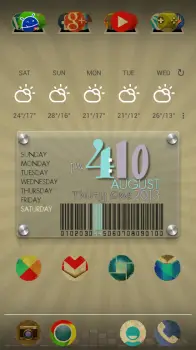
This time around, I downloaded the Vintage icon pack for use with many modern launchers such as Apex and Nova. I love a good washed-out, torn, ripped, worn, and weathered look, so this was a no-brainer for me to apply once AndroidForums.com user Cincybearcatfan recommended it for me.
For my clock widget, I installed One More Clock Widget, and used one of the many pre-installed custom clock/date/weather/battery widgets it came with (the one shown above). I’ve since customized the colors and arrangement a bit more, but that is pretty much what it looks like as of the time of this writing. I used the Eye in the Sky weather widget / app to give me that clean weather widget you see above the clock (and the weather app that sits behind it is quite beautiful and functional, might I add).
As for my launcher settings, I’ve shaven the number of home-screen panels I have down to one — no scrolling left or right for me. As you might notice, I have also hidden my status bar and gotten rid of my apps tray button. Instead, I opt to use the swipe down gesture in Nova launcher to bring up my notifications, the home button while on the home screen to bring up the apps tray, and swipe up to access my Google Search / Google Now.
And since I love Halo, but I’m not on a ROM based on Paranoid Android, I’ve used Floating Notifications to get a quick look at my notifications while I’m on the home screen. It’s not quite as good as the implementation of Halo, but it does the trick just fine.
The setup is a bit unconventional, but that’s the joy of Android — it’s made for people who like to be unconventional. Be sure to show us your own home-screen in the comments section below, and let us know what you used to make it all happen!





Nothing special …
Wallpaper?
Android 4.3
Posted this once before. Simply layout that’s served me well for months now. Used to change my phone’s layout almost weekly before settling on this one. Earth is live wallpaper rotating. Buzz Launcher.
Clean, simple, informative, and functional. I like it.
Cheers.
Goolge?
Haha! I know, I’ve fixed it since that screen shot was taken.
Blasted dyslexia!
Nova with 12×8 grid + “It’s on” UCCW + Nox iconset
Dat icon pack.
That is a beautiful icon set. Just purchased!
My homescreen
It would be nice to be able to see them through the phandroid app. The app could use an upgrade
My homescreen
Sweet!
Thnx! :)
No, it’s zooper widget on a normal background. I used this theme: https://play.google.com/store/apps/details?id=org.zooper.zwskin.circle_clock
and edited it to match the background color
I went all out.
My set up
Custom Wallpaper and Icons… big Trekkie :)
That is pretty cool. How did you do that?
The wallpaper is based on a screencap from the menu on the Star Trek (2009) Blu-ray. The ship and background are from the screencap. UI elements (text, white lines, etc.) are custom re-creations in order to get the layout I wanted with a cleaner look at the ship. The icons were done in Photoshop. The wallpaper is actually designed for two screens, with ship info taking up most of the space on the second screen. Using Nova Launcher.
Nice…
Older layouts here. Just a few of the many that I was messing around with. Used to have a serious problem changing stuff out way too often. But that’s what’s fun about Android isn’t it? Mix of stuff made using Nova Prime and Buzz Launcher.
Nothing too fancy here
Do you mind sharing the wallpaper? It’s pretty cool.
Not at all, here you go
Thanks.
You’re welcome
this is one of the setups I’ve had for a while now (Note 2)
Here you go (N4 on PA)
My homescreen with 90% original size icons. That way I can squeeze a 5th column in without it looking too crowded. Apex Launcher Pro. Magic Smoke live wallpaper (I normally use Thunderstorm Live). Note the Android Forums app in the tray *hint hint* :D
Here’s mine…LiquidSmooth Rom, Nova, simple calendar widget, simple text widget, Nox icons.
HTC Sensation on some random CM10.1 based ROM
UUCW Sense clock
ClickUi icons
Brilliant Quotes
edit – ugh came out blurry/washed out, ROM isnt perfect yet
Note 2, Nova Launcher, Stark Icons
What clock/weather widget is that?
It’s HD Widgets with the Colourform pack.
Apex. Clean and simple.
Same setup i just change wallpaper
Klok Project Icon Pack, Wallpaper from Wallbase app (search Ubuntu), Nova Launcher Prime, ROM AOKP(Jellybean 4.2.2 )Task650 (7.20.2013b) SGS3 AT&T
Note2 using nova. Getting inspiration from these posts, time for some change..
My Galaxy Note 2!
Key Lime Pie Concept
I must be different from everyone else. I figured i wanted all my important most used info in my homescreen so i have wunderlist widget at the top, bus calendar widget to the left and evernotes widget om right. Probably pretty ugly but very productive for me.
I use sidebar app for other common apps
My current home screen. Only one :-) the only one I need
All I need.
just minimal
I like that one !!!
This is slick!
Clean look pimp.
I love this! Can you tell us what icons, wallpaper, and widgets these are?
This is A GS4 so some of the grid setting might need to be tweaked, but here is what I used.
Nova launcher grid set to 10/5 and I have widgets set to overlap
I have the notification bar turned off
Minimal ui icon pack and the wallpaper comes with that pack
Mnml weather uccw skin
Minimalistic digital clock widget
http://mycolorscreen.com/spiral777
Nova Launcher and PowerAmp
I’m using NFL 2013 Live Wallpaper with TSF Shell. My Doc is hidden and requires a hidden tap and everything else is swipe based. When it’s not Football season my screen is completely black.
Thank you for this. I been looking for a good NFL live wallpaper, this looks great.
GO NINERS!
I’m glad I could be of service. I used this one for the Bulls Basketball season too. I wish they did a College Football Version!!!
Kinda boring compared to everyone elses
Paranoid Android, Nova Launcher, Dash Clock, and Nox icon pack :)
On the dash clock widget, what’s that item that says the breaking bad episode? Is that a reminder? What app is that?
It’s Cliffhanger https://play.google.com/store/apps/details?id=com.cliffhanger
Next Launcher Stock VZW Note 2
Mine
Informative. Right to the point.
Next Launcher Stock VZ Note 2.
Nice one !
Here is my one screen set-up with 3 pages of docks, nice and simple …..Nova Launcher Prime, Metro Station Icon Pack, Battery Widget Reborn, WidgetZoid (donate), HD Widget and Back2Black as my wallpaper. I also have a couple of apps which are invisible on top of some of the widgets.
Stock Touchwiz on a VZW Note 2. No picture needed.
Nova, nexus pro lwp, cLock
Its all about what I use the most. (Wallpaper is a pic I took at a Club in Quebec City)
Note 2 Goodness Noteworthy rom
AOKP Galaxy S3, Gyrospace 3D Wallpaper, Nova Launcher + RoundedSet Theme, etc.
You can do anything in MIUI hehe
https://www.youtube.com/watch?v=xcYH8SGrxQ4
IOS7! get it outta my face!
I know! I can’t believe they made it so ugly
Now I see why Hugo Barra decided to go to Xiaomi
http://www.youtube.com/watch?v=8GxXM-Owacg
Ok that is WAY too cool! Holy crap.
Nova Launcher
Metro Station icons
Minimalistic text
Smooth calendar
Most used apps in the ‘favorites’ folder. Everything else in the app drawer grouped together by category courtesy of Nova Launcher Prime.
Nexus 7 v2 with Apex, gasklart icons, tablet ui.
Lets try this again.
Nexus 7 v2 with Apex, Glasklart icons and tablet UI.
Wicked nice.
Thank you!
Went all circles
My setup probably hasn’t changed in a year. http://db.tt/m1sRqXSg
Home screen Nova launcher
Home screen Nova launcher.
Simple and clean:)
could you explain how to setup like that?
Apex launcher non scrolling wallpaper with nothing on it. Gesture based swipe up opens app drawer swipe down shows notification. Swiping from the left edge to right activates swapps(side bar) paid version with my personal choice of apps and recent apps under that, and under that is an all apps section. I’m on a Verizon galaxy s3 with CarbonRom stable 1.8.
Thanks man!!
While I’m constantly changing it, here’s my favorite
Nothing too fancy.
Nothing too fancy here.
What widget is that?
I was wondering the same thing. I’d love to use that widget! Please advise!
Motobean uccw. I found the uzip and tweaked it a bit.
Love the wallpaper mind sending it me at [email protected]?
My set up :)
What launcher are you using I really like this setup.
nova launcher
What widgets? Still by far my favorite then after that mine comes in second. Mine is one that says “mine is kinda busy” a few post up.
zooper widgets,uccw,power toggles,simple rss widget ans tasker
What did you use for the Applications widget?
Zooper widget i created
Ty I’m going to really enjoy using these :-) I just took ziggy clock and hooked it up in my style
You’re Welcome
Thanks again for the info I now have a new favorite widget. :)
here is my homescreen. doing an away rotation in chicago so thought i would have my wallpaper match!
What icons and widgets are you using?
top widget is a UCCW clock i got from a friend, bottom widget is zooper, and icon pack is grunge icons (free). i’m running regular apex launcher
I keep it simple or to the basics with flat icons.
Holo icons? :D
Simple
Loving the new Nox theme. Was using Stark before this.
ParanoidAndroid 4.3 with Pie Controls and Parallax wallpaper
I’m digging the icons.
They’re called “Stark” if I remember correctly. I’m currently using a similar set called “Nox” that’s made by the same devs.
Mine’s kinda busy but I like it
Mine’s kinda busy but I like it.
Home screen
Looks very nice. I really like the icons.
The top one is with Next Launcher and Peaceful Icons for Next.
The bottom one is TSF Launcher with standard TSF icons.
Cheers.
Mine is kinda busy but I like it.
I like minimal and clean. ADW launcher on CM10.2. Clock is Timely.
Love that gaze…..
Mine is simple but effective. I have the phone and text icons on the left and right. In the middle of the dock I have a small dot that is my “most used” folder. My app drawer is just a quick swipe away if I need something else. Beautiful Widgets takes care of my weather and clock needs.
Apex Launcher.
Nexus 7 homescreen
Here’s my baby. Nova launcher.
Lots of Zooper widgets
Love the icons, where did you get them?
My Home Screen. Enjoy!
I’m assuming you didn’t charge your phone last night because its a little early to be down to 27% battery
SoundCloud and HDMI output to TV :)
Smoked Glass clock widget at the top. Yahoo hourly weather at bottom.
The widget is called Appspace. I have all my apps linked to the picture. I click the camera it opens instagram. I click the guitar it opens spotify
my home page using nova launcher
Nova launcher with Nox icons
Here is mine. TSF Shell. One page to rule them all.
Here is mine, i’m using Holo icons with the stock LG launcher and the Timely widget.
what Debbie responded I didnt know that some one able to earn $8818 in one month on the computer. moved here www.JAM20.com
Here’s mine on my Galaxy S3.
Nova Launcher and using the misaClean theme.
misaClean tutorial: http://forum.xda-developers.com/showthread.php?t=2045174